
For members
Community
A guide for every tool, plus trading education and resources. Public, so you can see exactly what's inside before you join.
Indicators
TradingView Indicators
A big thank you to Miles from the community for his help refining these tools. When you see (Miles) next to an indicator on TradingView, it has had his fine eye on the programming and logic.
Indicator Guides and Walkthroughs
How to set up and get the most out of the TradingView indicator suite.
Trading Desk Guides
Trading Desk GuidesPlus & up
Discord Screeners
Trading ToolsTrader & Quant
Market IntelQuant only
Indicator Access
Indicator Access
Active Patreon members: enter your TradingView username and Patreon email and you'll be invited to your tier's indicators, usually within 1–2 hours.
Sign in to request accessSign in first so we can link your TradingView username to your account. Use the Patreon-registered email you subscribe with.
Trading Education
Courses and Lessons
In-depth courses, tutorials, and articles on Patreon. Active members get the full content; everyone can preview what is covered.
Resources
Guides and Downloads
Reference material, cheat sheets, and sector watchlists. Hosted on Patreon, so access stays with active members.
Video Collections
Video Collections
Recurring video series: Zoom calls, trade recaps, market breakdowns, and watchlist reviews.
Market Tools
Calculators & Dashboards
Deviation Bands
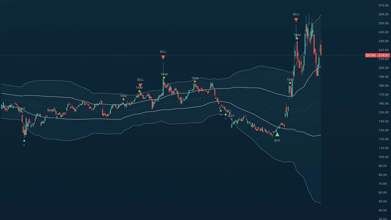
Purpose
TA (Miles) Deviation Bands shows you where price sits relative to its own normal behaviour, and then prints staged buy and sell markers when enough independent evidence lines up at that location.
Use it for location, timing, and scaling knowing whether price is cheap, balanced, or stretched, and being told when a stretch has actually started to turn. It measures location and follow-through; it does not predict tops and bottoms.
Best used for:
- Accumulating into declines in stages rather than in one guess, with a suggested size per stage.
- Scaling out of rallies in stages, and taking a full profit at a genuine swing top.
- Reading the repeating rotation of price through the lower band, the centre, and the upper band and noticing when that rotation breaks.
- Buying back after an exit only when trend continuation actually confirms (optional).
- Selling rips into resistance during downtrends and choppy regimes (optional, Aggressive sell mode).
- Keeping you out of falling knives most of the buy-side logic exists to make you wait for a lift off the low instead of catching one.
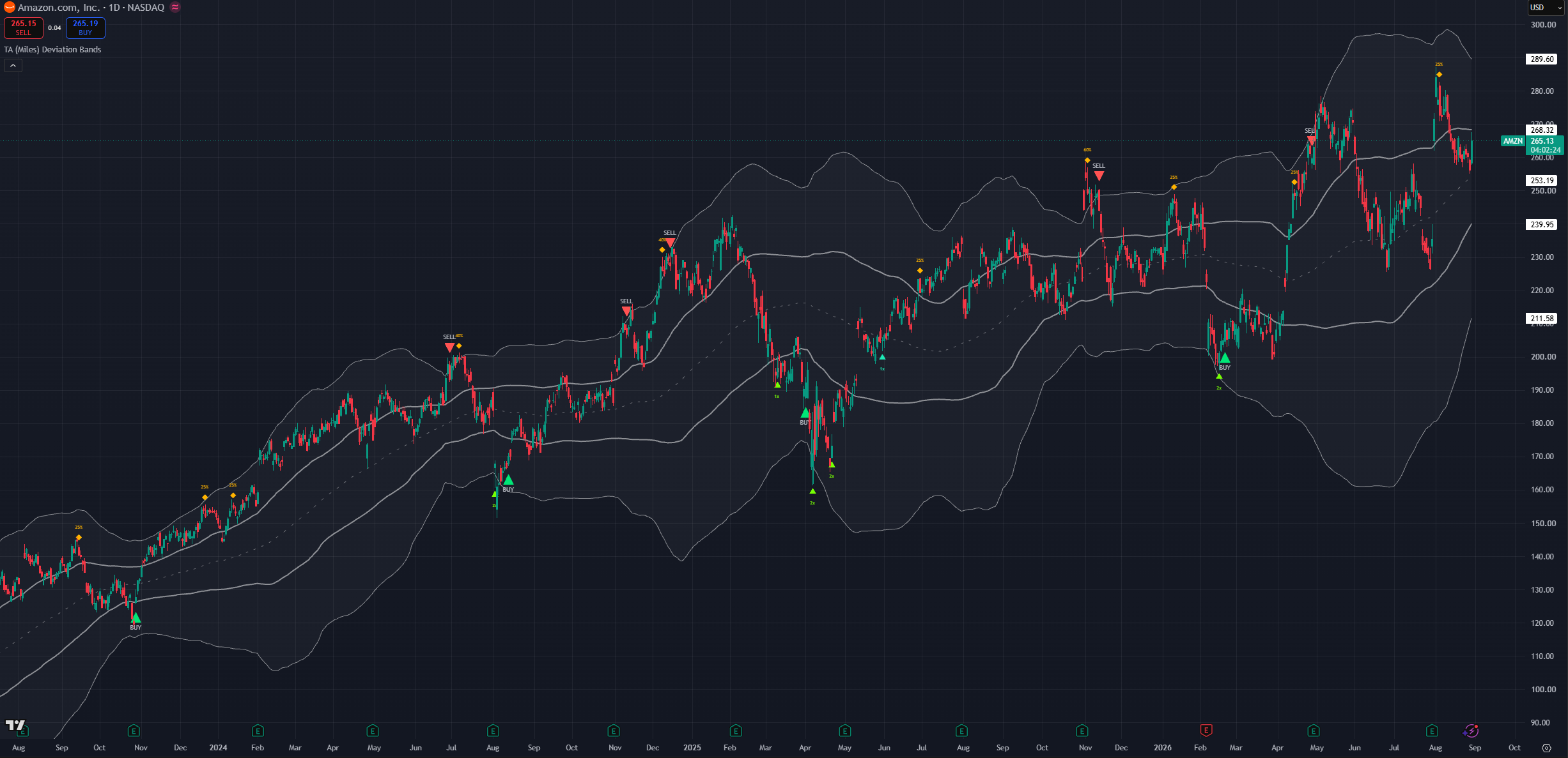
(AMZN 1D chart, default settings)
NOTE: Times and settings throughout this guide are provided as default samples. Different assets may benefit from different settings that may go counter to their standard intended usage.
Candle close & no repaint
Every solid marker is confirmed on the bar's close. Nothing is ever stamped backwards onto a candle that has already closed. The signals are designed to be actionable by humans and work by candle close when information is complete.
Optional dim "forming" previews can appear while the live bar is still building, so you can prepare before the close. A forming preview only ever appears on the same bar that would confirm the signal if the setup fails before the candle closes, the preview simply disappears. A signal that confirms on one bar can never have previewed on an earlier one. This is a helpful guide to set yourself up during the candle formation
How to read Deviation Bands
Deviation Bands is a price-chart overlay. There is no lower pane. Everything is drawn on price: a midpoint, two pairs of bands, three shaded clouds, and the markers.
What you see
- An upper cloud: the zone marked by the upper two lines indicating asset has gained momentum.
- A middle span the optional shading between the two inner bands. This is the balanced middle of the range and usually acts as a transition point.
- A lower cloud: marked by the lower two lines indicating the asset lacks momentum.
- A dashed midpoint line the central reference. Price near here is behaving normally. On equities it coincides with the 100 moving average
- Coloured triangles below price the buy family: ADD, BUY (core), BUY (aggressive), RE (continuation re-entries).
- An amber diamond above price TRIM signals accompanied with a suggested magnitude.
- Coloured triangles above price the sell family: SELL and POP (aggressive SELL).
- Size text on the scaling markers a suggested position multiplier on ADD, a suggested take-profit slice on TRIM.
- A dotted aqua guide the live breakout level while a post-exit continuation pattern is forming (only when the re-entry engine is enabled).
- Optional score dashboard and a signal legend colour key.
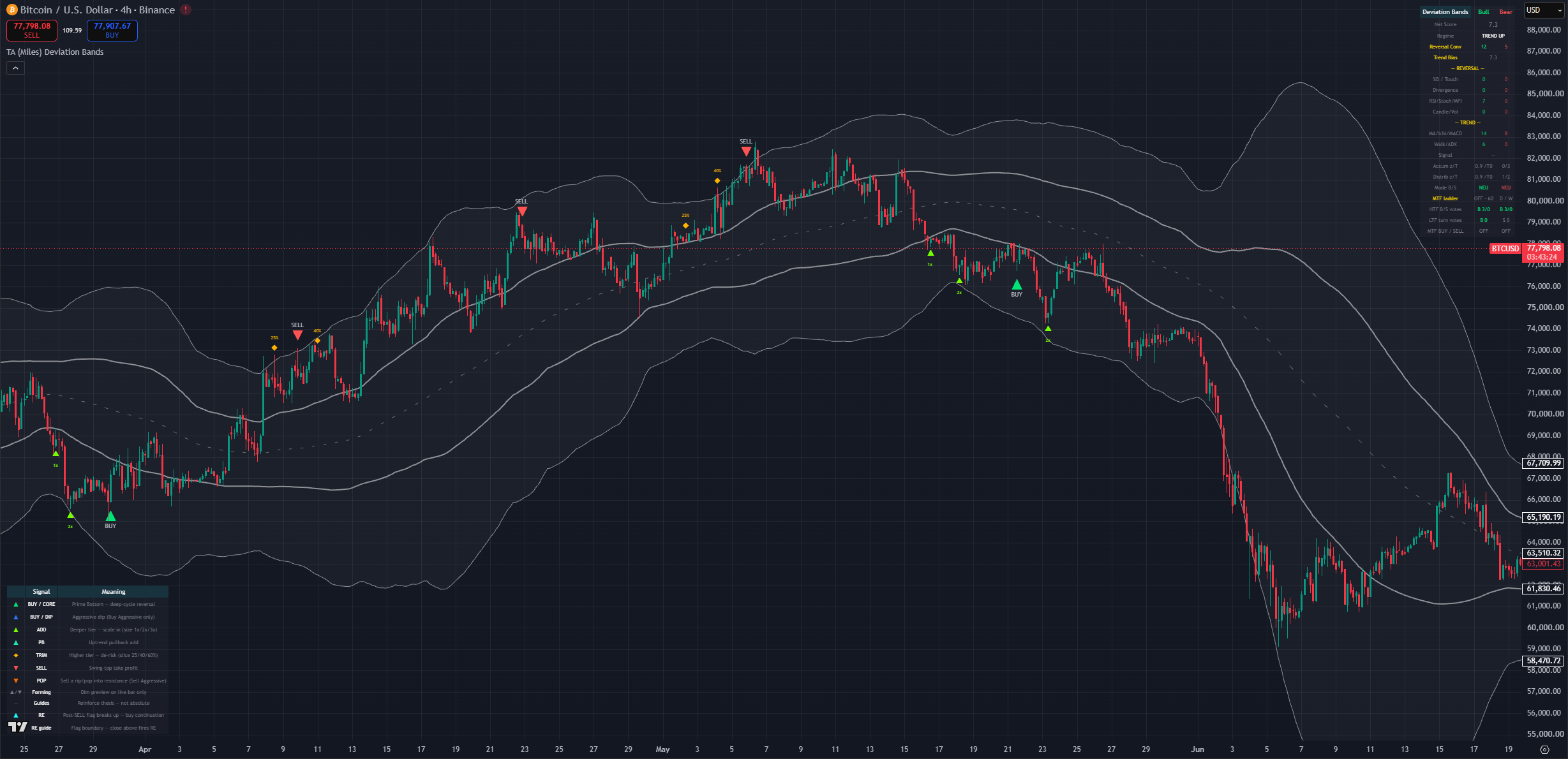
(BTC 1D chart, default settings with the legend and dashboard on)
The band geometry
There is one shared midpoint and two band pairs drawn around it. Together they produce four levels: an inner and an outer band above, and an inner and an outer band below.
The geometry is deliberately asymmetric. The floor beneath the midpoint sits further away than the ceiling above it, because downside stretch runs further and faster than upside stretch. A market grinding higher pokes the upper shoulder constantly; a market selling off punches through the lower shoulder and keeps going. If the two sides were symmetric, sell signals would trigger easily and buy signals would almost never activate.
That asymmetry is why the two sides of this indicator feel different in use, and it is intentional:
- Upper cloud: entered often, even in healthy uptrends. Being here is not a reason to sell it needs a rejection.
- Middle span: the working range. Most price action lives here.
- Lower cloud: entered less often and usually with force. Reaching it means weakness in the asset.
The inner bands are the shoulder edges the point where a stretch becomes worth watching. The outer bands are the extremes the deep floor and the far ceiling. Crossing an inner band arms attention; reaching an outer band is where the strongest reversal signals live.
The band-rotation narrative
This is the most useful habit to build, and it has nothing to do with markers. Price tends to rotate through the bands in a repeating pattern, and the value comes from noticing when it fails to complete the pattern.
The normal rotation
Price moves through the lower band, back into the centre, chops around, pushes through the upper band, comes back through the centre, into the lower band, and back to the centre again. Each band visit typically produces two or three swings before the rotation moves on a first push, a retest, sometimes a third.
Learn what the normal rotation looks like on your asset and timeframe. Then the deviations tell you the story.
Failure to reach the next band
- Price leaves the lower band, gets halfway through the centre, and cannot reach the upper band before rolling over. That is weakness. Expect another trip to the lower band, and expect a lower low to be possible.
- Price leaves the upper band, dips into the centre, and never reaches the lower band before turning back up. That is strength. The trend is intact and another trip through the upper band is likely.
- Price rejects from the midpoint itself without even getting through the centre span that is pronounced weakness, and usually precedes a bigger leg down.
The rotation also gives you a rough count. If you are on the second swing in the lower band and it is making a slightly higher low, that is a small constructive sign. If it rejects, expect a third and often deeper swing.
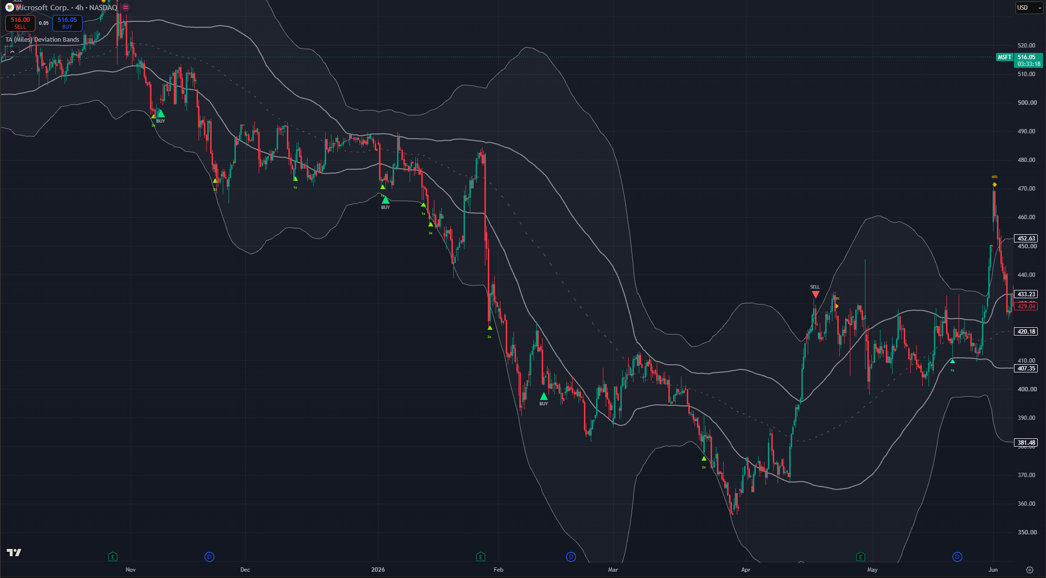
(MSFT 4h chart, default settings lower-band swings and a failed push toward the upper band)
Centre-band backtests
When price breaks into the centre span from either side, it frequently comes back and backtests the boundary it just crossed. A hold there is constructive. A failure there says the break was not real, and often marks the point where the rotation reverses.
When the bands squeeze
When the bands narrow and travel horizontally, volatility is compressing and an expansion is coming. The squeeze does not tell you direction. It tells you that a decision is near.
Direction has to come from context: the prevailing trend, where price sits in the rotation, and whether it is stretched. A squeeze after a stretched rally in a persisting downtrend most likely resolves down. The same squeeze in an established uptrend after a shallow pullback most likely resolves up.
Timeframes nest
Band rotations nest inside each other exactly as days nest inside months. One weekly rotation contains several daily rotations; one daily rotation contains several 4H rotations.
This matters for risk more than for entries:
- A weekly lower-band condition supports a position you might hold for months or years.
- A daily lower-band condition supports a swing lasting weeks to months.
- A 4H lower-band condition supports a trade lasting days to a couple of weeks.
The best risk-reward is a higher timeframe leaving its lower band and working toward its upper band, and you playing the lower-timeframe stretches inside that. The worst is a lower-timeframe buy signal while the higher timeframe is stretched into its upper band that trade can work, but you are fighting the regime and it deserves a smaller size.
Marker reference
Eight markers, in the order you would meet them across a full cycle. Each carries a distinct colour, so the colour identifies the signal type even with marker text turned off.
ADD lime triangle below the bar
Price has reached a new deeper tier of discount and turned up with enough agreement behind it. Adds are graduated: the deeper the tier reached, the larger the suggested size, shown as the marker's own text (1x / 2x / 3x).
An ADD is a scale-in. The whole design assumes you do not know where the bottom is, so it buys progressively worse prices in progressively larger size instead of committing to one guess.
A tier normally adds once. It can add a second time if price genuinely left that tier and later came back to retest it a bounce, then a return. A straight uninterrupted slide never re-adds at the same tier, which is what stops the engine from feeding a waterfall.
Adds are capped per decline cycle, and the counter resets once price has recovered back toward the midpoint.
Pullback teal triangle below the bar
A Pullback add. The trend is intact, price has pulled back toward the midpoint without ever reaching the discount tiers, and it has turned back up.
This exists so trends that never get cheap still produce entries. In a strong uptrend, price may never reach the lower cloud for months. PB is how you participate anyway. It is the lightest of the buy markers, and it carries a 1x size hint.
BUY green triangle
The Prime Bottom: a confirmed reversal of a deep decline. This is the highest-conviction buy the indicator produces, and it fires once per decline cycle.
It requires the decline to have actually reached deep-cycle territory, price to have lifted clear of the cycle low, a real location anchor (a reclaimed level, a rejection candle, or historically respected support), and agreement from independent evidence families momentum turning, divergence, price action, support memory.
Because it is once per cycle and exempt from the per-cycle buy cap, an earlier ADD can never suppress it.
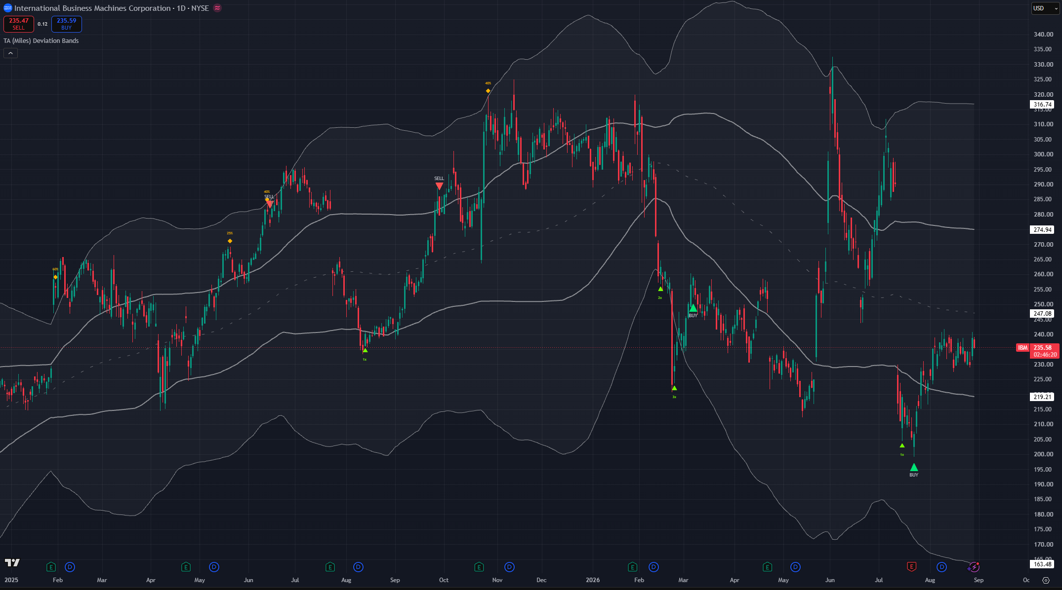
(IBM 1D chart, default settings)
Aggressive buy blue triangle
The Aggressive Dip. This marker only exists when Buy Sensitivity is set to Aggressive. If you never see a blue triangle, that is why.
It is the opportunist: a real-time bounce finder that fires on shallower discounts than the core BUY, at support, when momentum turns up. It resolves on the current bar rather than waiting for a swing to complete, so it is earlier and, being earlier, less reliable.
The two bottom-finders are kept in separate depth territory on purpose. Once a decline is deep enough to belong to the core BUY, the dip finder goes quiet for the rest of that cycle, so you never get a blue and a green marker a few candles apart calling the same bottom.
Dips count toward the per-cycle buy cap and carry their own minimum spacing.
An important note: the aggressive engine will also modify the behaviour of the BUY green triangles to make them more aggressive.
Reentry aqua triangle
Continuation re-entry. Off by default, and marked experimental.
This addresses one situation: you exited on a SELL, price never really corrected, and you want a disciplined way back in without chasing. After a confirmed exit the engine watches for a continuation pattern a shallow, flat-or-drifting-lower consolidation beneath the exit peak that dries up in volume and buys the breakout of that consolidation. A dotted aqua guide draws the live breakout level while the pattern forms; a confirmed close above it is what fires the marker.
A second, stricter path catches a failed top: price reclaims the exit peak outright while the trend stack is fully aligned.
Either path demands, on the firing bar itself, a decisive breakout candle, expanding participation, and agreement from independent context families. A fresh bearish divergence blocks it outright. The watch is cancelled by capitulation, a structural breakdown, a too-deep retracement, or simply expiry.
One RE per exit, maximum. If it does not confirm, nothing prints that is the intended behaviour, not a miss.
TRIM amber diamond
Price has reached a new higher tier of extension and turned down with agreement. Similar to ADD in mirror image, trims are graduated, and the marker's text is the suggested take-profit slice (25% / 40% / 60%) higher tier, bigger slice.
A TRIM is partial de-risking on the way up. Same retest logic applies: a tier trims once, unless price genuinely dropped away and came back to retest it. Trims are capped per rally and the counter resets once price falls back toward the midpoint.
A TRIM is suppressed whenever the same bar qualifies as a full SELL, so you never get a trim immediately followed by a sell marker at the same top.
SELL red triangle
The high confidence take-profit at a swing top. This is the sell-side counterpart to the core BUY, and it is deliberately sparse.
It works in two stages. First, exhaustion has to build while price is stretched overbought oscillators, participation anomalies, price-action exhaustion, divergence. That arms a short window. Then, inside that window, a real-time rejection at a significant swing peak fires the marker. Significance is genuine: the peak has to dominate the bars before it and the rally has to have risen a meaningful distance from its base, so ordinary wiggles are dropped.
Two extra behaviours shape the timing:
- The parabolic guard holds the SELL back while a steep run still closes above and rides its fastest trend line. In blow-offs the first rejection wick almost never marks the top. The signal releases the moment that line cracks, so the marker lands on the real top instead of selling into strength.
- Rounded-top detection catches distribution tops that roll over slowly instead of spiking down. A grinding, curling top never makes the sharp one-bar failure the main path looks for, so this path watches for the roll itself a fast trend line tipping over, a run of lower highs, or a loss of the medium moving average, with momentum fading inside a wider "still near the top" window.
In a strong uptrend, being overbought is normal rather than sufficient. Every mode waits for a genuine crack in trend before selling into strength.
POP orange triangle
Sell a rip into resistance. This marker only exists when Sell Sensitivity is set to Aggressive.
POP is the exact mirror of the Aggressive Dip on the sell side: a real-time fade finder that fires on a premium at resistance, or overbought at resistance with agreement, once price gives back some of its move off the running high.
An important note, Aggressive sell mode does not produce more red SELLs. It runs the same take-profit engine as Neutral and adds the orange POP on top. Moving from Neutral to Aggressive gives you more pop signals, not more sells. POP is suppressed when a full SELL fires on the same bar. This is different than the aggressive buy behaviour which does change the BUY behaviour.
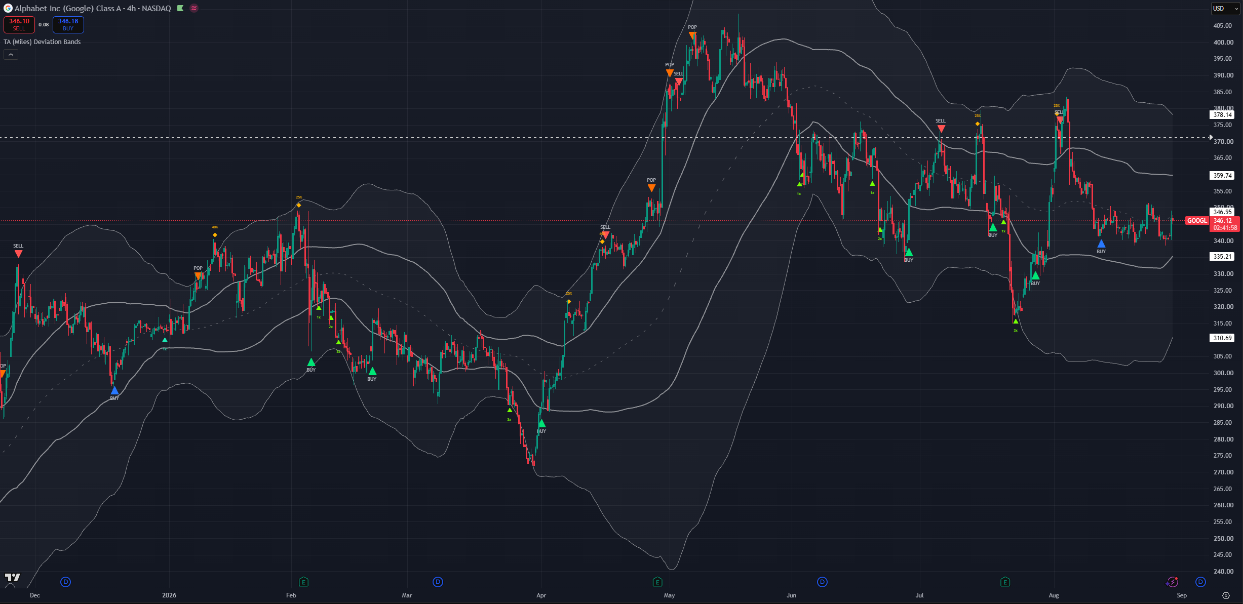
(GOOGL 4h chart, Aggressive buy and sell sensitivity)
Same-bar priority
When two signals qualify on one candle, only one prints, and the more consequential one wins:
- A full SELL or POP owns the bar over everything else, buys included. Risk-side events come first.
- Among the buys: BUY outranks Aggressive BUY, which outranks Re-entry BUY, which outranks ADD and Pullback.
Counters and latches only advance when a marker actually prints, so a signal that lost the bar to a higher-priority one has not silently consumed your cap.
Forming previews follow exactly the same hierarchy, so the live-bar preview matches what would confirm.
What the engines are actually asking for
You do not need this section to use the indicator, but it explains why signals arrive when they do and why they sometimes do not arrive at all.
Importantly the engine modes are not tied to a timeframe but to a style. Meaning that there is no need to use the conservative mode in the weekly chart nor the aggressive only in the lowest timeframes.
Engines are designed to provide different logic applied to all timeframes.
The lift off the low
The indicator is not trying to guess the exact bottom, it will wait for proof of reversal. This can come in multiple forms including historical data, multi-frame analysis and reversal or exhaustion signals firing behind the scenes. This is a key component for the indicator avoiding noisy buy signals and avoiding catching falling knives without proof.
The trade-off is direct, the actual exact bottom will not usually be the candle that is marked, the signals more commonly coming earlier or later than said bottom the majority of the time.
Scaling has to be structural
A green candle is not a turn. The scaling engines require a real momentum or structure reversal momentum curling up off a low reading, reclaiming an inner band, a rejection candle that closes well off its low, or a genuine divergence.
The same discipline applies in mirror on the trim side.
Agreement, not a single trigger
Alongside the turn, each side counts agreement from separate families: participation, candle structure, divergence, oscillator condition, and reclaimed or historically respected levels. A signal needs a minimum amount of that agreement, and how much depends on the situation:
- When the current decline is statistically extreme for this symbol, the requirement eases slightly the drop has already earned the benefit of the doubt.
- When the decline is shallow, when recent bounces have been shrinking, or when price is in a structural downtrend, the requirement tightens.
This is how the same setting produces different behaviour on a quiet mega-cap and on a name in freefall.
The momentum factor
An optional confluence family (on by default) that measures how far momentum has displaced from its own mean, normalised so it reads comparably across assets. When that reading is deep in its stretch tail and crosses back through its own basis, that counts as one more turn read behind the BUY and SELL signals.
It is another component in the neutral modes that counts towards the agreement. However it gains a higher level of importance in the more aggressive mode unique signals. Other systems can always gate against them and act as extra filters.
Historical memory
The buy side learns this symbol's own history rather than applying fixed thresholds. It records how large past declines became before they bounced, how long they lasted, what oscillator level they bottomed at, and at what prices. Then it reads the current decline against that record:
- A drop deeper or longer than most past drops makes buys more eager and earlier.
- Remembered trough prices are scored by how price actually behaves at them a level that has held before scores up, a level that breaks cleanly scores down. Buying at a well-respected shelf is treated as evidence in itself.
- The typical bottoming oscillator level is learned per symbol, because some assets bottom near 35 and others near 20.
- When recent bounces are shrinking, a falling-knife regime is assumed and more confirmation is demanded.
Everything reads completed history plus the current bar, so none of it repaints.
Chart timeframe profiles
There is no single "trading style" dropdown. The chart timeframe you work on, plus the two sensitivity dials and a handful of toggles, define how the indicator expresses itself. The profiles below map common workflows onto settings.
With that said in the lower time-frames the aggressive engines can provide a more reactive and fast-paced signal engine that better suits day trading and scalping trading styles.
NOTE: these are starting points. Different assets particularly options-heavy names may want something different.
Position / cycle investor (Weekly)
For positions you intend to hold for a year or more. Set Buy Sensitivity → Conservative and Sell Sensitivity → Conservative: fewer, deeper adds and a SELL that targets genuine cycle peaks rather than swing highs. Leave Detect rounded / rolling tops → On cycle tops are usually rounded, not sharp. Keep Continuation re-entry off. Turning the size hints on is useful here, because the whole point is graduated accumulation over a long decline.
The conservative BUY engine focuses more on the ADD signals in favour of BUY signals as way to build positions rather than looking for the more swing-oriented BUY signals. Signals on both engines are significantly sparser sometimes signals may not fire for years.
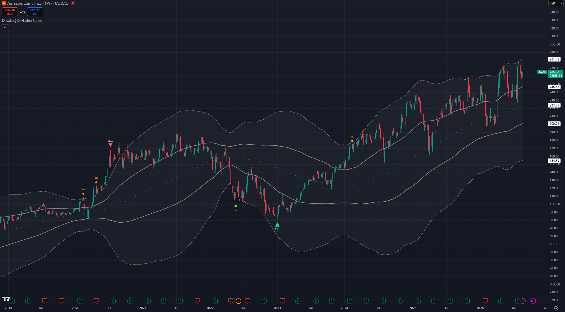
(AMZN 1W chart, Conservative buy and sell engines)
Daily swing trading (default)
The all-rounder, and the settings the indicator ships with. Buy Sensitivity → Neutral, Sell Sensitivity → Neutral, momentum stretch on, historical memory on. Entries you expect to develop over weeks to a few months. Leave everything at default; add the score dashboard while you are learning it and turn it off afterwards.
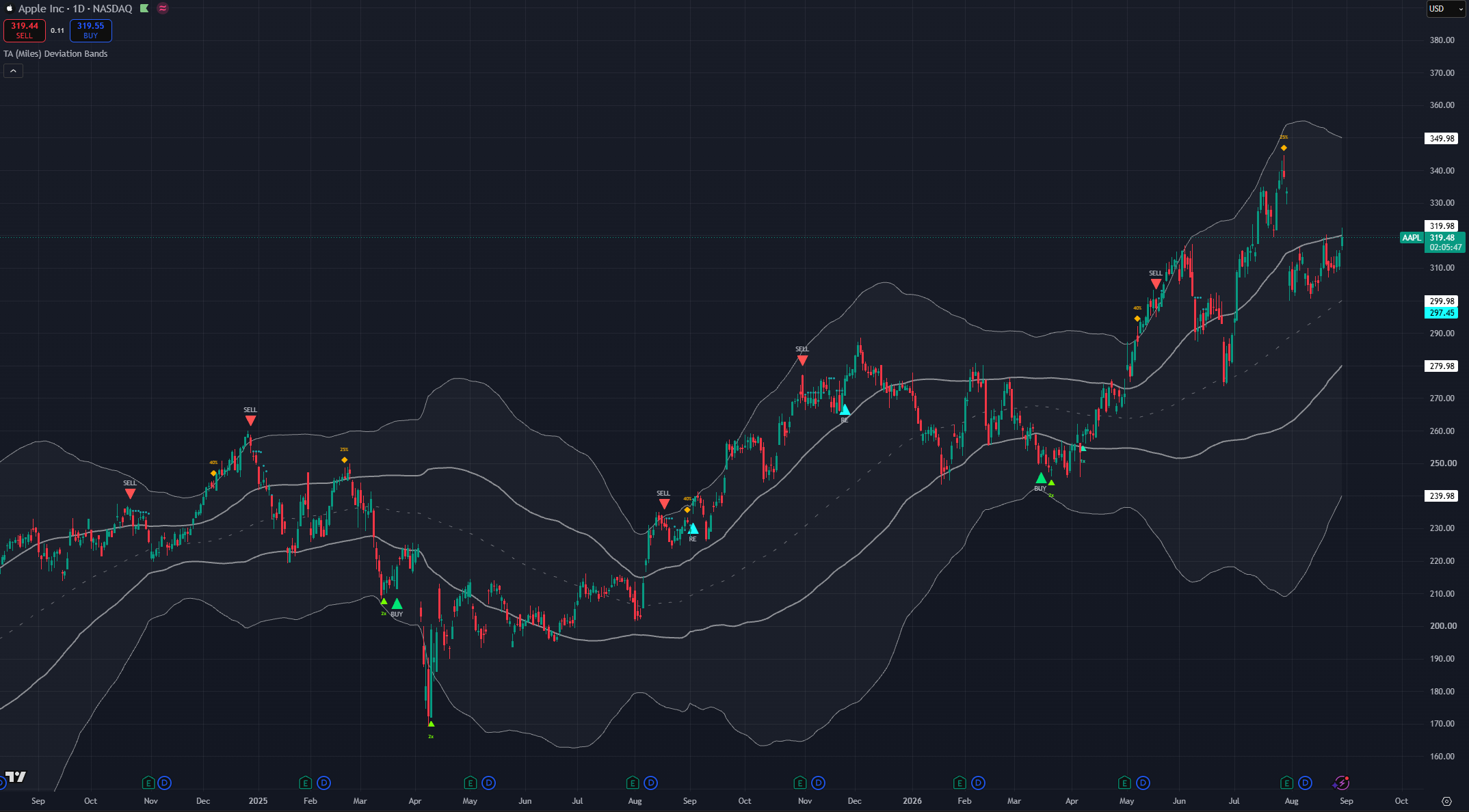
(AAPL 1D chart, default settings with reentry engine ON)
Active swing trading (4H)
For trades measured from days to a few weeks. Keep Buy Sensitivity → Neutral or move to Aggressive if you want the blue dip markers for finer timing.
Depending on your own preference and how active you want to be this is the first timeframe where you may consider mixing and combining different engine modes. The engines have been left separated in configuration on purpose. This allows traders to adjust them with more detail to their own liking. You may consider having Aggressive mode in only one of the sides while the other stays in neutral or conservative. You can fine tune the profiles to fit the asset type.
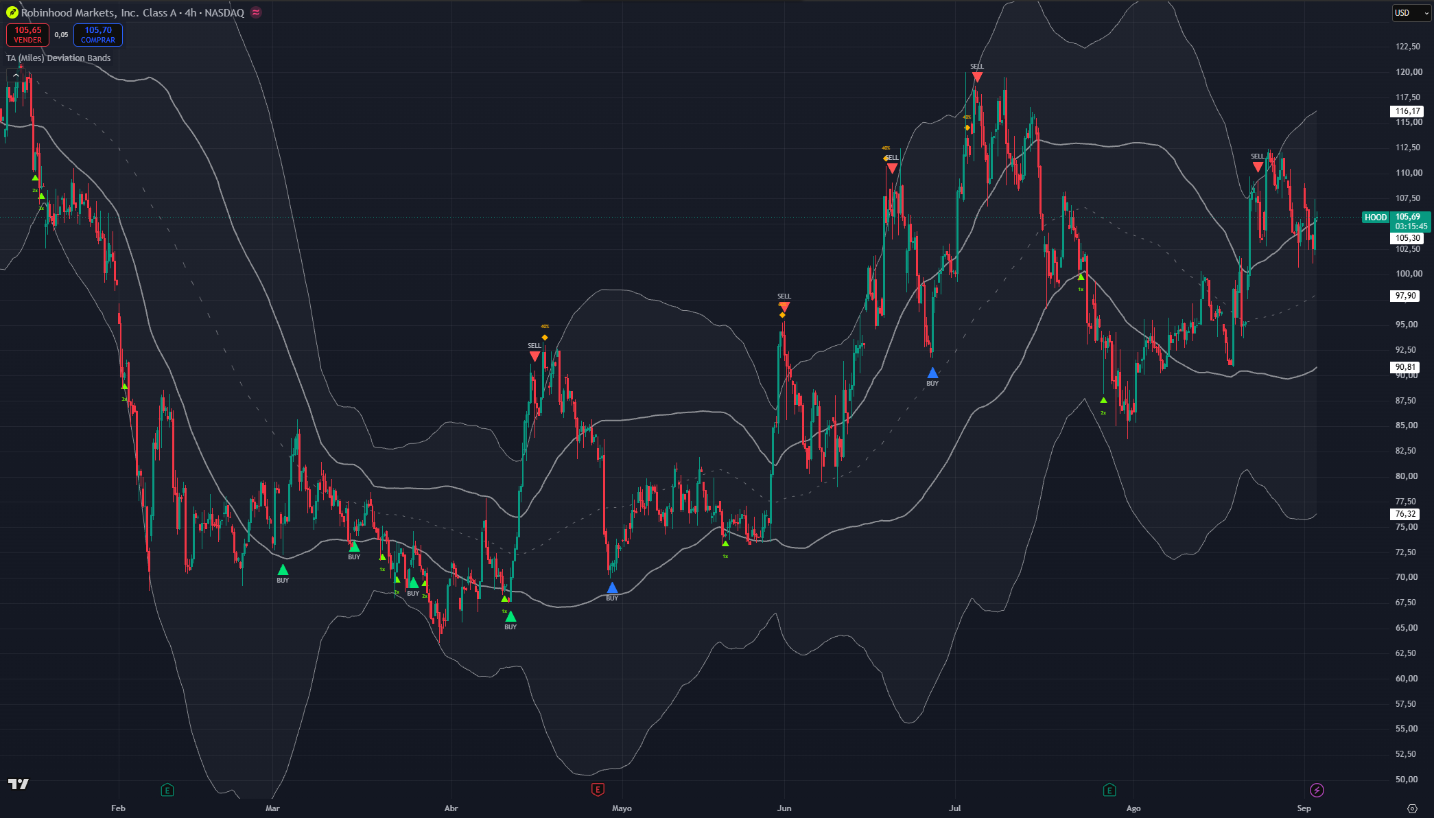
(HOOD 4H chart, Aggressive buy and neutral sell)
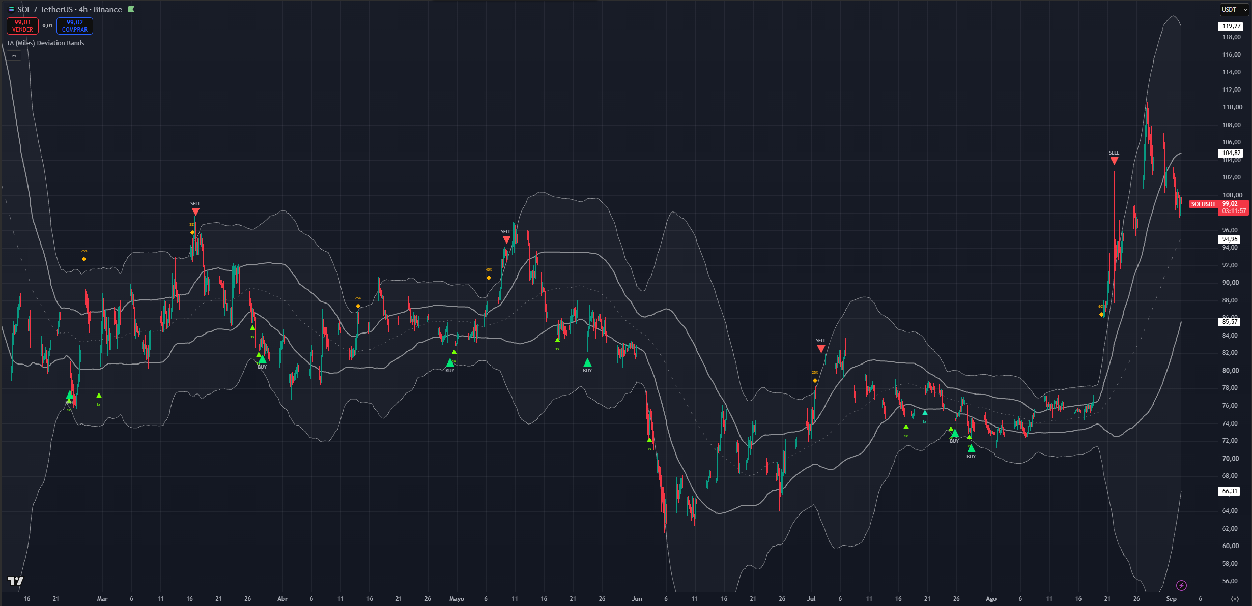
(SOL 4H chart, neutral buy and conservative sell)
Intraday
The indicator runs below 1H without errors, but the staging logic is built around swing-scale rotations, so signals become more frequent and less durable. If you work here, favour working with both modes in aggressive and using the bands as a stronger confluence signal.
Avoid buy signals that are not in the lower band and use the top of the upper band as confluence with the sell signal.
As mentioned these timeframes are not as well suited for the indicator concepts but the concepts can still be applied.
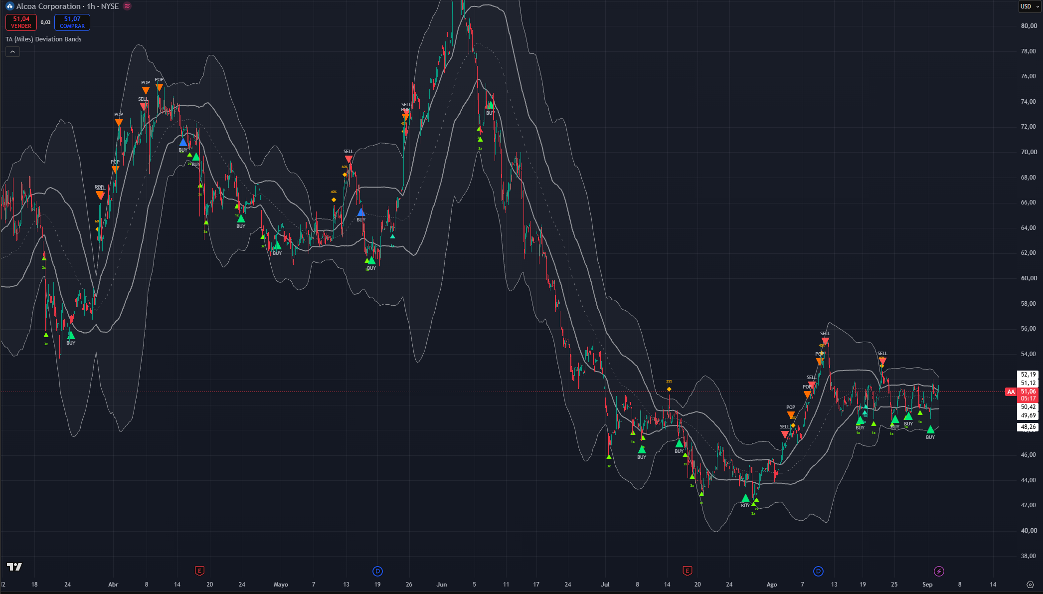
(AA 1h chart, Aggressive buy and aggressive sell)
Setting inputs and how to use them
Every user-facing input, grouped as the settings panel groups them. Visual settings never change when a signal fires only how it looks.
NOTE: since this is the first settings section, companion settings from other sections are mentioned here only at a high level. Each has its own section below.
Signal Sensitivity
Buy Sensitivity
The master dial for buy-side eagerness. Three modes, and each one retunes a coordinated set of factors tier spacing, how much agreement is required, what counts as a turn, how quickly a tier can re-arm, and minimum spacing between markers not a single threshold.
- Conservative: the fewest, highest-quality buys. Deeper tiers, more agreement required, a structural reversal factor demanded, one fewer add per decline, and roughly double the spacing between markers.
- Neutral (default): balanced. Meaningful decline cycles produce a core BUY; adds arrive at a moderate cadence.
- Aggressive: the most buy activity. Shallower tiers qualify, agreement requirements loosen, tiers re-arm faster, one extra add is allowed per decline and this is the only mode that produces the blue dip BUY marker.
Sell Sensitivity
The master dial for the sell side, and the one place where the modes do not behave the way you would guess.
- Conservative: the fewest sells holds winners. The SELL targets abnormal, parabolic cycle extensions specifically, and it additionally requires the rally to have been a genuine swing before it will trim. Expect a once-per-major-swing cadence.
- Neutral (default): balanced, tuned to land on the actual swing top. Trims are deliberately thinned relative to the raw engine so they do not clutter a rally.
- Aggressive: the same red SELL engine as Neutral no extra red sells plus the orange POP engine. Moving to Aggressive adds "sell a rip into resistance" markers. It does not make the take-profit engine looser.
Momentum stretch confluence
On (default): how far momentum has displaced from its mean becomes one more piece of confirmation behind the core BUY, the dip BUY and the SELL and gains importance for the dip BUY and POP in Aggressive mode.
Off: stock band-engine behaviour throughout.
Leave it on unless you want to compare against the original band behaviour.
Momentum stretch threshold
How far momentum must stretch from its mean before it counts toward a signal. Independent of the sensitivity modes.
A higher number demands a more extreme, rarer stretch, so fewer signals appear. A lower number lets milder stretches qualify, so more appear.
Tune based on frequency of signals in aggressive.
Signal Suppression (bars)
A cooldown on repeat partial markers, applied per side. Buy-side spacing never blocks a sell and sell-side spacing never blocks a buy, and the core BUY and full SELL take priority over partials regardless.
Higher values thin out clustered ADD, PB, TRIM, dip and POP markers. Set it to zero to disable spacing entirely.
Raise it if the chart looks busy on a fast timeframe. Leave it alone on Daily and above.
Show forming BUY-side markers / Show forming SELL-side markers
Two independent toggles for the live-bar previews, one per side. When on, dim same-colour previews of that side's markers can appear while the bar is still forming and solidify on close or disappear if the setup fails.
Off means that side's markers appear on bar close only. Display only; the alerts are unaffected.
Suppress SELL during parabolic runs
The parabolic guard. When on, the SELL is held back while price still closes above its fastest trend line and that line is climbing steeply, and releases the moment the line cracks.
On (default) means fewer premature tops in blow-offs and markers that land closer to the real high. Off means the SELL can print on earlier rejection wicks earlier, and more often wrong in exactly the moves where being wrong costs the most.
Detect rounded / rolling tops
Adds the slow-rollover top path. When on, a SELL can also fire when an already-significant rally loses momentum and curls lower a fast trend line tipping over, a run of lower highs, or a close back below the medium moving average, with momentum fading inside a wider window around the peak.
On (default) catches distribution tops that grind rather than spike. Off restricts the SELL to sharp-turn tops only, which will miss most cycle tops in slow, heavy markets.
Multi-Timeframe Confirmation
Enable MTF precision filter
Default Off, pending cross-timeframe walk-forward validation.
When on, the chart timeframe still creates every setup MTF data can never originate a signal. Two completed higher timeframes classify the prevailing regime and can veto or delay a signal; one lower timeframe confirms the turn timing. Concretely:
- Primary buys and the red SELL additionally require a confirmed lower-timeframe turn in their direction.
- A unanimous higher-timeframe bearish regime vetoes buys, with a narrow exception for genuinely capitulative conditions.
- A SELL into a unanimous higher-timeframe bullish regime becomes a bounded watch instead of an immediate marker, and releases only if chart structure actually cracks while price is still near the watched peak.
ADD, PB, TRIM and POP are unaffected.
The timeframe ladder is automatic from your chart timeframe and there is nothing to configure. Expect fewer and later signals when you turn this on that is its entire purpose. If you enable it and signals vanish, check the dashboard's MTF rows to see which gate is holding.
Continuation Re-entry (EXPERIMENTAL)
Enable continuation re-entry (experimental)
Default Off. Turns on the reentry (RE) marker and the dotted aqua flag guide described in the marker reference.
Enable it only if your workflow actually exits on SELL markers and you want a disciplined buy-back. It is conservative by construction and will stay silent through re-entries that worked out, because a V-shaped recovery never forms the consolidation it is looking for.
Also arm after aggressive POP
Default Off, which means only the full red SELL starts a re-entry watch. Turn it on only if your strategy treats POP as a genuine exit rather than a partial fade.
Re-entry watch expiry (bars)
The maximum number of bars the continuation pattern has to form and break upward after the exit. Buy Sensitivity scales this internally Conservative is shorter, Aggressive slightly longer as it does the pattern depth and duration requirements and the minimum spacing from the exit.
Longer gives a slow consolidation more room to complete; shorter keeps the buy-back tight to the exit. Leave it at default unless you are working on an unusually slow timeframe.
Historical Memory (Buy)
Five checkboxes. Together they let the buy side learn this symbol's own decline behaviour instead of applying fixed rules. Everything reads completed history plus the current bar no repaint. All five are on by default.
Enable historical move-magnitude memory
The master switch. Learns how large past declines became on this symbol and timeframe, then ranks the current drop against that history. A drop deeper or longer than most past drops makes buys more eager and earlier.
Off means buys ignore historical context entirely and run on real-time confluence alone. Leave it on it is the main reason the same settings work across a mega-cap and a small-cap.
Use self-referential stretch percentile
Also ranks the current stretch against roughly the last year of this symbol's stretches. A smooth, always-available extremity read, so the system has historical context before enough complete swings have been recorded.
Useful especially on newer listings with short histories. Leave on.
Bottom: condition on historical bounce
Pairs each past decline with the rally that followed it. A forming bottom whose decline class historically bounced well becomes more eager; when recent bounces have been shrinking, a falling-knife regime is assumed and more confirmation is demanded.
This is the setting that keeps the engine cautious in genuine bear markets. Leave on.
Bottom: adaptive oscillator-at-trough
Learns the oscillator level this symbol has historically bottomed at, and counts reaching that characteristic level as bottom evidence. More precise than a fixed oversold line, because some assets simply never reach the textbook level.
This mirrors a rule experienced traders apply by hand: give yourself tolerance on the weekly oscillator rather than insisting on a fixed number. Leave on.
Bottom: prior-trough support clustering
Remembers the prices of past troughs. When the current low sits on a shelf of two or more remembered troughs, that historically-validated support counts as bottom evidence price has bounced here before.
This also feeds a behaviour score: levels that hold score up, levels that break cleanly score down, and only respected levels qualify a buy. Leave on.
Buy Frequency
Max repeatable BUY signals per decline cycle
A hard cap on repeatable buy markers ADD, PB and dip BUY within one decline cycle. The core BUY is exempt, because its once-per-cycle latch already bounds it and it must not be suppressed by an earlier partial.
Lower means fewer scale-in opportunities per drop. Higher means more, at the cost of committing more capital before the decline ends. The counter resets once price recovers toward the midpoint.
If your position sizing cannot absorb four graduated adds in one decline, lower this rather than moving to Conservative.
Band Calculation
Source
The price series the midpoint and bands are built from. Alongside the four single prices, the last four options are common composite prices median, typical, average, and weighted close which smooth intrabar noise.
Different sources shift band placement slightly, which moves where the stretch tiers trigger. Close is the default and the right choice unless you have a specific reason.
MA Length
The lookback for the midpoint. Longer means a smoother midpoint, wider and more stable bands, and fewer stretch signals. Shorter means tighter, faster-reacting bands and more signals.
This is the strongest single lever over how often anything fires. Best left at default the staging logic was tuned around it.
MA Type
Simple or exponential midpoint. Exponential adapts faster, so the same move can reach a tier sooner. Simple is the default and produces the steadier rotation described earlier.
Band Deviations
Four inputs define the asymmetric geometry an upper and a lower distance for each of the two pairs. Larger values push that band further from the midpoint, which means signal territory moves further out and signals become rarer:
- Bullish · Upper Deviation the top of the sell shoulder. Larger means a rally has to extend further before the upper cloud is reached.
- Bullish · Lower Deviation the deep floor, the bottom of the buy shoulder. Larger means a decline has to go further before it reaches deep-cycle territory, which directly delays the core BUY.
- Bearish · Upper Deviation the bottom of the sell shoulder, the inner ceiling. Larger lifts the whole upper zone.
- Bearish · Lower Deviation the top of the buy shoulder, the inner floor. Larger drops the whole lower zone.
The defaults encode the asymmetry deliberately: a deeper floor than ceiling. If you flatten them into a symmetric pair you will get frequent sell activity and starved buys. Change these only if you have measured your asset's own stretch behaviour and know the standard geometry does not fit it.
Band Display
All visual. None of these change when a signal fires.
- Show Midpoint MA the dashed central line.
- Show Zone Fills the cloud shading as a whole.
- Fill Middle Span shade the central span between the inner bands as well, not just the two shoulders. Off fills only the shoulders, which reads cleaner if you also run other overlays.
- Sell Shoulder Fill (upper), Middle Span Fill, Buy Shoulder Fill (lower) each cloud region has its own colour, so you can run a green lower cloud and a red upper cloud if that suits how you read the chart.
- Sell Shoulder Transparency, Middle Span Transparency, Buy Shoulder Transparency opacity for each region. Higher is fainter; the maximum hides that region entirely (or simply untick Show Zone Fills).
Visualization
- Show Entry / Exit Markers the master switch for every marker shape. Off leaves just the bands. Alerts continue to fire.
- Show BUY / SELL / RE / POP text on markers the word next to the shape. Off leaves the coloured triangle alone. The colour still identifies the signal type, so this is a good way to declutter without losing information.
- Show suggested add / trim size the 1x/2x/3x and 25%/40%/60% text on the scaling markers. Off leaves plain shapes.
- Show Score Dashboard the context table. Off by default.
- Show signal legend table the static colour and symbol key. On by default and worth keeping while you learn the marker set.
- Signal legend position corner or edge placement for that legend.
None of these change when a signal fires.
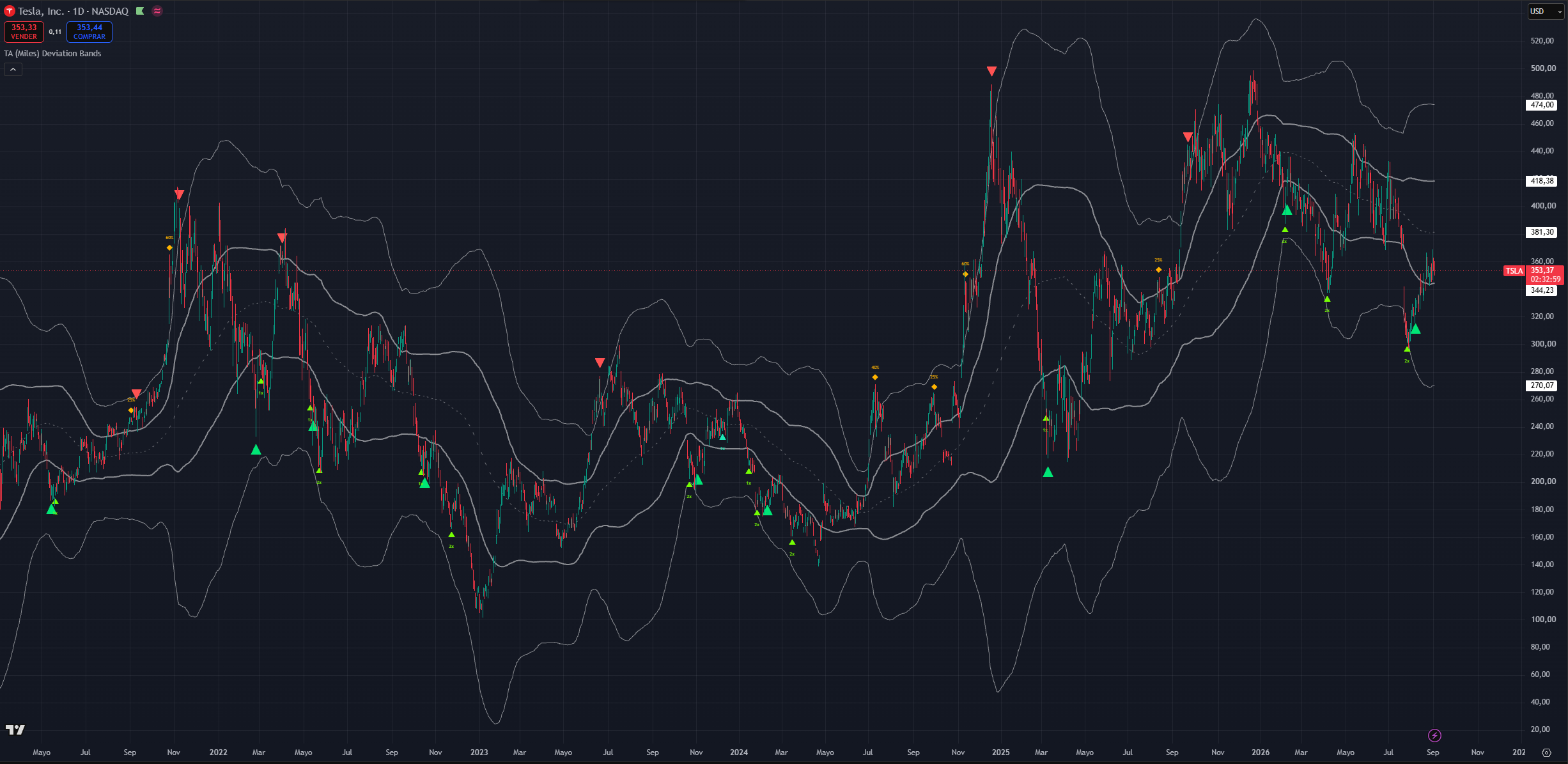
(TSLA 1D chart, default settings with buy/sell marker text off add and trim size on and the bands unfilled)
The dashboard and the legend
Signal legend
A static key: each marker's shape, colour, label and one-line meaning, plus a row explaining that dim markers are live-bar previews and a row noting that the guides reinforce a thesis rather than being absolute. Independent of the dashboard. On by default.
Score dashboard
An optional context table on the last bar, and a learning aid rather than a signal source. It reports:
- A headline conviction score and the current regime squeeze, trending up, trending down, or ranging.
- Reversal conviction for each side, and the net trend bias.
- The contributing groups broken out band position and touch, divergence count, oscillator condition, candle and participation, moving-average and trend structure, band-walk and trend strength.
- The current signal, if any.
- Accumulation and distribution state: current stretch, which tier you are in, and how many adds or trims have been spent out of the allowance for this cycle. This is the most practically useful row it tells you whether you have scaling capacity left.
- The active buy and sell modes.
- MTF status: whether the filter is on, the ladder in use, the higher-timeframe regime reads, the lower-timeframe turn reads, and whether each side is ready, waiting, or vetoed.
Read the MTF rows as status, not as signals. If you have the filter on and markers stopped appearing, these rows tell you which gate is responsible.
Turn the dashboard on while you are learning the indicator, then off.
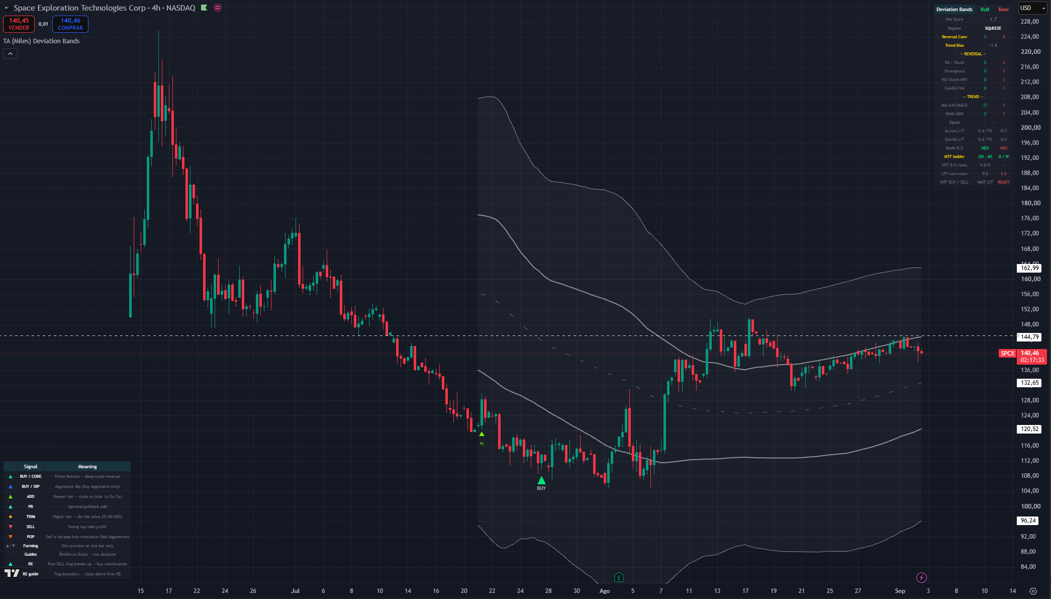
(SPCX 4h chart, default settings with MTF-precision filter and show score dashboard on)
Using it with the rest of the suite
Deviation Bands answers where and when. It does not answer whether this asset deserves your capital. That comes from context you bring:
- Start wide, then narrow. Index, then sector, then the individual name. A strong chart in a weak sector in a weak index is a harder trade than its own chart suggests. Relative strength usually decides which technically-similar setups actually work.
- Higher timeframe regime first. A daily buy signal while the weekly is stretched into its upper band is a higher-risk trade it can bounce, but the weekly has not resolved. The best risk-reward is a weekly working from its lower band toward its upper, with you playing daily and 4H stretches inside it.
- Pair with the momentum suite. Confluence between an oscillator extreme and a band condition is stronger than either alone: an oscillator above its overbought line while price is in the upper cloud and a sell marker prints is a materially better read than any one of the three. Multi-timeframe oscillator tools and the mean-reversion tools in this suite are the natural companions.
- Map horizontal levels yourself. Volume clusters, prior highs and lows, gaps, and on newer listings the offering price and the first public trade. The bands will not know that a fund mandate forces selling below an offering price. Where a band condition and a real level coincide, the read is much stronger.
- Respect the pattern targets you can see. A measured move from a completed chart pattern pointing at the same area as a band extreme is confluence worth weighting.
Assets where the bands behave less well
Options-heavy names respect technical levels less reliably. Price turns slightly before you would expect, or fails to reach a band it "should" have, because positioning rather than price structure is driving the tape. On those names, treat the rotation as a guide rather than gospel and lean more on your horizontal levels.
Crypto and cleaner-volume equities tend to respect the geometry far better. The approach does not transfer well to forex.
Useful Alerts
Every condition below is a separate entry in TradingView's Create Alert → Condition dropdown. Alerts are evaluated regardless of whether the matching marker is displayed, so you can subscribe to a signal while keeping the chart clean.
Entries and scale-ins
- Deviation Bands MF: Core Buy the Prime Bottom deep-cycle reversal
- Deviation Bands MF: Pivot Buy the Aggressive dip buy (Aggressive buy mode only)
- Deviation Bands MF: Accumulate Add a tier-deepening scale-in
- Deviation Bands MF: Re-entry Buy a post-exit continuation pattern broke upward (re-entry enabled only)
De-risking and exits
- Deviation Bands MF: Sell the full swing-top take-profit
- Deviation Bands MF: Trim a tier-scaled partial profit-take
- Deviation Bands MF: Pop sell a rip into resistance (Aggressive sell mode only)
Location and context
- Deviation Bands MF: Squeeze Start entered a squeeze regime; volatility is compressing
- Deviation Bands MF: Squeeze Release the squeeze released; expansion is underway
- Deviation Bands MF: Bullish Upper Cross close crossed above the outer upper band
- Deviation Bands MF: Bullish Lower Cross close crossed below the outer lower band
- Deviation Bands MF: Bearish Upper Cross close crossed above the inner upper band
- Deviation Bands MF: Bearish Lower Cross close crossed below the inner lower band
The four cross alerts are location only they carry none of the signal logic. They are useful for knowing that price has entered or left a shoulder; they are not entries.
Note that the Accumulate Add alert covers both the tier ADD and the trend Pullback, since both are the same underlying accumulation event.
A small set of values is also published to the data window for the companion strategy script. They are wiring, not something to read by hand.
Simple Workflow
- Map your horizontal levels first or use TA (Miles) Adaptive Levels, on a long history. Major support and resistance, volume clusters, gaps, prior highs and lows. The bands are dynamic; these are not.
- Check the higher timeframe. Where is price in the weekly rotation? A weekly working up from its lower band is a tailwind; a weekly stretched into its upper band is a headwind on every lower-timeframe buy.
- Locate price in the rotation on your trading timeframe. Lower cloud, centre span, or upper cloud and which swing of that band visit you are on.
- Ask what the rotation failed to do. Did the last push reach the next band, or stall? That is your strength-versus-weakness read, and it usually matters more than the marker.
- Wait for a marker. Touching a band is not a signal. Reaching the lower cloud without an ADD or BUY means the engine did not see a turn that is information.
- Size by marker type. ADD and PB are graduated scale-ins with a suggested multiplier. BUY is the cycle reversal call. TRIM is a partial slice. SELL is the full take-profit. RE is a disciplined buy-back, not a fresh entry.
- Check your scaling capacity on the dashboard if you are working a long decline how many adds are left in this cycle.
- Confirm against structure and your risk plan before acting. Every trade needs a thesis, an invalidation, and a stop. Once a trade moves in your favour, get it risk-free.
Common Mistakes
- Buying because price touched the lower cloud, with no marker.
- Selling because price touched the upper cloud, with no marker. In an uptrend the upper shoulder is visited constantly.
- Treating an ADD as a full entry. It is one graduated slice of a plan that assumes you do not know where the bottom is.
- Waiting for a blue dip BUY without setting Buy Sensitivity to Aggressive, or for an orange POP without setting Sell Sensitivity to Aggressive. Those markers do not exist in the other modes.
- Expecting Aggressive sell mode to produce more red SELLs. It adds POP markers; the take-profit engine is unchanged.
- Acting on a forming preview before the candle closes. It exists so you can prepare, and it is allowed to vanish.
- Enabling MTF or continuation re-entry and expecting more signals. Both make signals fewer, later, or rarer that is what they are for.
- Enabling every visual at once all three clouds, marker words, size hints, dashboard and legend together bury the price action.
- Flattening the band deviations into a symmetric pair and then wondering why buys stopped printing.
- Treating the bands as gospel on options-heavy names, or expecting the approach to transfer to forex.
- Forgetting the bands recalculate every close. They are the weakest of the three kinds of reference on your chart, and they are only trustworthy for the candle in front of you.
- Assuming the indicator predicts exact tops and bottoms. It measures location and follow-through, and it deliberately gives up the exact low in exchange for not catching knives.
Summary
The clouds show where price sits relative to its own normal behaviour. The rotation between them and, more usefully, the rotation's failures tells you whether the trend is strong or weakening. ADD and PB are graduated scale-ins on the buy side; BUY is the deep-cycle reversal call; TRIM scales out as price extends; SELL is the swing-top take-profit. The dip BUY and POP are opportunistic extras that only exist in Aggressive mode, and RE is an optional disciplined buy-back after an exit. The two sensitivity dials control how selective the engine is, historical memory adapts the buy side to this symbol's own declines, and the optional multi-timeframe filter trades signal count for precision. Use it to locate, stage, and time not to call tops and bottoms.
TA Adaptive Mean Reversion
Purpose
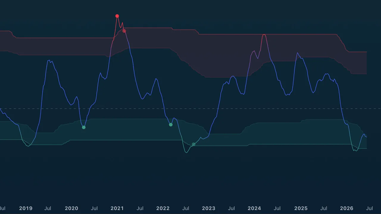
TA (Miles) Adaptive Mean Reversion helps you see when price has stretched far from its normal behavior and may be preparing to rotate back toward balance.
Use it for reversal awareness, exhaustion warnings, and timing help after extended moves. It is not designed to chase trends.
Best used for:
- Finding possible exhaustion after sharp moves.
- Watching for buy opportunities after downside stretch.
- Watching for sell or trim opportunities after upside stretch.
- Spotting lower-timeframe pullbacks inside a higher-timeframe stretch (optional MTF markers).
- Avoiding late entries when price is already extended
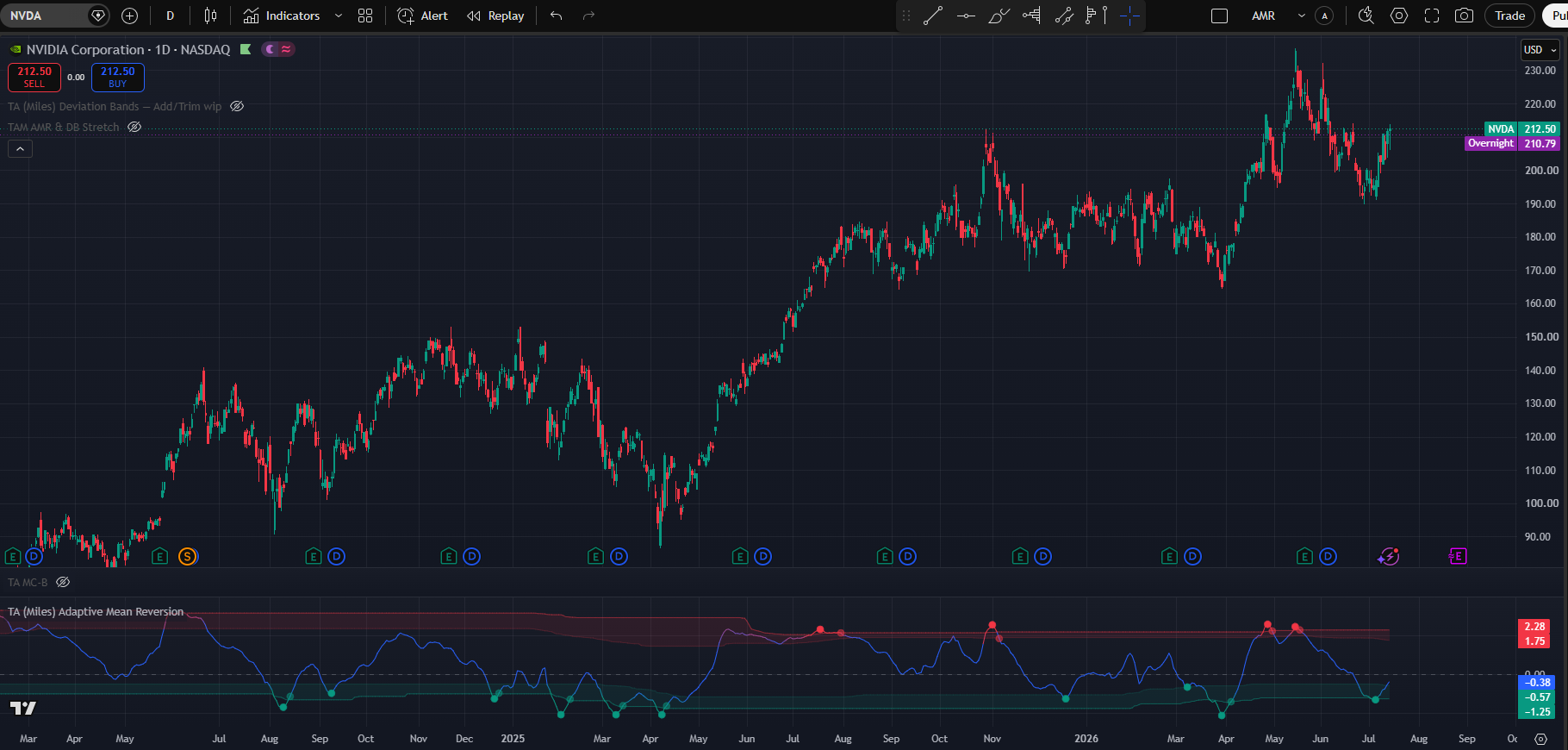
(NVDA 1D chart Default settings)
How to read AMR
Adaptive Mean Reversion displays as an oscillator panel. AMR has three main visual components
What You See
- An AMR line in the lower pane.
- A center line that represents balance.
- Upper and lower stretch zones (adaptive by default: they adjust to each asset).
- Circle markers: main Trigger signals on the chart timeframe.
- Cross (+) markers: optional lower-timeframe reversal cues (when MTF is enabled).
- Optional setup markers (X), confirmations, zone fills, state background tint, and readout table.
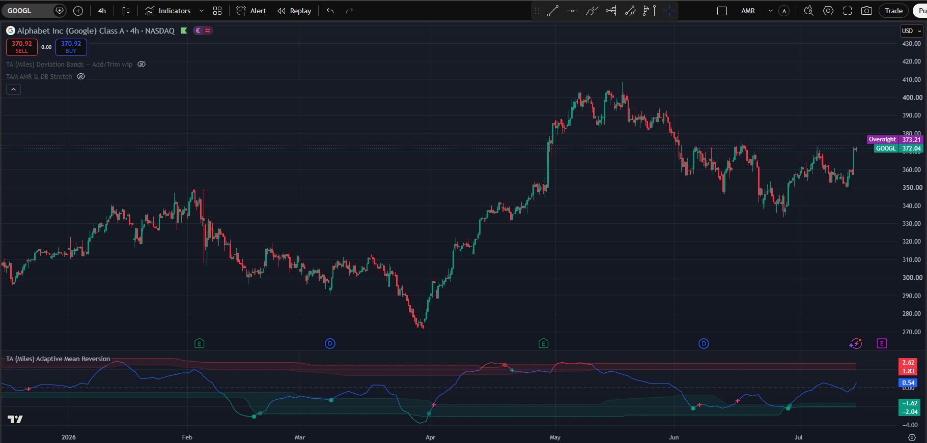
(Default setting with Multi-Timeframe 1h triggers)
The bands
Red Upper Band: Price is or is approaching overbought, stretched conditions. The price has made an out-of-the-ordinary move to the upside. Start looking for exit opportunities and avoid chasing price action.
Middle Band: Price is behaving regularly with no stretched moves either direction and no actionable signals either way.
Green Lower Band: Price is or is approaching oversold, stretched conditions. The price has made an out-of-the-ordinary move to the downside. Start looking for long entries or taking profits from short positions.
Triggers (Circles)
Circles are the main actionable events on your chart timeframe.
The indicator is flagging that a stretched move may be turning. Confirm with price structure and risk management.
Lower-TF Markers (+)
When enabled, a “+” sign may appear on the AMR line that signals that a faster timeframe fired its own trigger. Lower timeframe oversold conditions may indicate a higher low, for example 1h oversold conditions may serve to indicate a higher low in daily time-frame. This will be displayed as a green “+” signal in the AMR line. On the inverse lower time-frame overbought conditions may mark a lower high during a downtrend. This will be indicated as red “+” in the AMR line.
Lower time-frame signals are meant as potential continuation warnings. If the lower TF engine detects a reversal to the downside it will fire the red “+” as a warning that despite being oversold we might still experience more downside.
Disclaimer: a shift in direction will almost certainly require the lower timeframes to throw a “+” sign because lower time-frames always move faster. Because of this the “+” markers are meant to be taken as a warning to double check the current situation rather than a directly actionable signal.
Pictured above we can see all three scenarios. The first red “+” sign indicates the 1h fired a sell signal but that situation was a genuine change of direction. The first green “+” sign indicates a 1h buy signal for continuation that played out as such. Notice the difference between a “V” shaped recovery and the consolidation respectively. Finally the second and third red “+” signs are both marking lower highs during a downtrend signaling continuation.
Confirmation Markers (semi-transparent circles)
Confirmations appear after price has moved away from it’s position to mean revert. This are late signals that act more as confirmations of the move rather than early entries. Notice that they may fire even without a AMR signal and can serve to indicate that the indicator is no longer primed to fire one as the price is already recovering or has recovered.
Setup Markers
If enables the setup markers indicate when the MR signals are starting to agree more and more behind the scenes. They mark the area of interest rather the specific moment in time.

State Machine
The Adaptive Mean Reversion state machine works as a progressive confirmation system that filters false signals by requiring multiple conditions to align before taking action. As conditions align and miss-align AMR can move back and forth in it’s different states.
Watch
Starting with the with the watch stage, the system detects early signs of a potential reversal like price stretching away from average with momentum beginning fade.
Setup
As more conditions trigger, it moves to the Setup stage. This stage usually requieres more factors to be in agreement like price, volume and strech factor. This is where we need to start paying attention. If signals fade away the system would move back to “Watch”
Trigger
This stage fires the actual buy and sell signals as a great mayority of the elements are firing at the same time. The Trigger stage is where the actual signal fires: all three key elements align (the price stretch, a directional turn, and confluence of multiple technical indicators), which is your cue to seriously consider an entry, exit, or position adjustment.
Confirm
Finally, the Confirm stage appears when the stretched price condition begins reversing back toward the mean, providing a more patient and usually delayed, confirmation that the setup was valid.
Essentially, the state machine moves you from passive observation → active planning → aggressive signal → patient confirmation, ensuring that each stage brings stronger evidence before committing capital, reducing whipsaw trades and false breakouts.
Setting inputs and how to use them
This section covers the different setting options and how they affect the behaviour of Adaptive Mean Reversion. Since this is the first section of the settings there will be mentions of other settings. There will only be superficial-level explanation of the other settings; each setting will have its own section where more details will be provided.
NOTE: time and settings are provided as default samples, different assets may benefit from different settings that may go counter to their standard intended usage.
NOTE 2: Since this is the first section of the settings, companion settings for other sections are mentioned only at a high level here. Refer to each dedicated section below for full detail.
Trading Style
The trading style setting affects the time preference AMR will express.
Very Conservative
Best fit for longer term position trading in daily or weekly timeframes. This fits best for cycle-based traders that are looking for good entries in assets they are willing to hold for 1 year and beyond. Due to its low time preference in winning assets it might be good to pair with low line smoothing and adaptive bands activated.
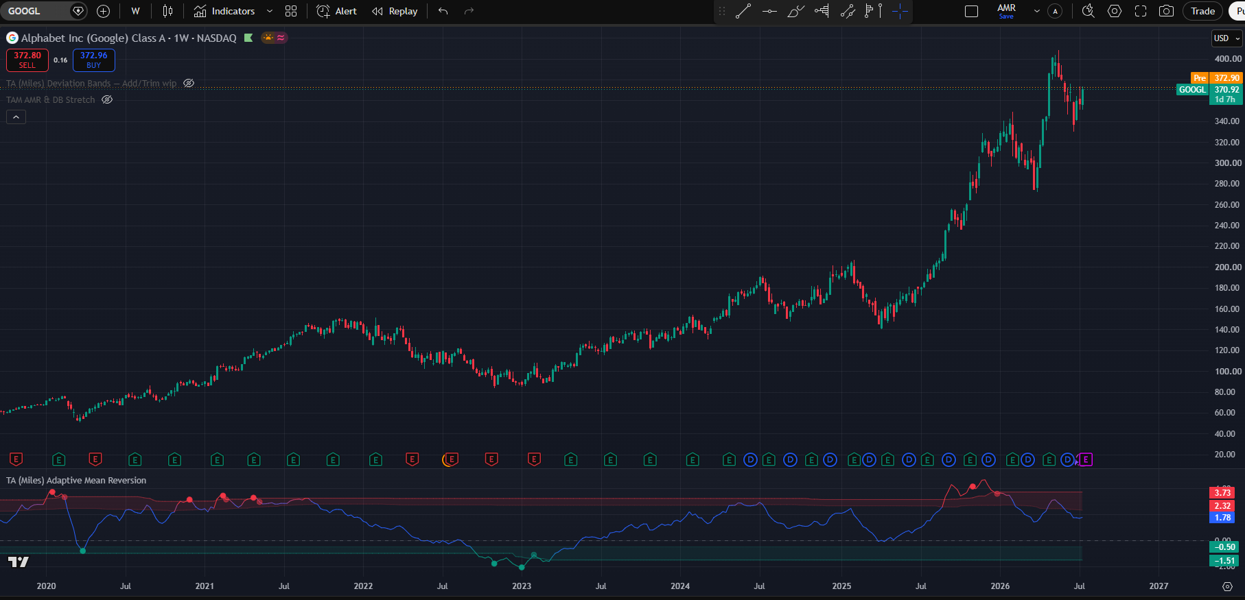
(Google weekly chart with default settings except trading style → very conservative and Line smoothing → low )
Conservative
As the name implies, this one has a slightly higher time-frame preference compared to the previous one. This will be more reactive both in entries and exits and is best used in the daily and weekly when you are looking to build a position for 3 months and up to a year.
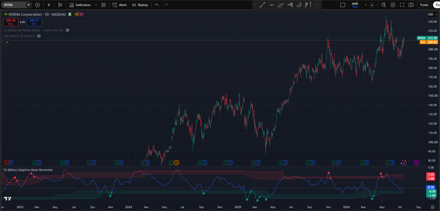
(NVDA 1D chart with default settings except trading style → Conservative)
Neutral
This is the standard setting and meant as an all-rounder. As the name indicates it has a neutral time bias without overreacting to short term switches nor having the same patience of the conservative modes. It is meant to be used in the daily timeframe and the 4h timeframe to look for entries that materialize in weeks or a few months.
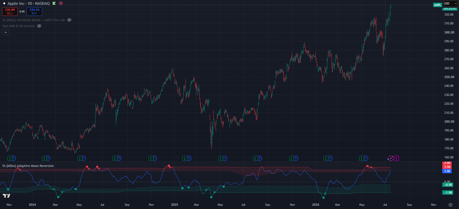
(AAPL 1D chart with default settings)
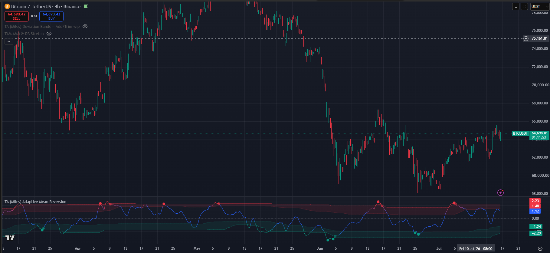
(BTC 1D chart with default settings)
Aggressive
This style has very high time preference and thus works best below the 4h time-frame for trades where you go in and out within 72h. Once we reach these timeframes and styles, this is also where we need to start to look at changing some of the other settings alongside this trading style to allow for a better read of the noisier market conditions of the lower timeframes. To address the extra noise in the lower time-frames I would recommend lowering the line smoothing from high as well as filtering the entry triggers more tightly than “All Qualifying” settings.
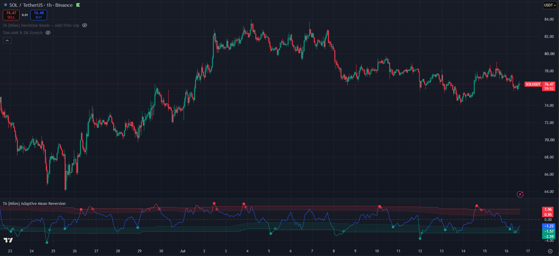
(SOL/USDT Binance 1h chart with trading style → Aggressive, Line Smoothing → low & trigger display → strong only )
Very Aggressive
This trading style has very high time preference and this it works best in the lowest timeframes like the 15m and the 5m time-frames. Best fit for same day scalp trades. Similar the above we need to change some accomying settings to properly accomodate the additional noise that can be found in this minute timeframes. At this point changing the system to work on the outer bands rather than asymetrically is strongly reccomended. additionally low line smoothing and strong signals become more useful. To avoid visual clutter turning off “show zone-exit confirmations” might be a good idea.
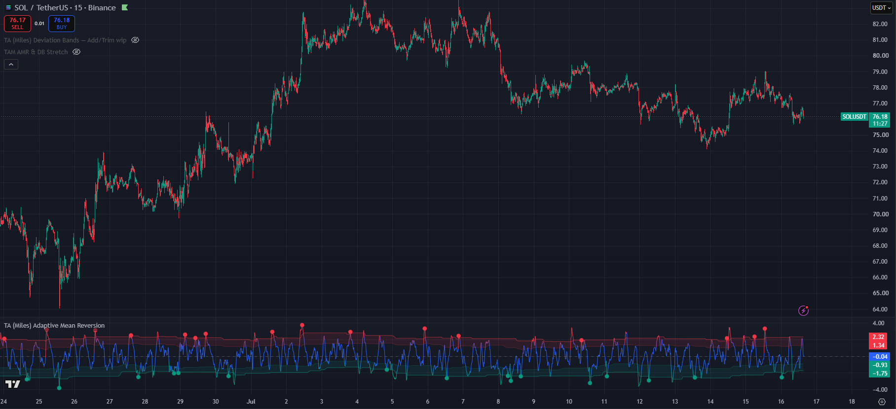
(SOL/USDT Binance 15m chart with trading style → Very Aggressive, Line Smoothing → low & trigger display → strong only, Stretch threshold Outer band, Show zone-exit confirmations OFF)
Line Smoothing
This is a responsiveness setting, the lower the line smoothing the more responsive it becomes. Responsiveness by itself is not an absolute positive, responsiveness comes with noise. While the trading styles are more tied to timeframes the line smoothign settings requieres of multiple factors. Line smoothing will also have an effect on how early a signal fires. In this case this is not about being late to the move but about longer moves in time.
A smoothing function being applied to the AMR line has an effect on the pivot vs rollover detection. Since the line is smooth it will tend to have less sharp turns and more roll, thus firing more signals throw the rollover engine.
While it is true that lower timeframes, especially those below the 4h one, do benefit from more reactiveness and thus lower smoothing, this does not go the other way with the same strength.
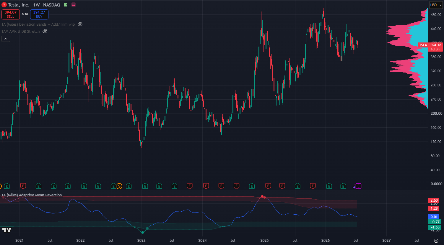
(TSLA Weekly chart default setting except line smoothing → Very High)
Time-frame
As a general guide higher line smoothing is usually paired with the higher time-frames as the lower in timeframe you go the lower your smoothing setting should be. However this is not a linear relation as “High” line smoothing can still be useful in the 4h timeframe at the same time that “Low” smoothing can be paired up with the 4h timeframe.
Volatility
The more volatile and asset is the more it will benefit from higher line smoothing. This will help avoid noise and clustered signals in a potential false bottom. This will also factor in the trading style of each user as “Low” line smoothing may play well with more volatile assets for quick entries and exits like user looking for longer term entries may want higher smoothing for more confident entries.
HTF Trend
When looking at higher time frame assets it is crucial to assertain the overall trend and direction. Assets that have a very clear trend many benefit from lower smoothing. While assets that chop and range a lot will benefit from higher smoothing. In trending assets the high smoothing settings may prevent the AMR line from ever properly reseting either direction thus missing many signals. In ranging or choppy assets the higher smoothing might reduce some the noise.
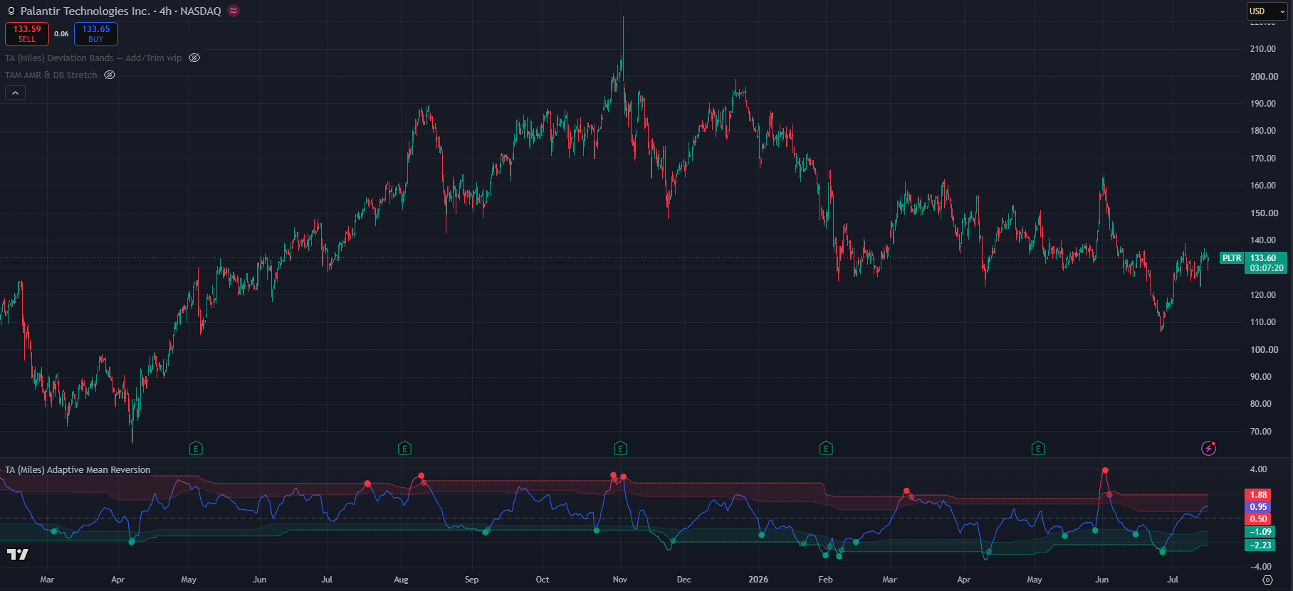
(PLTR 4h chart default setting except line smoothing → Mid)
Adaptive zones
This is a True / False setting. It affects how the bands the price needs to reach to be considered stretched are calculated.
When the setting is off the zones will reflect static 1 & 2 STD stretches in reference to the price. The values for the inner and outer band can also be set by the user.
However when the adaptive zones are turned on the zones automatically tune and learn from the price movement. This automatic adjustment of the bands helps the system remain working and effective even during strong one-side trends and movements by automatically adjusting and changing what overbought and oversold mean according to the asset and the timeframe. Additionally it also helps adjust for price volatility as they will move closer together or move further to the extremes depending on how the asset is behaving.
Stretch Threshold
This settings is also tied to to the bands, however this one is in reference to when the stretch signals starts to count. Since markets tend to be asymetric and move upwards move than they move downwards it is easier correction that do not reach as low in the AMR bands as the movements up reach high. For that reason on the oversold band the stretch starts to count in the first band while for the overbought band it starts to count in the second band. This however can be overwrote to have inner or outer symetry. Inner bands will generate more signals which can work for faster entries and exits however it may generate more noise as well. While the outer band may generate less signals but of higher mean reversion chance.
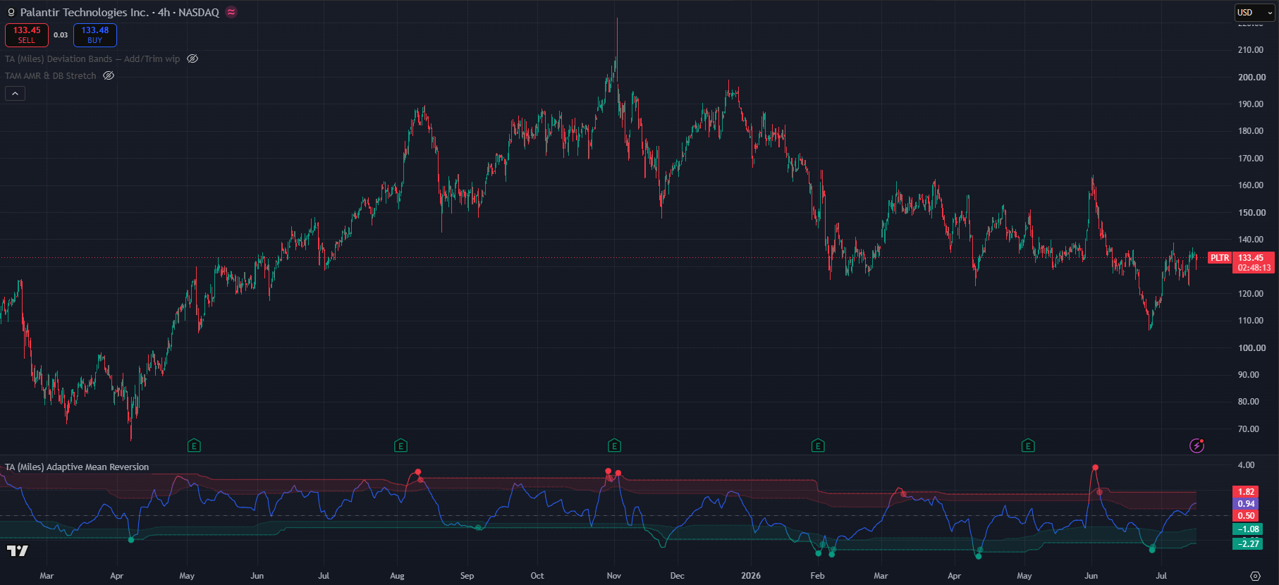
(PLTR 4h chart default setting except line smoothing → Mid, Stretch threshold outer)
Regime filter
Enable regime filter
Master switch for the section
Requiere ATR contraction
It requieres a contraction in the Average True Range as a way to measure that volatility is contracting. It blocks triggers where this condition is not met
Block counter-trend triggers
Vetos seeling on uptrends and buying on downtrends. It prevents you from catching falling knifes or stepping in front of trains.
Trigger display
Trigger display acts as a quality gate for the buy and sell signals. Since the state machine already does a lot of filtering the default settings is “All Qualifying”. However this setting may prove to noisy on extremly volatily assets that have huge price swings in both directions. Thus the other options can helo filter signals and prevent noise. This setting has a direct effect on the underlying state machine.
All qualifying
Shows every trigger that passed the full pipeline
Strong only
Displays only signals that carry a 2+ quality or confluence flags
Pivot Only
Display one where there is a clear pivot and avoid rollovers. This helps avoid potential flags or find V shape recoveries
High Quality
Requieres 2 or more quality flags
With Divergence
Triggers only where there is a divergence between the price and the AMR line
Candle confirmed
only triggers on regection candles
Extreme Stretch
Blocks any trigger that is not outisde the outer bands
Multi-timeframe (Lower TF)
This systems works a duplciate multi-timeframe engine whose main goal is to help identify potential continuation entries or avoid bad entries. While it’s main role is to look at the lower time-frames it has benn left open for manual setting to whichever one the user prefers. The Auto mode will automatically enable the engine two common TFs bellow. An important note is that these are not the trading view tiemframes but the oens commonly used to identified higher lows or lower highs in trends. In case if doubt extend the “Manual Lower TF” to identified which time-frames are taken into account.
This setting warns users about potential continuation either direction. it is possible that an AMR dot is fired and the price never fully corrects to the downside or consilidates at the new level before a continuation. In order to not be left behind this engine will scan the lower TFs and fire green “+” in case your current chart is overbought but the lower TF having fired an oversold AMR signal. This might indicate a continuation to upside. The same logic applies the other way around.
It can also be used to avoid bad entries in the cases where an AMR dot has fired on but on the same candle or close by the lower time-frames fires a “+”. This may act as a warning ofr users to check if they are falling for a lower high or a higher low trap.
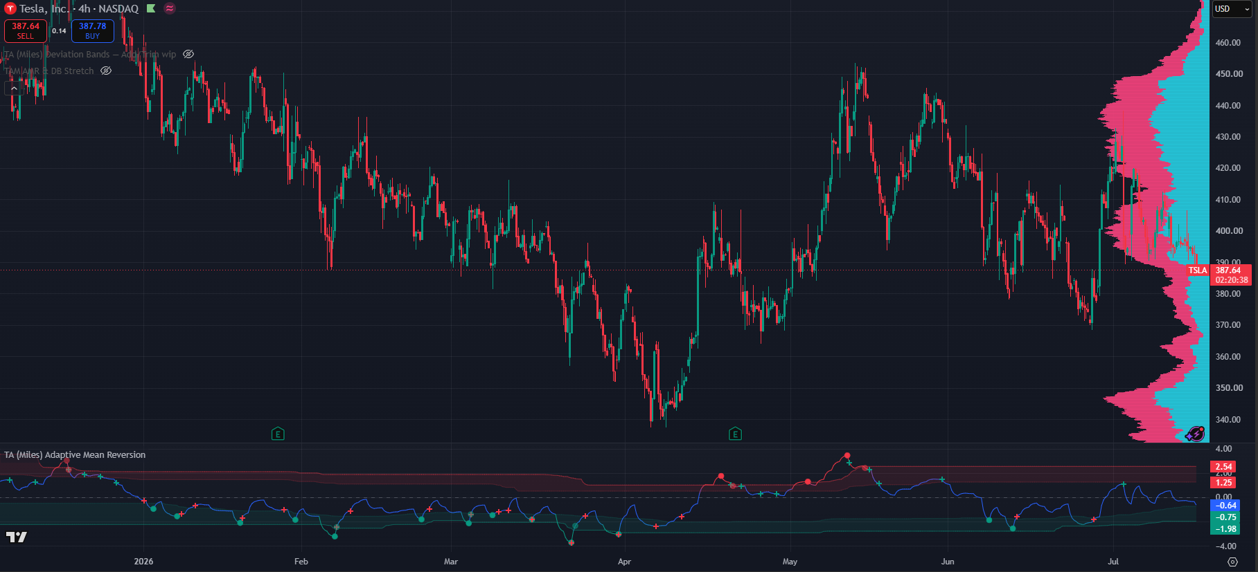
(TSLA 4h chart, default settings except line smoothing → low)
The Lower Timeframe engine inherits the same line smoothing as the regular chart however it does have it’s own setting for signal filtering and noise supresion.
It has additionally a context aware system that maintains the context of your current chart to look for specific signals. This helps keep the noise to a minimum as lower timeframes would fire significantly more signals and present only the relevant ones. It can also be turned off.
Useful Alerts
Every condition below is a separate entry in TradingView's Create Alert → Condition dropdown, listed under TA (Miles) Adaptive Mean Reversion. Alerts are evaluated by the engine itself, so a condition fires whether or not its marker is currently displayed on the chart. That means you can subscribe to a signal while keeping the chart clean, and it also means the Trigger display filter and the marker on/off switches do not silence the alerts.
Each alert message already carries the ticker and the timeframe, so one alert can be reused across a watchlist and you will still know what fired and where.
Every marker in this section is drawn on the AMR line itself, in the indicator pane, not on the price candles. Green is the oversold/bullish colour and red is the overbought/bearish colour by default, and both are user-configurable in the settings, so if you have changed them read "green" and "red" below as "your bullish colour" and "your bearish colour".
Actionable triggers (the solid dots)
- Buy trigger an oversold trigger fired: stretch, a directional turn, and confluence all agreeing. This is the standard actionable long-side event.
- What you see: a small solid green dot on the AMR line, down in or just outside the lower green band. The readout table state flips to ▲ TRIGGER buy.
- Sell trigger the overbought mirror: stretch, turn and confluence agreeing on the short/exit side.
- What you see: a small solid red dot on the AMR line, up in the upper red band. The table state reads ▼ TRIGGER sell.
- Strong buy trigger the same event with two or more extra confirmations at the AMR trough. Fewer of these print. This will correspond 1 to 1 with the green dot if you have the trigger display set to "Strong only". If instead you have "All qualifying", you may get a dot without this alert triggering.
- What you see: the same solid green dot. A strong trigger is not drawn differently from a normal one. If you want to see only the strong ones on the chart, set Trigger display filter → Strong only, and every dot that remains is a strong trigger.
- Strong sell trigger the overbought equivalent, two or more confirmations at the AMR peak.
- What you see: the same solid red dot, with the same Strong only note above.
Progressive state machine (early heads-up)
- OS watch — exhaustion price is stretched to the downside and momentum is starting to fade. The Watch stage: start paying attention, nothing to do yet.
- What you see: no marker at all. Watch is only visible in the readout table, which reads ▲ Watch OS. If you set State background → Watch (strict) you also get a very faint green background tint behind the candles for as long as the condition holds.
- OB watch — exhaustion the overbought mirror of the above.
- What you see: again no marker; the table reads ▼ Watch OB, and in Watch (strict) background mode the faint tint is orange rather than red.
- OS setup — turn likely the Setup stage on the oversold side: price and volume are now agreeing at the extreme, so a turn has become likely. This is the "get your levels and size ready" alert.
- What you see: a small green "x" cross on the AMR line (not a dot, and not the "+" of the lower-timeframe engine), provided Show SETUP markers is on. The table reads ▲ Setup OS, and with State background → Setup only the background tints faint green.
- OB setup — turn likely the overbought equivalent.
- What you see: a small red "x" cross on the AMR line, table state ▼ Setup OB, faint red background tint in Setup only mode.
Watch and Setup are deliberately earlier and looser than the triggers. They exist so you can prepare before the dot prints, and because the state machine can walk backwards, an "x" cross that is never followed by a dot is normal: the conditions stopped agreeing and the state fell back to Watch or Neutral.
Confirmations (late but higher-certainty)
- Buy reversal confirmed AMR crossed back above the outer oversold band; the stretch is actively unwinding upward.
- What you see: a faded, semi-transparent green dot on the AMR line at the point where it exits the outer green band. Same shape as a trigger dot, visibly washed out, and it prints later and higher than the trigger would have.
- Sell reversal confirmed AMR crossed back below the outer overbought band.
- What you see: a faded, semi-transparent red dot where the line leaves the outer red band on its way down.
These are the semi-transparent dots. They appear later than the triggers by design and can fire even when no solid dot printed, which itself is information: the move is already reverting and the engine is no longer primed. They require Show zone-exit confirmations to be on to appear, but the alert fires either way.
Location and context (no signal logic)
- Entered OS approach zone the AMR line crossed down into the oversold band. Price has arrived in the green zone; no turn is implied.
- What you see: no marker. The visual is the line itself: the AMR line drops below the faint inner green band line and, with the gradient line enabled, starts shading from neutral toward green as it goes deeper.
- Entered OB approach zone the AMR line crossed up into the overbought band.
- What you see: no marker; the line rises above the faint inner red band line and begins shading toward red.
- Extreme oversold (σ) the AMR line pushed beyond the −2σ outer band. A genuinely out-of-the-ordinary move, and the zone the Extreme stretch (outer σ) trigger filter cares about.
- What you see: the AMR line crossing below the lower of the two green band lines (the stronger, more solid one) and turning fully saturated green. Once the line is solid green rather than a gradient, you are beyond the outer band.
- Extreme overbought (σ) the same beyond +2σ.
- What you see: the line above the outer red band line and fully saturated red.
- Returned to neutral from oversold the AMR line left the oversold band and re-entered the neutral middle. Useful for knowing a mean-reversion cycle has completed.
- What you see: no marker; the line crosses back up through the inner green band into the middle of the pane and its colour returns to the neutral line colour, with no green left in it.
- Returned to neutral from overbought the same from the upper side.
- What you see: the line crossing back down through the inner red band, colour returning to neutral.
These six are location only. They tell you where the AMR line is, not that anything is turning. If the line reaches a band and no "x" cross, no dot and no state change follows, that is the engine telling you it did not see a turn.
Lower-timeframe continuation warnings
- LTF buy reversal the lower-timeframe engine fired a buy (higher-low cue).
- What you see: a small green "+" cross on the AMR line. The "+" shape is what distinguishes these from the Setup markers, which are "x" crosses, and from triggers, which are filled dots.
- LTF sell reversal the lower-timeframe engine fired a sell (lower-high cue).
- What you see: a small red "+" cross on the AMR line.
As with the markers themselves, treat these as a prompt to re-check the situation rather than a signal to act on. A change of direction will almost always produce one, so on their own they carry little edge; their value is in coinciding with, or contradicting, a dot on your own timeframe. A red "+" appearing on or right next to a green buy dot is the classic warning to check whether you are buying into a lower high.
Quick visual key
| What is on the AMR line | Which alert fired |
|---|---|
| Small solid dot, green or red | Buy / Sell trigger (and Strong, which looks identical) |
| Small faded, semi-transparent dot | Buy / Sell reversal confirmed |
| Small "x" cross | OS / OB setup |
| Small "+" cross | LTF buy / sell reversal |
| Nothing drawn, only the line colour and the table changing | Watch stage, approach zones, σ extremes, returns to neutral |
A practical alert set
For most users three alerts are enough: Buy trigger and Sell trigger to catch the actionable events, plus OS setup — turn likely (or its OB counterpart, depending on which side you trade) so you get the "x" cross warning one stage before the dot prints. Add the two confirmations only if you prefer to trade the unwind rather than the turn.
TA Stack Attack RSI
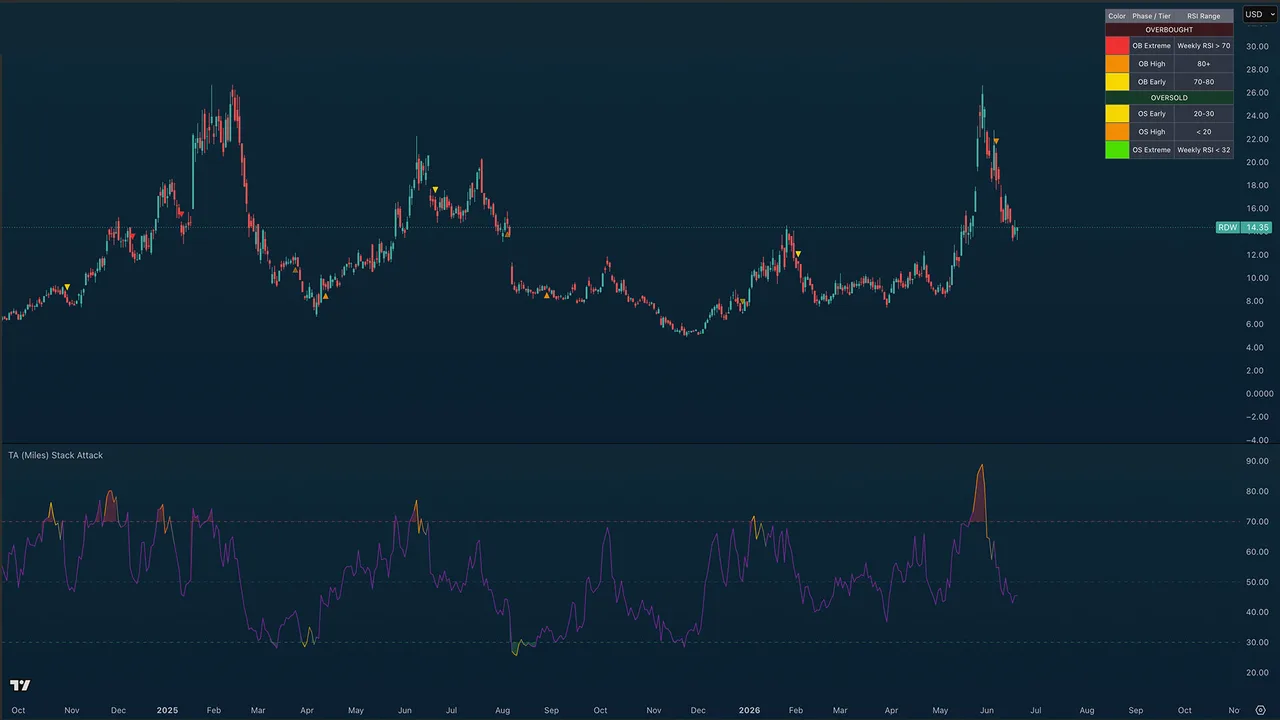
Purpose
TA (Miles) Stack Attack helps you see when several important timeframes are stretched at the same time and then walks that situation through warning and confirmation phases so you know how seriously to take it.
Use it for spotting high-confluence overbought or oversold conditions, separating early warnings from confirmation, and managing exits, trims, and re-entries over several timeframes. It measures stretch and follow-through; it does not predict tops and bottoms.
Best used for:
- Finding high-confluence exhaustion when multiple timeframe, such as the 4H, Daily and weekly RSIs are stretched together, not just the one in your chart.
- Separating "pay attention" (Phase 1) from "the move is weakening" (Phase 2) from "it has turned" (Phase 3).
- Catching the rare Weekly-confirmed extremes the highest-conviction tops and bottoms.
- Watching for long re-entry opportunities after prior sell-side pressure (Stack Memory engine).
- Spotting lower-timeframe pullbacks inside a higher-timeframe stretch (optional 15M / 1H / 4H stack markers).
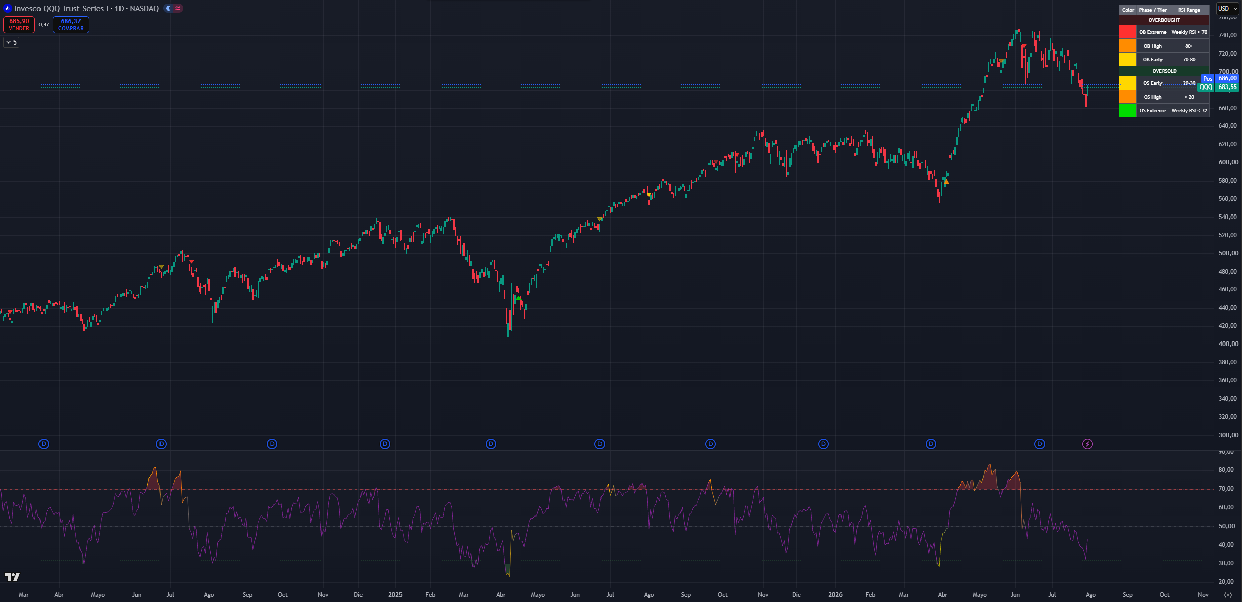
(QQQ 1D chart, default settings)
NOTE: Stack Attack is intended mainly for 4H, Daily, and Weekly charts. On lower timeframes the underlying higher-timeframe RSIs move slowly.
NOTE 2: Time and settings are provided as default samples. Different assets may benefit from different settings that may go counter to their standard intended usage.
How to read Stack Attack
Stack Attack displays as an oscillator panel with its signal markers drawn directly on the price chart. It has two main surfaces: the RSI pane below and the phase markers above.
What You See
- A standard chart-timeframe RSI line in the lower pane, with overbought (70), oversold (30), midline (50), and outer extreme (80/20) reference levels.
- The line is colored in reference to the stack OS/OB agreeing with each other.
- Zone fills when the RSI is inside the overbought or oversold zone.
- An optional composite multi-timeframe RSI line (off by default).
- Circle markers Phase 1 stack ignitions on the price chart (off by default).
- Translucent triangles Phase 2 warnings on the price chart.
- Solid triangles Phase 3 confirmations on the price chart.
- Vertical conviction lines the rare Weekly-extreme ignitions.
- green cross (+) markers dip re-entry longs from the Stack Memory engine.
- Optional white fixed-timeframe stack triangles (15M / 1H / 4H tiers), divergence lines, background tint, and a color reference table (legend).
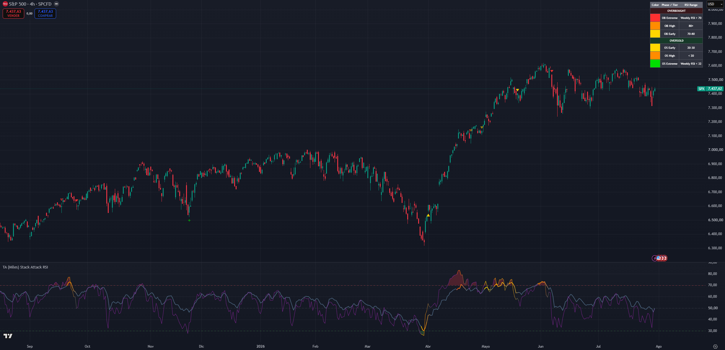
(SPX 4H chart, default settings and Composite RSI on)
The stack
At its core, Stack Attack watches the RSI of a fixed ladder and with different weights of timeframes 1H, 4H, Daily, with the Weekly on top no matter what chart you are on.
Red / overbought stack: the rungs are above 70 together. The asset is stretched everywhere at once, not just on your chart. Start looking for exit or trim opportunities and avoid chasing price action.
Middle / no stack: the timeframes disagree or sit mid-range. Price is behaving regularly and there is nothing actionable either way.
Green / oversold stack: the rungs are below 30 together. The downside move is stretched across the ladder. Start looking for long entries or for taking profit on short positions.
By default a stack needs 2 of the three lower rungs (1H / 4H / Daily) in agreement. The Weekly is not required when it also confirms, the signal upgrades to the Extreme tier.
Color severity
Every marker carries a severity color. Same idea on both sides the stronger the color, the deeper the confluence:
Overbought side: Yellow (Early RSI just crossed 70) → Orange (High RSI deep above 80) → Red (Extreme the Weekly RSI also confirms, max conviction).
Oversold side: Yellow (Early RSI just crossed 30) → Orange (High RSI deep below 20) → Bright Green (Extreme Weekly confluence).
Stronger colors mean the condition deserves more attention: red says long-side risk is at its highest, bright green says recovery or re-entry conditions are at their strongest.
Phase 2 and Phase 3 markers inherit the color of the Phase 1 ignition that armed the cycle a red Phase 3 traces back to a Weekly-extreme overbought ignition.
The same color severity applies to the RSI line. This can be used instead of the markers in the chart if the goal of keeping the chart cleaner while maintaining the stack awareness
Phase 1 Ignition (Circles)
Circles mark the moment the stack ignites: the required timeframes align overbought or oversold on the same bar. This is the earliest warning the market is stretched enough to pay attention, but this is not confirmation.
Phase 1 re-fires when an already-active stack escalates into the High tier (RSI pushing deeper into the 80/20 extremes), so an escalating circle sequence means the condition is intensifying, not repeating.
Phase 1 circles are off by default to keep the chart clean and to reduce the temptation to act too early.
Phase 2 Warning (Translucent Triangles)
After a Phase 1 ignition fires against the prevailing trend, the system arms a watch. The first opposing swing pivot after that ignition prints a translucent triangle: the stretched move may be starting to weaken.
Phase 2 inherits the color of the Phase 1 that armed it, so a red Phase 2 traces back to a Weekly-extreme ignition. It is stronger than Phase 1 but still earlier and less reliable than confirmation.
Consequence: this is the planning layer. Decide what you would do if the move confirms, but do not treat it as a standalone entry or exit.
Phase 3 Confirmation (Solid Triangles)
Phase 3 fires when the trend engine flips against the original stack direction. The reversal Phase 1 hinted at now has real follow-through.
Phase 3 arrives later than Phases 1 and 2, but it is the marker new users should trust first. It also closes the cycle the watch disarms until the next ignition.
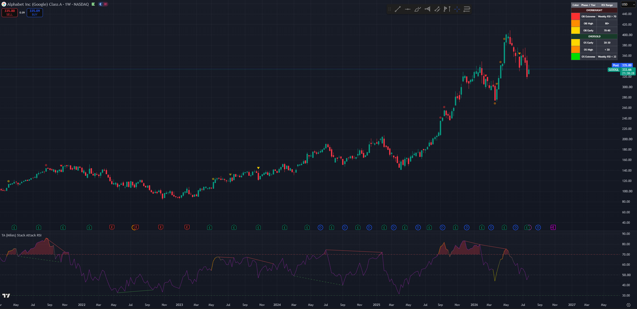
(Higher-timeframe chart showing a red vertical conviction line at a Weekly-extreme overbought ignition near a major top)
Weekly-Extreme Conviction Lines
When an ignition fires with Weekly confluence the Extreme tier a subtle vertical line is drawn on the price chart (red for overbought, green for oversold). These are deliberately rare: they mark the handful of moments per year when everything from the 1H to the Weekly is stretched in the same direction. Weekly re-fires are throttled so the line marks events, not noise.
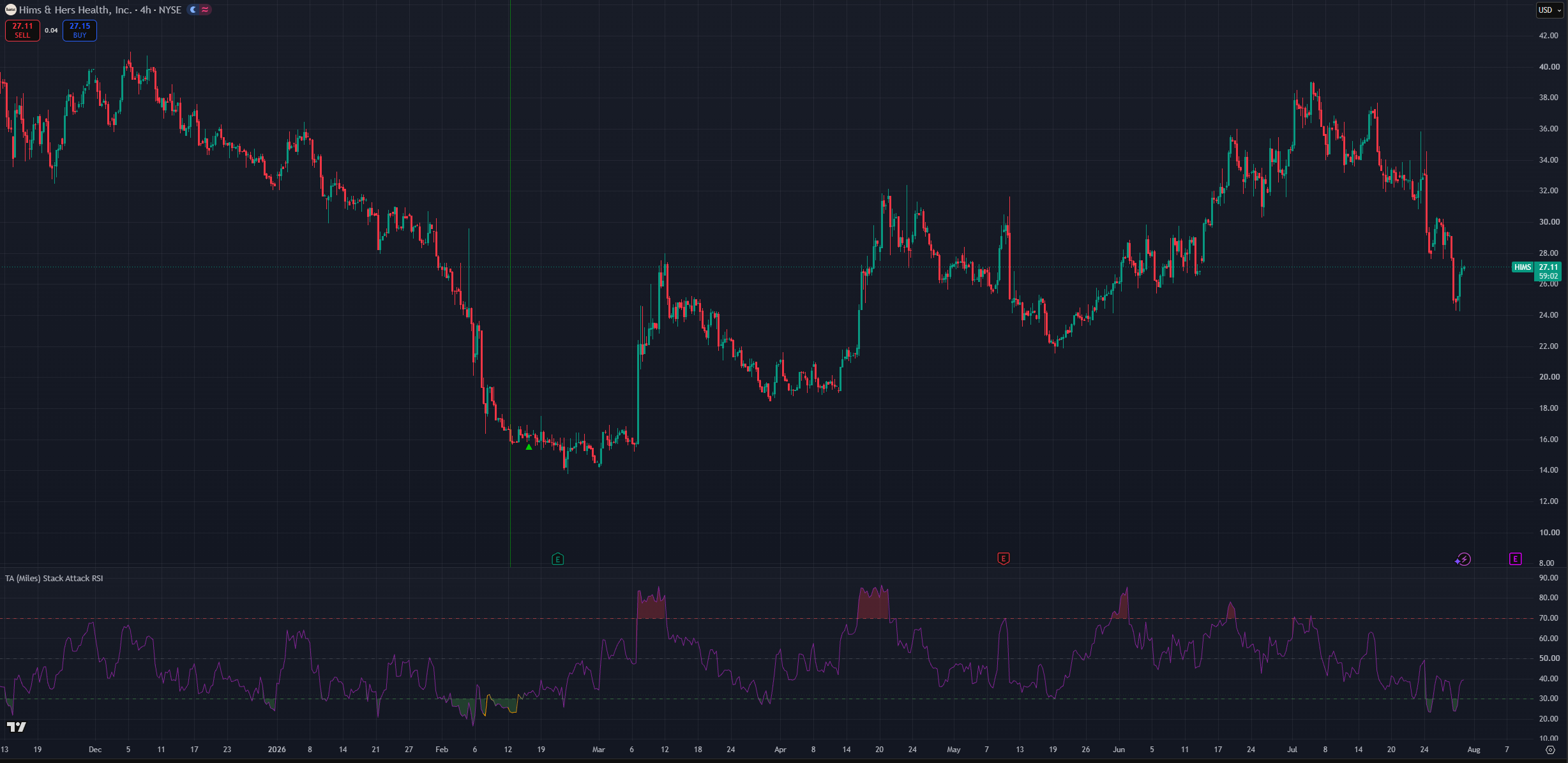
(HIMS 4H chart, default settings)
Stack Memory (dip re-entry)
This is the advanced engine, and it addresses one specific scenario: you sold or trimmed on sell-side pressure (an overbought Phase 1/2/3), price never fully corrected, and you want a disciplined way back in without chasing.
After any sell-side event the engine arms a re-entry cycle and starts auditing price behavior:
- Cooldown: for a fixed window after the sell it will not fire at all this is what prevents buying right back into the top.
- Qualification: during the cooldown it counts how many bars were ranging (bounded range, no waterfall legs, no active overbought stack). Only if the great majority (≥ 80%) were ranging does the cycle qualify a market still trending down never qualifies. If the audit fails but the market later settles into a clean consolidation streak, the cycle can recover and qualify late.
- Tilt: once live, the longer the consolidation holds, the more the internal re-entry RSI shifts its weight from the higher timeframes toward the lower ones (Max tilt period controls how long full tilt takes). Early in a consolidation it demands deep HTF-weighted oversold readings; months in, a shallower LTF dip is enough. This is the "patience" of the engine.
- Trigger: a green "+" fires when the re-entry RSI (or the chart RSI) curls back up through its oversold level. Dump legs, fresh bear phases, and active overbought stacks all block the trigger. Fires are capped per cycle.
Any regular buy-side event (an oversold Phase 1/2/3) disarms the cycle the normal phase system has taken over.
Disclaimer: the Stack Memory engine is deliberately conservative its job is to keep you out of falling knives, which means it will also be late or silent on V-shaped recoveries. Treat every "+" as a prompt to check the higher-timeframe trend, not as a standalone buy signal.
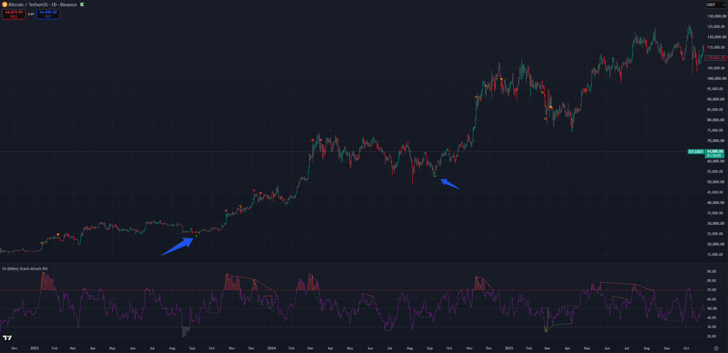
(BTC 1D chart, Default settings with with divergences on)
15M / 1H / 4H Stack Markers (white triangles)
Six optional fixed-timeframe markers (all off by default) for users who want granular context. They read fixed timeframes regardless of your chart, so they work on any chart and any TradingView plan.
When enabled, a white triangle may appear on the price chart that signals a shallower multi-timeframe RSI alignment. Lower-timeframe oversold conditions may indicate a higher low for example, 1H+4H oversold together may mark a daily higher low in an uptrend. This appears as a white up-triangle below the bar.
On the inverse, lower-timeframe overbought conditions may mark a lower high during a downtrend shown as a white down-triangle above the bar.
These markers are meant as potential continuation or trap warnings. If your chart shows an oversold stack but a nearby 1H OB marker fires, that may act as a warning that despite being oversold you might still experience more downside through a lower high.
Disclaimer: a shift in direction will almost certainly require lower timeframes to move first because lower timeframes always move faster. Because of this the white stack markers are meant to be taken as a warning to double-check the current situation rather than a directly actionable signal.
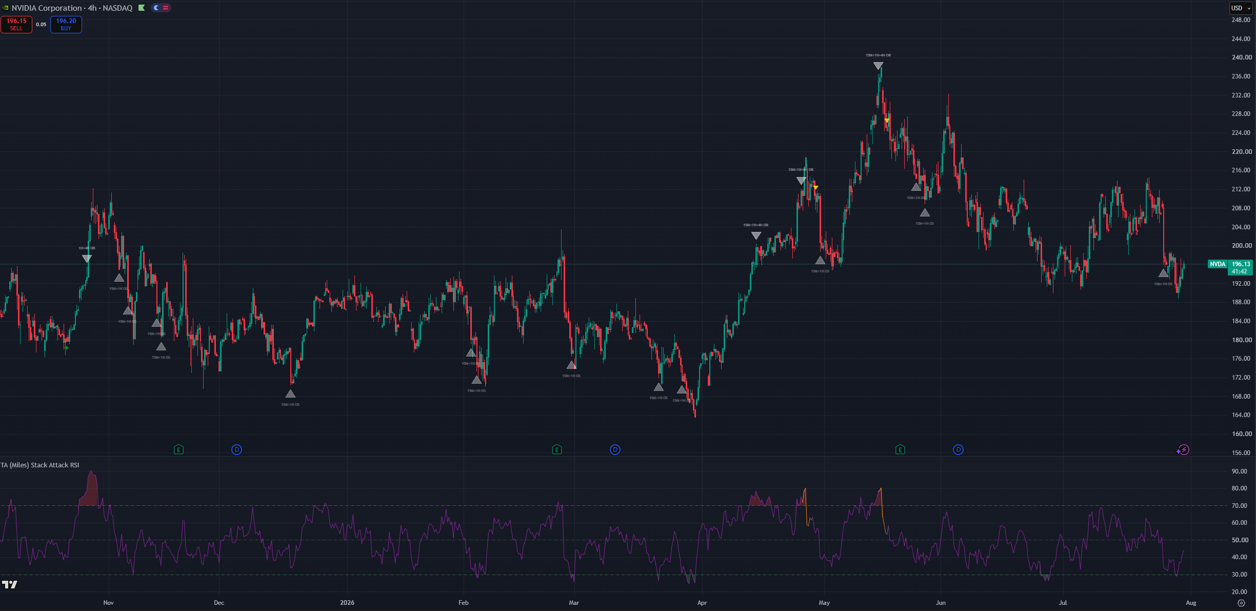
(NVDA 4H chart, default setting with lower timeframe markers)
Divergence Lines
Optional thin lines in the RSI pane connecting divergent RSI pivots.
The solid lines will conne two peaks or valleys indicating the confirmation fo a bullish or a bearish divergence.
Bullish Divergence: Price makes a lower low while the RSI makes a higher low, indicating weakening downward momentum and a potential upward price reversal. Bearish Divergence: Price makes a higher high while the RSI makes a lower high, indicating weakening upward momentum and a potential downward price reversal.
dashed for hidden ones (trend continuation), green bullish, red bearish. Off by default; the alerts fire even while the lines are hidden.
Only extreme-zone divergences are drawn: bearish needs the current RSI pivot at least 60, bullish at most 40. This keeps the lines meaningful rather than cluttering the pane with mid-range noise.
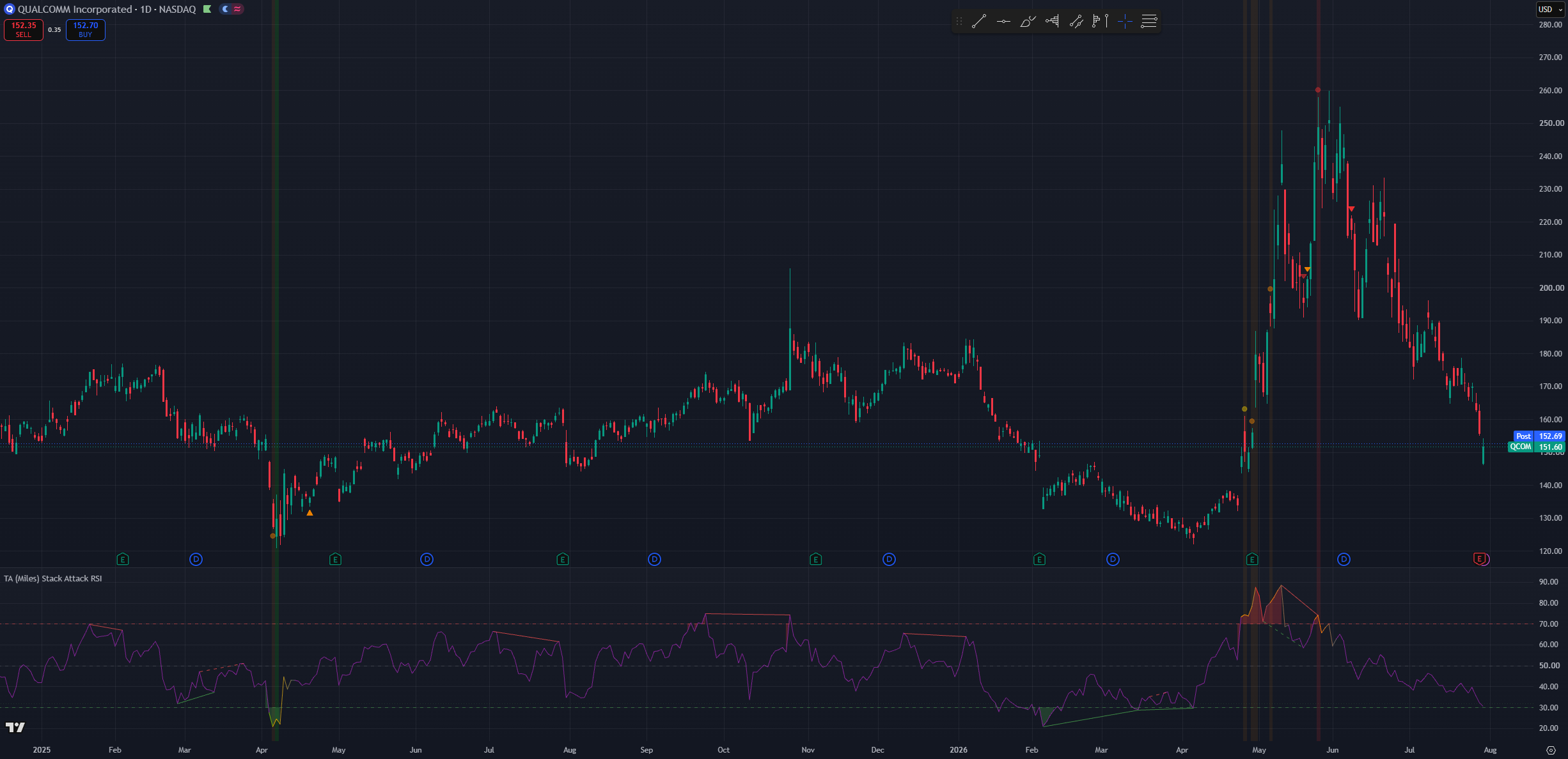
(QCOM 1D chart, Default settings with stack background tint and divergences on)
The Three-Phase Cycle
Stack Attack works as a progressive confirmation system that filters false signals by requiring more evidence at each step before you commit capital. As conditions align and mis-align, the system moves through its phases.
Stack forming
Individual timeframes cross into overbought or oversold territory. Nothing prints yet you can watch this build on the pane (RSI entering its zone fill) or with the optional background tint.
As a quence: passive observation. The ladder is building agreement but has not yet met the minimum threshold for ignition.
Phase 1 Ignition
The required number of timeframes align on the same bar. This is passive observation turning into active attention: the condition is real, but stretched markets can stay stretched.
Next steps: start paying attention, but do not act on this alone unless you are an experienced user who deliberately enables Phase 1 circles.
Phase 2 Warning
The first opposing swing pivot after the ignition. Structure is starting to bend against the stretched move.
Next steps: active planning decide what you would do if it confirms. Still not a standalone trigger.
Phase 3 Confirmation
The trend engine flips against the stack direction. The reversal is underway.
Next steps: the patient, delayed evidence that the setup was valid easier to trust, later to arrive. This is the marker the workflow is built around.
Stack broken
At any point, if the timeframes fall out of agreement, the stack breaks. The composite line (if shown) fades back to neutral over five bars and a Stack Broken alert fires the visual cue that the signal has expired without resolving.
Essentially the phases move you from passive observation → active planning → confirmation, ensuring each stage brings stronger evidence, reducing whipsaw trades and acting-too-early mistakes. Unlike a single-timeframe RSI, a Stack Attack signal already carries multi-timeframe agreement before Phase 1 even prints.
Setting inputs and how to use them
This section covers the different setting options and how they affect the behaviour of Stack Attack. Since this is the first section of the settings there will be mentions of other settings. There will only be superficial-level explanation of the other settings; each setting will have its own section where more details will be provided.
NOTE: time and settings are provided as default samples. Different assets may benefit from different settings that may go counter to their standard intended usage.
NOTE 2: Since this is the first section of the settings, companion settings for other sections are mentioned only at a high level here. Refer to each dedicated section below for full detail.
Chart Timeframe Profiles
Stack Attack does not have a single "Trading Style". Instead, the chart timeframe you work on and a handful of companion settings define how the indicator expresses itself. The profiles below map common workflows to recommended settings.
Position / cycle investor
Best fit for longer-term position trading on Weekly charts. This fits cycle-based traders looking for good entries in assets they are willing to hold for a year and beyond. Due to its high timeframe preference, pair with Min timeframes required for stack signal → 3 so every ignition requires full 1H+4H+Daily agreement. Keep Phase 1 circles off; enable the composite line with Composite weighting → Higher timeframes. Phase 2 and Phase 3 stay on confirmation matters more than speed at this horizon.
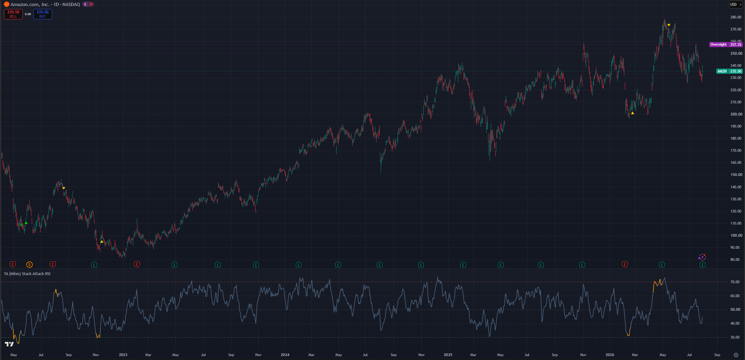
(AMZN 1D chart 3 confirmations, composite RSI)
Daily swing (default)
This is the standard setting and meant as an all-rounder. It has a neutral time bias without overreacting to short-term switches nor demanding the patience of the position profile. It is meant for Daily charts to look for entries that materialize in weeks or a few months. Leave defaults in place; Phase 2 and Phase 3 on and divergences on.
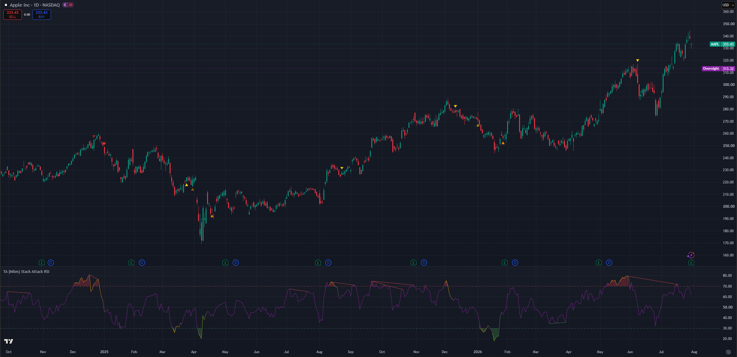
(AAPL 1D chart, default settings and divergences on)
Active swing (4H)
This profile has a slightly higher reactivity preference and works well on the 4H timeframe for trades where you go in and out within a few weeks. Keep Min timeframes → 2. Consider turning Background tint when stacked → On so alignment is visible at a glance, and optionally enable 15m & 1H OS / 15m & 1H OB stack markers for daily higher-low / lower-high context inside the larger move.
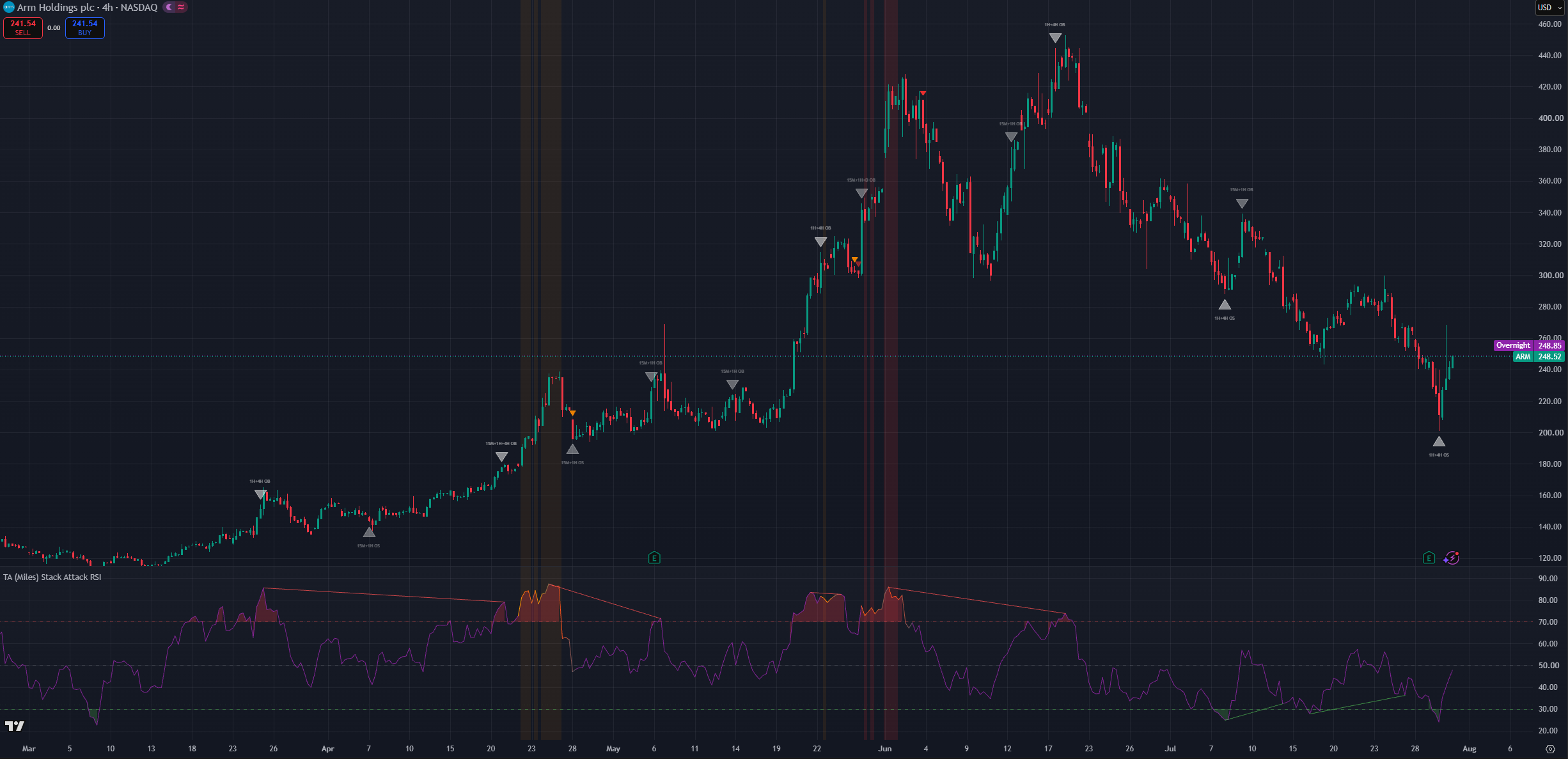
(ARM 4H chart dabove settings)
TV Premium intraday (sub-hour scanning)
This profile requires a TradingView Premium plan. Enable Enable sub-hour scanning (TradingView Premium) → On to swap the ladder to 15S / 30S / 1m / 5m on sub-hour charts. Phase 1 circles should stay off to reduce clutter. Consider Show dip re-entry markers → Off on fast charts the Stack Memory engine is tuned for daily/weekly consolidation patience. Severity color (Orange/Red vs Yellow) becomes your quality gate since there is no separate "Strong only" filter.
NOTE: You can still use Stack Attack in the lower time-frames without errors as long as you dissable “Sub-hour scanning”.
RSI Length
This is a responsiveness setting. The lower the RSI length, the more responsive every RSI in the system becomes chart RSI, ladder RSIs, composite, and Stack Memory re-entry RSI all share the same period.
Responsiveness by itself is not an absolute positive; responsiveness comes with noise. While chart timeframe profiles are more tied to how often signals appear, RSI length requires weighing multiple factors. RSI length also affects how early a stack can ignite this is not about being late to the move but about how quickly RSI resets after extended runs.
Best to leave as the default value.
Min timeframes required for stack signal
This setting is tied to the stack ladder and controls when a stack ignition can count how many of the 1H / 4H / Daily rungs must agree before Phase 1 can fire.
Since markets can reach overbought on one timeframe while another lags, the default of 2 allows meaningful confluence even when one rung has limited history or sits mid-range. Setting 3 demands full agreement fewer signals, stronger confluence, often later arrivals.
This is more of a lower timframe fine-tuning parameter as in higher-timframes by defualt will encompas multiple lower time-frame RSI considitons thus having little effect on higher time-frame candles but helping filter out some noise in lower time-frames.
Enable sub-hour scanning (TradingView Premium)
Master switch for running the full stack system below the 1H chart.
Below 1H the standard 1H / 4H / Daily / Weekly ladder pauses you will see a notice label instead of stack ignitions. TradingView Premium accounts can opt in to a seconds-based ladder (15S / 30S / 1m / 5m) that lets the stack run on 1-minute charts.
Leave this Off unless you have Premium. That is what prevents the seconds-request runtime error (RE10063) on lower plans. Turn it On only when you deliberately want intraday stack reads and understand the noise trade-off.
Composite weighting & Include Weekly in composite RSI
These two settings only shape the optional composite RSI line. Phase 1 / 2 / 3 stack signals are unaffected.
Composite weighting
Controls how the composite RSI weights the ladder rungs:
- Higher timeframes (default): the slow end weighs most (Weekly heaviest in standard mode; 5m heaviest in Premium sub-hour mode). Best for investor and swing reads.
- Blended: all four rungs equal.
- Lower timeframes: the fast end weighs most favors the trading timeframe. Better for more reactive and earlier signals. As has been mentioned previously reactiveness is not inherenctly positive, it allows for earlier entries and exits at the cost of more false positives.
- Current chart: leans about half the weight on your chart's own RSI with a light multi-timeframe taper, so the composite tracks the timeframe you are actually viewing.
Use the composite as a ladder-wide stretch gauge next to the standard RSI: when your chart RSI is pinned but the composite is mid-range, the stretch is local to your timeframe; when both are pinned, that is stack territory. Its color mirrors live stack severity. Context, never a trigger.
Include Weekly in composite RSI
When On (default), the slowest rung participates in the blend. When Off, that rung drops out and the remaining weights re-normalize useful on assets in long secular trends where a pinned Weekly RSI would skew the composite for months. In Premium sub-hour mode the dropped rung is the 5-minute rather than the Weekly.
Display
Stack Attack v8 uses separate display toggles rather than a single "Display Mode" dropdown. Combine them for the view you want.
Individual toggles
- Show phase arrows on price: master switch for Phase 1/2/3 markers and dip "+" signals on the price chart. Off keeps just the pane lines.
- Show standard RSI line: the familiar chart-timeframe RSI (on by default). It tints to the stack severity color while a stack is live a subtle status readout even with individual phase toggles off.
- Show composite RSI line: the weighted multi-timeframe blend (off by default).
- Fade composite line on stack break: when an active stack breaks, gradually fade the composite back to neutral over five bars the "signal expired" cue.
- Background tint when stacked: tints the price chart and indicator pane while the stack is active (subtle red for OB, green for OS, brighter with Weekly confluence). Off by default for a cleaner chart; turn on for at-a-glance alignment awareness.
- Show color reference table (legend): explains every marker color on the price chart. On by default and helpful while learning; independent of timeframe it shows even when the stack is paused below 1H.
- Reference table position: moves the legend to any corner or edge of the price chart.
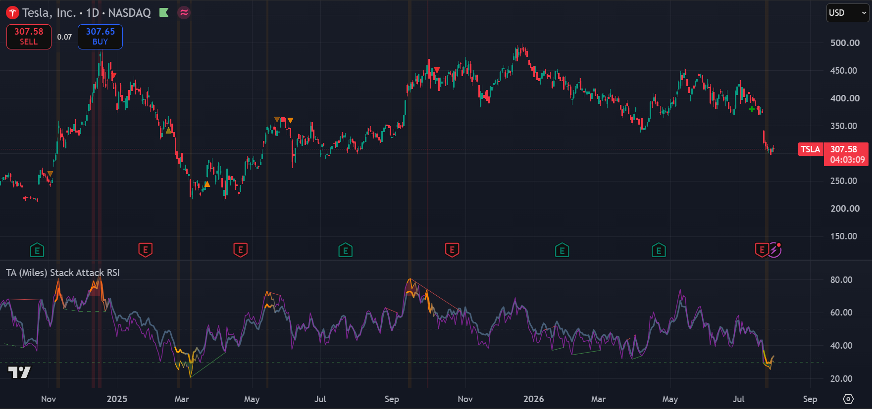
(TSLA 1D chart, Default settings, background tint, composite RSI and divergences ON)
Stack Memory settings (dip re-entry)
The user-facing knobs:
- Enable dip re-entry (on): master switch. Off = Phases 1–3 only.
- Dip signal cooldown (bars) (12): minimum bars between "+" crosses. Higher = fewer repeated attempts.
- Max tilt period (bars) (90): how patient the engine is before giving full weight to the lower timeframes 90 bars on a daily chart is roughly three months of consolidation. Most users should leave this alone.
- Show dip re-entry markers (on): display toggle for the "+" crosses. The alert fires either way.
Colors
Stack Attack exposes color inputs for severity tiers, divergence lines, composite neutral, and each 15M / 1H / 4H stack marker. Defaults follow the yellow → orange → red / bright-green scheme described above.
Customize when you need higher contrast on your chart theme or when printing screenshots for a dark vs light background. Changing severity colors does not change when signals fire only how they appear.
RSI Pane colors (line, zone fills, reference levels) live in the separate RSI Pane group and do not affect price-chart markers.
Useful Alerts
Every condition below is a separate entry in TradingView's Create Alert → Condition dropdown. Alerts are evaluated every bar even when the matching line or marker is hidden, so you can subscribe to a signal without cluttering the chart.
Divergences (RSI vs price)
- Divergence Regular Bullish (price lower low + RSI higher low → possible reversal up)
- Divergence Regular Bearish (price higher high + RSI lower high → possible reversal down)
- Divergence Hidden Bullish (price higher low + RSI lower low → uptrend continuation)
- Divergence Hidden Bearish (price lower high + RSI higher high → downtrend continuation)
- Divergence Any Bullish / Any Bearish (regular or hidden, one alert to catch either)
Phase 1 stack ignition
- Phase 1 OB Ignition / Phase 1 OS Ignition
- Phase 1 OB Escalation (High tier) / Phase 1 OS Escalation (High tier) re-fires when an active stack pushes deeper
- Phase 1 Weekly OB (Extreme) / Phase 1 Weekly OS (Extreme) the rare, highest-conviction reads
Phase 2 / 3 warning + confirmation
- Phase 2 Bear Warning / Phase 2 Bull Warning
- Phase 3 Bear Confirmation / Phase 3 Bull Confirmation
Stack break
- OB Stack Broken / OS Stack Broken an active stack lost timeframe agreement
15M / 1H / 4H markers (fixed timeframe, works on any plan)
- 15M Oversold / 15M Overbought
- 1H Oversold / 1H Overbought
- 4H Oversold / 4H Overbought
Dip re-entry
- Dip Re-entry Long
Use Phase 1 and divergence alerts for early warnings. Use Phase 3 alerts when you prefer confirmation. Stack Broken alerts tell you the setup expired without resolving.
Simple Workflow
- Open a 4H, Daily, or Weekly chart Stack Attack's ladder is built for these horizons.
- Watch the standard RSI in the bottom pane for familiar context; note zone fills and reference levels.
- When phase markers appear on price, check color severity yellow demands attention, orange/red or bright green demands more.
- Treat Phase 1 (if enabled) as early attention only not confirmation.
- Treat Phase 2 as warning and planning structure may be bending.
- Treat Phase 3 as confirmation the trend engine flipped; the cycle closes.
- Optionally cross-check 15M / 1H / 4H stack markers or dip "+" markers for continuation vs trap context.
- Always check the larger trend, structure, and your risk plan before acting.
Common Mistakes
- Treating Phase 1 as confirmation.
- Expecting frequent stack ignitions on low timeframes without Premium sub-hour scanning.
- Ignoring color severity and reacting equally to yellow and red markers.
- Acting on dip re-entry "+" markers against the higher-timeframe trend.
- Enabling every visual option at once Phase 1 circles, all stack markers, divergence lines, background tint, and composite together overwhelm the chart.
- Turning on Enable sub-hour scanning without a TradingView Premium plan the stack pauses below 1H for a reason.
- Assuming Stack Attack predicts exact tops and bottoms it measures stretch and follow-through across timeframes.
TA Gann Swing Indicator
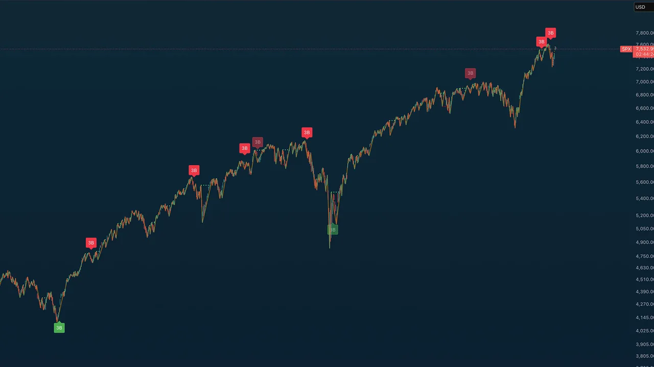
Draws the market's swing structure for you: W.D. Gann's swing highs and lows, break-line projections, and his classic 3-bar reversal rule, with strict gating so mid-trend bounces never print a signal, but structural tops and bottoms do.
What you see on the chart
- Orange swing lines connecting confirmed pivots, with a dotted line for the current, unconfirmed leg.
- Swing break lines: lime when price closes through a prior swing peak, red when it closes through a prior trough. These are the structure-break reads.
- "3B" labels: Gann 3-Bar Rule signals: a sell after three consecutive down bars off an ultimate swing high, a buy after three consecutive up bars off an ultimate swing low. Full-opacity labels are strict three-in-a-row; faded labels allowed one interruption.
- Optional bar-type classification: up bars (green ▲), down bars (red ▼), inside bars (gray ●, ignored by the swing logic), outside bars (blue ◆).
How to read it
The gating is the value. A 3B signal only fires off an ultimate swing (the most extreme pivot in a long lookback), with cooldown and minimum-move filters, and a correction-depth check measured in ATR multiples, so a routine dip and a genuine correction aren't treated the same. Signals are for Daily charts and up; below that the indicator stays quiet by design. Use the swing and break lines continuously for structure; treat 3B labels as the rare, high-value events they're tuned to be.
Key settings
Swing/break-line toggles, 3-bar strictness (allow one inside/outside bar interruption), ultimate-swing lookback, minimum bars between signals, cooldown override threshold, bar-type markers, and optional seasonal dates.
Alerts
Gann 3-Bar Buy and Gann 3-Bar Sell (Daily and above).
TA Trend Ribbon
Bull or bear regime at a glance: a volatility-adaptive ribbon that doubles as your dynamic stop. There are no arrow markers to interpret: the color flip is the signal.
What you see on the chart
A filled ribbon band with a center trend line. Blue means bull: the ribbon rides below price as dynamic support. Orange means bear: it hangs above price as dynamic resistance. The center line is the active SuperTrend stop level.
How to read it
The ribbon is a SuperTrend engine: an ATR-scaled stop that trails price and flips when it's crossed. The main dial is the Trend Bias Preset, and it's asymmetric on purpose:
- Neutral (3.0 / 3.0): balanced flips both ways.
- Bullish Bias (4.0 bull / 2.5 bear): gives uptrends room to breathe through normal corrections, but exits fast when a downtrend starts. For markets that grind up and crash down.
- Bearish Bias (2.5 / 4.0): the mirror: quick to confirm downtrends, skeptical of bounces. Filters failed rallies in a bear market.
Ribbon touches are pullback-to-trend events; trend-line touches are your stop being tested. Both are alertable, which turns the ribbon into a complete trail-stop workflow.
Key settings
Trend bias preset, source and smoothing (HL2, EMA-2 by default), ATR period (10), ribbon width (0.5× ATR), and optional bar coloring / background tint.
Alerts
6 alerts: bullish and bearish flips, ribbon touches on both sides, and trend-line touches on both sides.
TA Adaptive Trend
A trend follower built to sit out the chop that bleeds plain moving-average-cross systems dry. The chart shows two familiar EMAs, but the colored zone between them is not the crossover: it's the verdict of a multi-factor engine that scores momentum, volume, divergence, and trend context together.
What you see on the chart
- A fast EMA (21, teal) and slow EMA (55, orange): visual reference only.
- The zone between them, colored by the engine: mint-green when conditions favor bulls, orange when they favor bears, and gray when the engine refuses to pick a side; that gray is the whipsaw protection.
- An optional info table with the current state, net score, factor breakdown, ADX, and bars since the last flip; optional flip triangles and background tint.
How to read it
The engine blends RSI (including multi-timeframe alignment), volume behavior, divergence, and trend context into one signed score from −100 to +100, then applies hysteresis, a flip cooldown, and a trend lock so one noisy candle can't flip the verdict. Read it as your directional backdrop: take reversion buys when the zone is green or gray, and demand more evidence when it's orange. Optional reversion-target lines project the price where a faster timeframe would reach oversold/overbought: natural pullback targets within the trend.
Key settings
- Decision profile: Lead (earlier, more flips), Balanced (default), or Confirm (later, fewer flips). This is the one dial most users touch.
- EMA lengths, info table, flip markers, background tint, and reversion targets. The deeper engine weights ship locked to tuned defaults.
Alerts
4 alerts: bull and bear trend flips, plus chop-regime entry and exit.
TA Adaptive Levels
Support and resistance the market has actually proven. Adaptive Levels finds confirmed pivots on the Weekly, Daily, 4H, and 1H, merges them into one shared pool, and scores each level by how price has respected it over time. Bounces build a level's strength; breaks decay it; only levels that earn their place get drawn. Because levels are built from fixed higher-timeframe data, the picture is identical on every chart timeframe, and it never repaints: a pivot only becomes a level after its higher-timeframe candle closes.
What you see on the chart
- Green (teal) lines: support at or below the current reference price. Red lines: resistance above it. Line opacity reflects strength.
- Labels on the right edge: role prefix (S support / R resistance / SR both), price, and optional stats: quality score, event count, and the bounce/rejection/break/failure breakdown.
- ATR zones (optional): shaded reaction bands on the nearest support and nearest resistance, sized by 4H ATR so they breathe with volatility.
- A Next-ATH scenario: a forward-looking gray-blue band with a dashed median line, blending up to three independent estimates (Fibonacci extension, measured move, and volatility projection) of where the next all-time high might land. A planning overlay, not a trade signal.
- A dashboard (top right): active tiers, filters, visible line counts, nearest S/R, and the ATH readout.
How levels are built
Anchor date → pivot detection per timeframe → confirmation delay (no repainting) → clustering of nearby pivots → scoring from touches, bounces, rejections, breaks, and failures → promotion once a level has earned enough evidence → a visibility cap that shows only the closest N levels below and above price. Confluence bonuses reward levels that align with Fibonacci retracements and round numbers.
How to read it
Quality tiers run confirmed → strong → elite; the strength filter lets you show all confirmed levels or only the strong/elite ones. Trade level to level: stretched price arriving into an elite support with a reversal signal from Deviation Bands or Adaptive Mean Reversion is the setup this suite is built around. Use it on 4H, 1H, or 15m charts; above 4H the 4H tier degrades and the dashboard warns you.
Key settings
Timeframe tiers on/off, a level timeframe view (show only levels born on a chosen tier, e.g. Daily levels on a 4H chart), strength and quality filters, independent counts of support/resistance lines shown, label detail (price only → full stats), ATR zone width, and the full Next-ATH projection block.
Alerts
8 alert types, including level touched (any/support/resistance, with an ATR-scaled touch tolerance), level crossed (any/up/down), new ATH, and Next-ATH median reached.
TA Money Flow
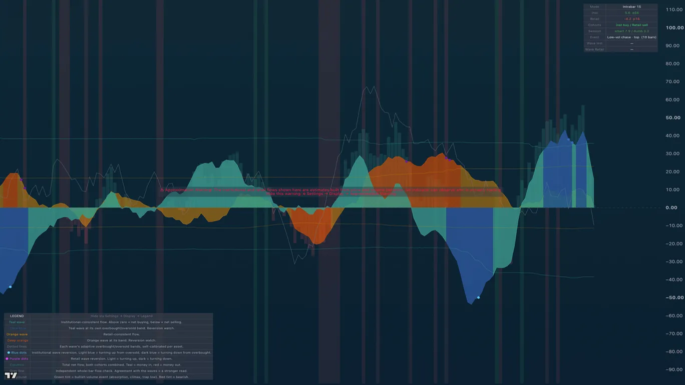
Splits every bar's volume into institutional-consistent and retail-consistent flow, and shows you when either side is exhausted. Money Flow is a lower-pane engine that separates money flowing in versus out of an asset, assigns it to two participation cohorts by print size, and flags the classic accumulation and distribution footprints as they form.
What you see on the chart
- Stacked flow waves for the two cohorts, large-print (institutional-consistent) and small-print (retail-consistent), each normalized to a common scale so their pushes and retreats are directly comparable.
- BUY / SELL marks when the cohorts split in the classic way, reversion dots on exhausted waves, and effort events: climaxes, absorption/stopping volume, churn, and low-volume traps.
How the engine works
Intrabar volume is signed into buy/sell delta from lower-timeframe data, then split into cohorts by a rolling large-print percentile. On top of that sit behavior detection (effort-versus-result events gated by each cohort's own history) and session priors: the opening half hour leans retail, the closing hour leans institutional. A mean-reversion layer runs on the cohort waves themselves, flagging when a wave is stretched past its own normal behavior.
The signals
- BUY (cohort flip): retail flips to net selling while institutions flip to net buying within a tight window; SELL is the mirror. STRONG marks both flips landing on the same bar.
- Quality filters (on by default) require the flip to be decisive, deep, and well-located before it prints.
- An alternate evidence engine flags TURN events (an institutional-flow zero-cross after a tail extreme) and DIV events (quiet accumulation against flat or falling price), each gated on multiple pieces of confirming evidence.
An honest caveat
No indicator built on price and volume can observe who is actually trading. What this engine measures is abnormal, large-lot-consistent effort and absorption-consistent behavior (the classic Wyckoff/VSA footprints), not literal identity. Treat the cohort labels as well-founded proxies, and read the signals as the story behind the tape, told honestly.
How to read it
The highest-value reads are the divergences: institutions accumulating while price is flat or falling (quiet accumulation), or retail buying enthusiastically into a top while the large-print wave withdraws (distribution). The reversion dots tell you when a wave (either cohort's) is exhausted and due to rotate.
Alerts
30 alerts across cohort flips, strong flips, reversion events, and the effort-event families.
TA Market Breadth
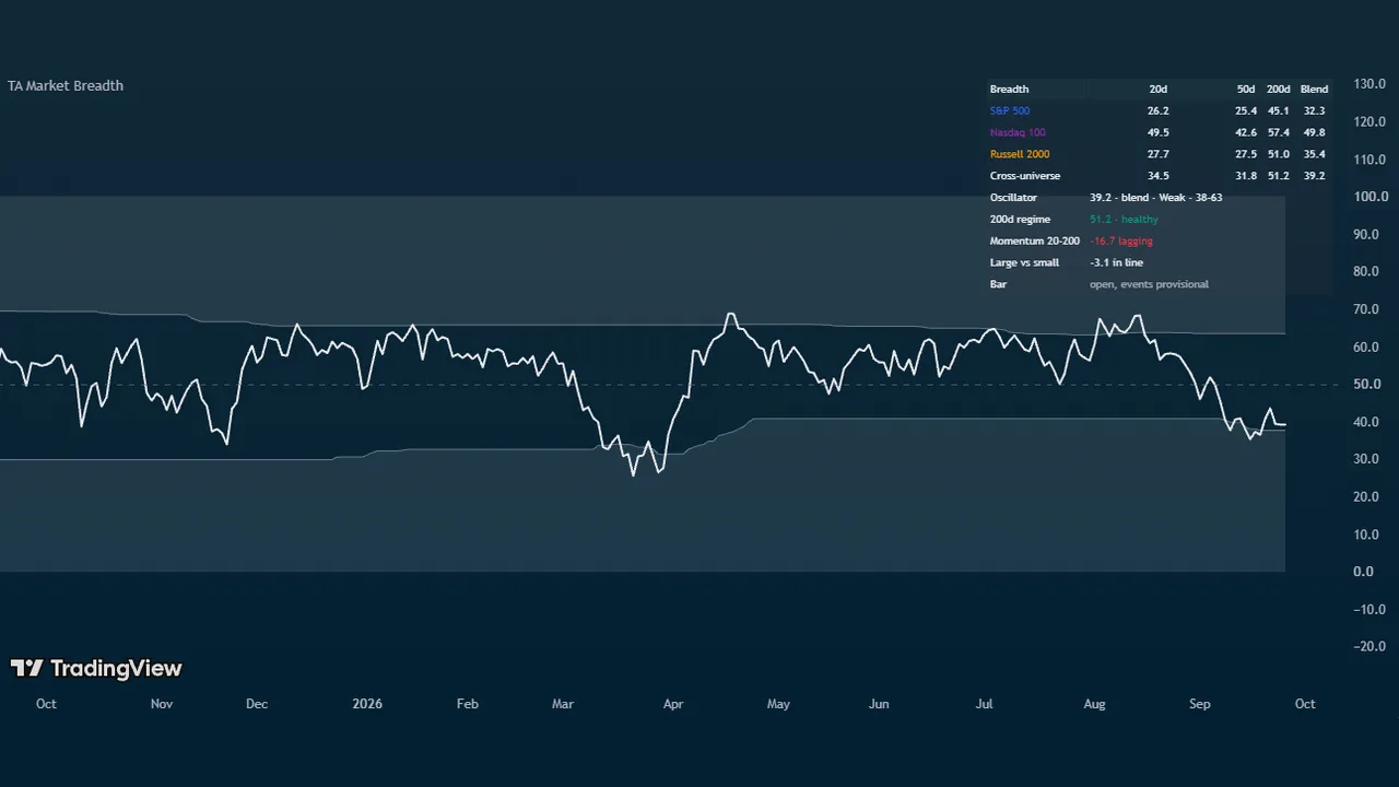
Answers one question in one panel: how many stocks are actually participating, and is that number at an extreme worth acting on. Market Breadth builds a single 0 to 100 oscillator from TradingView's own percent-of-stocks-above-moving-average series, adds the market internals breadth traders actually watch, and ranks sector rotation in the same pane.
Because the underlying data is market-wide, the panel reads the same whatever symbol is on your chart. Put it under SPY, QQQ, IWM, or a single stock and you are always looking at the market's participation, not that symbol's.
What you see on the chart
- The oscillator: the share of stocks participating, on a 0 to 100 scale with a dashed midline at 50. Low readings are washouts and high readings are broad participation, which is strength rather than an automatic top, so the line is one neutral colour by default.
- Shaded extreme zones, set from the composite's own trailing percentile rather than from fixed numbers.
- A breadth readout table carrying every universe at 20, 50, and 200 days, the plotted value with its zone and bands, the 200-day regime, both spreads, and any module you have switched on. Compact is the default; Full spells everything out.
- A sector rotation table (optional), ranking the strongest and weakest funds over the lookback you choose.
What makes it different
This is not one percent-above-average line with a 20 and an 80 level drawn on it.
- A calibrated composite across universes. Choose the moving-average length that drives the line, then average it across the S&P 500, Nasdaq 100, and Russell 2000, with the whole US market, the Nasdaq Composite, the S&P 400, and the S&P 600 available too. Presets read a single universe on its own, or weight a custom mix, and three optional compare lines draw individual universes against the composite.
- Bands that mean the same thing in every regime. The extreme bands sit at the composite's own trailing percentile over a year, so a washout in a quiet market and a washout in a violent one both register. Optional drift limits stop the bands wandering somewhere meaningless over a long trend, and the panel tells you when a limit is binding. Fixed levels are there for anyone who prefers them.
- The two spreads a single breadth line cannot show. Short-term participation minus long-term participation is breadth momentum, and a cross up through zero soon after a washout is the earliest broad recovery signal in the panel. Large-cap breadth minus small-cap breadth is the narrow-leadership detector: the classic late-cycle pattern where the index holds up while most stocks underneath it roll over. Both are readouts and alerts whether or not you draw the lines.
- NYSE internals computed correctly on any timeframe. An optional module reads advancing versus declining issues and derives the ratio-adjusted McClellan oscillator and Zweig Breadth Thrust inside the daily request, so the values are right whether your chart is hourly, daily, or weekly. Two more optional modules cover net new highs with a new-lows washout marker, and Lowry-style 90 percent up-volume and down-volume days.
- Borrowed scales that never flatline. McClellan and net new highs ride the same 0 to 100 pane through a soft curve, where 50 is zero and you set the value that reads 75. A crash-level print keeps moving toward the edge instead of pinning against it, which is exactly when you are looking at it.
- Event timing that does not drop or repaint. Each module returns a running event count from inside the daily request rather than a bars-since window, so two 90 percent down-volume days in consecutive weeks both mark on a weekly chart instead of collapsing into one. Markers wait for the bar to close, and on intraday charts they print once per day rather than flickering through the session.
Sector rotation
An optional table ranks the top three and bottom three performers from a 41-ticker pool of sector and industry funds over one day, one week, one month, or three months, with the S&P 500 and Nasdaq 100 as baselines in the middle. TradingView allows 40 data requests per script, so the pool fills in priority order with whatever the breadth modules leave unused, and the footer always shows how many loaded and how many requests are in use. Theme switches let you keep the industries you care about.
Best timeframes
Daily and weekly. The underlying breadth series print once a day, so on intraday charts the panel shows the day's running value as a step and the readout says so. Divergence flagging is disabled intraday for the same reason.
Key settings
The moving-average length behind the line and the universe mix driving it, adaptive bands or fixed levels, the two spread lines, and a switch for each internals module. The Breadth Readout Table and Sector Rotation Table sections sit at the top of the settings dialog, because they are the two most people reach for first. Two optional colour modes are there if you would rather the line read participation, or read extremes as stretched.
Alerts
19 conditions: extreme-zone entries and exits, midline crosses, breadth momentum turns and the post-washout thrust, narrow and broad leadership, 200-day regime changes, Zweig thrust, 90 percent volume days, new-lows washout, and breadth divergences against the chart's price. Create them with Once per bar close.
An honest caveat
The breadth and internals series cover US equities and are end-of-day data, so treat today's value as provisional until the close. Sector rotation and divergence read live prices. Nothing here predicts: it measures participation, and participation is context for your own trade decisions rather than a signal to take them.
TA Moving Averages
The classic daily and weekly moving averages, always true to their real values on any chart timeframe. Most MA indicators recalculate on whatever chart you're viewing: a "200 SMA" on a 4H chart is a 200-bar 4H average, not the 200-day institutions actually trade against. This one anchors every line to its home timeframe.
What you see on the chart
Eight timeframe-anchored simple moving averages: the 20, 50, 100, and 200 day and the 20, 50, 100, and 200 week, each computed on its true timeframe and drawn on whatever chart you're using, plus five custom slots for your own additions.
The color hierarchy keeps them readable at a glance: the 20-day (pink) and 20-week (green) mark the institutional buyer zone; the 50-day (royal blue) and 50-week (cyan) are the primary trend filters; the 100s (orange/amber) the intermediate reads; and the 200-day (yellow) and 200-week (purple) the long-term anchors.
How to read it
These are the levels everyone else is watching, which is exactly why they matter: reclaim/loss of the 50-day, tests of the 200-day, and the 20-week as bull-market support are among the most-traded reference points in markets. Having them exact, on any chart, removes a whole class of silent errors.
Free for everyone on TradingView.
TA Benner Chart
Samuel Benner's 1875 commodity-cycle forecast projected onto your chart: panic, peak, and trough years, extended through 2100. Benner published his cycle tables in Benner's Prophecies in 1875; an unreasonable number of major market turns since have landed on or near his years. This indicator plots the full calendar so you can judge it yourself. 2026 is a projected peak year.
What you see on the chart
- A lower pane with A/B/C event boxes, a connecting zigzag wave through past and projected turns, and vertical tier lines.
- Subtle vertical reference lines on the price chart marking each cycle year.
Works on Weekly and Monthly charts (intraday is skipped by design).
The three cycles
- A: Panic Years (red), repeating in 18/20/16-year gaps (…1907, 1927 … 2019, 2035): years of speculative panic. Benner's action: sell.
- B: Good-Times Peaks (orange), repeating 9/10/8 (…1999, 2007, 2016, 2026): high prices: the years to trim.
- C: Hard-Times Troughs (green), repeating 7/11/9 (…2012, 2023, 2032): low prices: the years to accumulate.
How to read it
This is a long-cycle context tool, not a timing signal, but a reminder of where you might be in the larger cycle while you work the shorter-term indicators. Position traders use it to lean allocations; everyone else can enjoy how often an 1875 table keeps landing.
Alerts
3 alerts, one per cycle, firing when a new cycle year begins.
TA Closing Hour Pulse & Tide
Track what institutions do in the final hour of each session: the hour smart money trades. The Closing Hour Pulse scores every session's last hour as buying or selling, optionally weights it by volume, and plots the running total as a smart-money line you read against price.
What you see on the chart
A cumulative Pulse line in its own pane, plus a table with a −100 to +100 score and the current regime read. Optional pivot lines mark structural turns in the Pulse itself.
How to read it
- Pulse rising with price: institutions are buying into the close; the rally has sponsorship.
- Pulse rising while price falls: hidden accumulation. Smart money is quietly buying weakness. Bullish divergence.
- Pulse falling while price rises: hidden distribution. The rally is being sold into. Bearish divergence.
The divergences are the whole game: the Pulse is designed to show accumulation and distribution before price does. Best on index products (SPX, NDX, SPY, QQQ) on Daily charts and above.
Free for everyone on TradingView.
TA Closing Hour Tide
The Pulse's companion gauge: where the Pulse is the running trend line of closing-hour flow, the Tide compresses the same flow into a bounded −100 to +100 oscillator: the force behind the line, with clear regime bands.
What you see on the chart
A single bounded oscillator with five labeled regime bands:
- ≥ +50: Strong Buying
- +18 to +50: Buying
- −18 to +18: Balanced
- −50 to −18: Selling
- ≤ −50: Strong Selling
How to read it
Because the Tide is bounded, it answers the question the cumulative Pulse can't: how intense is the current closing-hour pressure, and is it at an extreme? Readings deep in a Strong band that start to fade (especially against price still pushing the other way) are exhaustion tells. Run it alongside the Pulse: the Pulse for direction and divergence, the Tide for intensity and regime changes, with alerts on each regime transition.
Free for everyone on TradingView.
Stack Attack
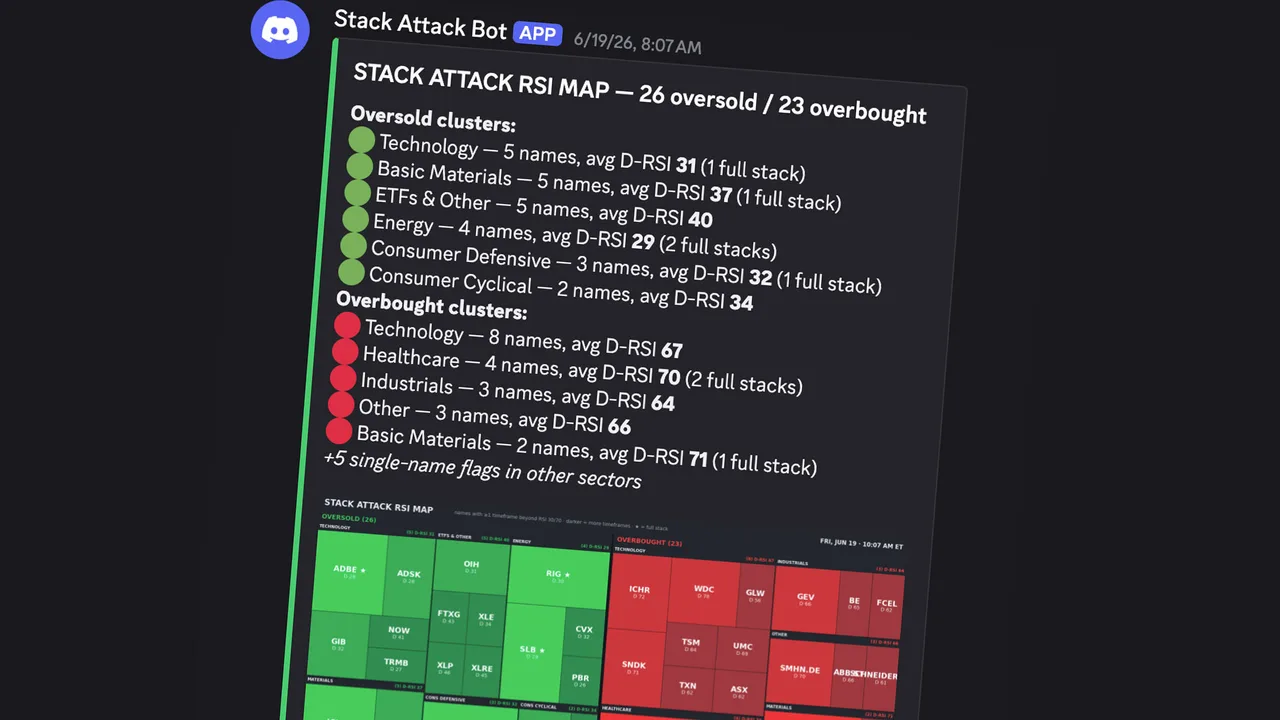
Guide content coming soon.
Premarket Movers

Guide content coming soon.
Juice Press (Monthly)
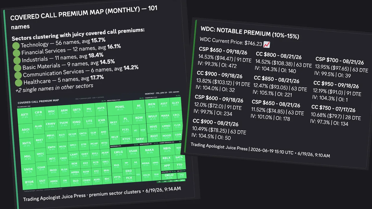
Guide content coming soon.
Juice Press (Weekly)
Guide content coming soon.
Rotation Radar
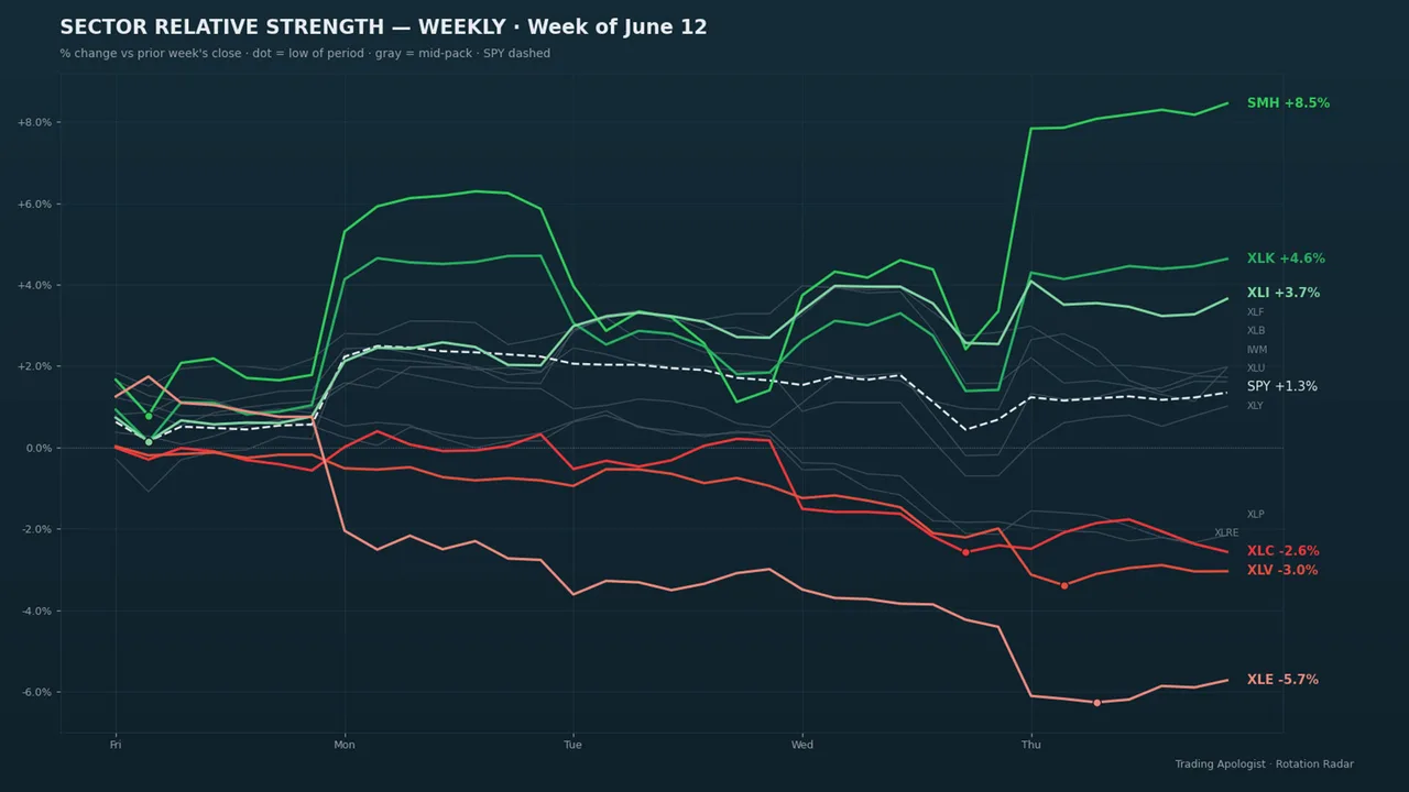
Guide content coming soon.
Market News
Guide content coming soon.
Market Vitals
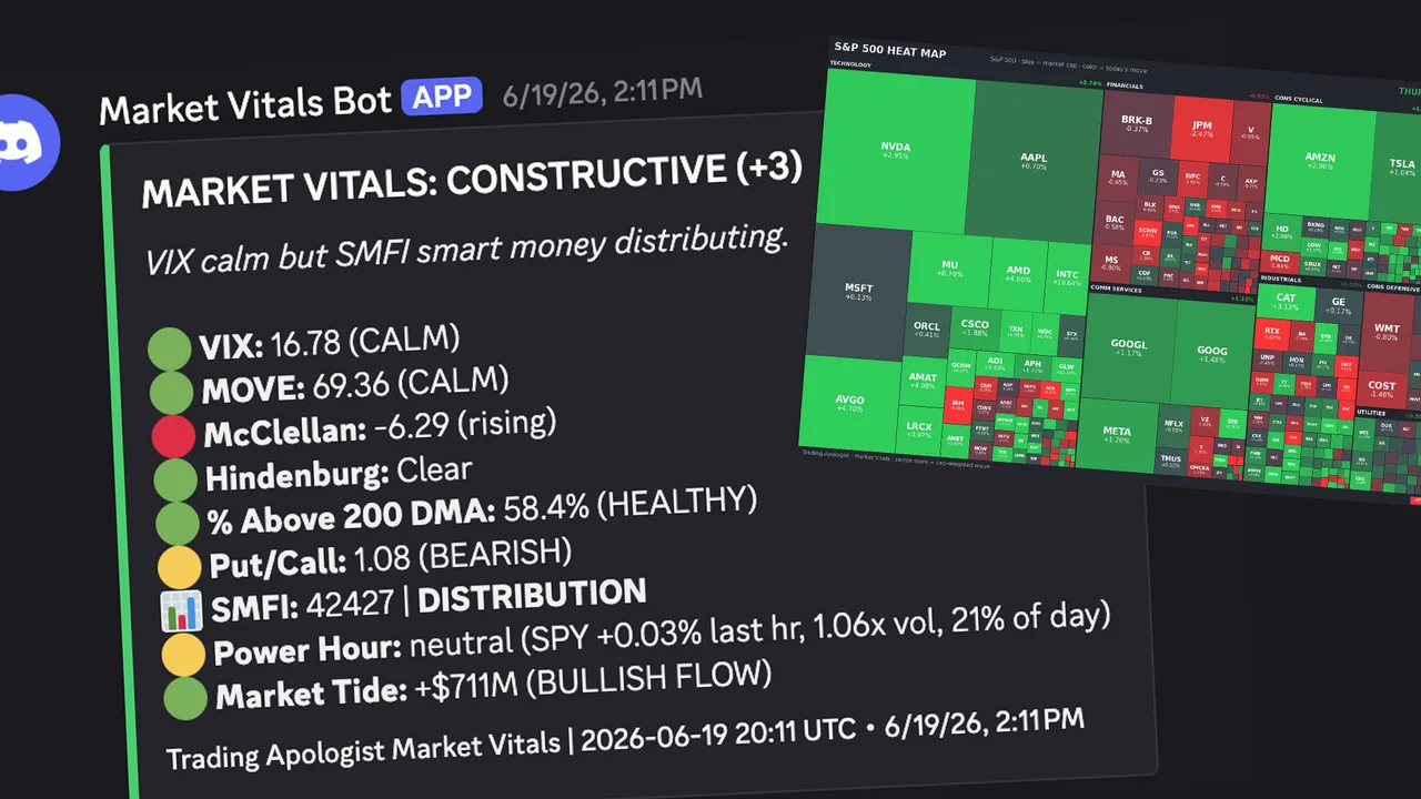
Guide content coming soon.
Crypto Vitals
Guide content coming soon.
Earnings Pulse
Guide content coming soon.
Macro Monitor
Guide content coming soon.
Insider Intel
Guide content coming soon.
Dark Pool Tracker
Guide content coming soon.
Pork Barrel
Guide content coming soon.
Option Walls
Purpose
Option walls marks the four prices that options positioning cares about most on the charted stock: the call wall, the put wall, the gamma flip, and max pain. These are the strikes where dealer hedging concentrates, so price tends to slow down, stall, or react when it reaches them.
It is the quickest way to put the options market's map on your price chart without opening a chain.
Best used for:
- Sanity-checking a target: a call wall sitting just above your target is a reason to take profit early, not to hope through it.
- Finding pin candidates into weekly and monthly expiry, when price often gravitates toward max pain and the heaviest strikes.
- Framing intraday ranges: on many liquid names the day's chop lives between the put wall and the call wall.
- Knowing which side dealers are leaning: above the gamma flip, hedging dampens moves; below it, hedging amplifies them.
What you see on the chart
Four horizontal price lines on the price pane:
- Call wall in red: the strike carrying the heaviest call-side gamma. Overhead, it tends to cap rallies.
- Put wall in teal: the strike carrying the heaviest put-side gamma. Below price, it tends to catch dips.
- Gamma flip in orange: the price where net dealer gamma changes sign. It behaves like a regime line rather than simple support or resistance.
- Max pain in grey, dotted: the price where the most option value expires worthless. A gravity level into expiry, not a trade trigger.
Line thickness carries information: the call and put walls are drawn thicker when their gamma weight is heavier relative to the rest of the ladder, so a fat line is a wall the market actually respects and a thin line is a minor one.
In the bubbles style, the call and put walls move into a column of size-scaled circles in the right gutter (bigger circle, heavier wall) and their lines collapse to axis labels. The gamma flip and max pain always stay as lines, because they are prices, not sizes.
How to read it
- Walls are magnets first, barriers second. Price is drawn toward heavy strikes as dealers hedge, then reacts when it arrives. The first touch of a strong wall is the highest-quality reaction.
- Respect the thickness. A thick call wall rejected twice is a real ceiling. A thin wall is a waypoint; do not build a trade around it.
- The gamma flip splits your playbook. Above the flip, fade moves toward the walls and expect chop. Below the flip, breakouts run further than they look like they should, so trail rather than fade.
- Max pain matters most in the final sessions before expiry. Far from expiry it is background information. In expiry week, a drift toward max pain with no news is normal behavior, not a mystery.
- Walls move. Positioning is rebuilt daily. A wall that migrates up day after day is bullish structure; a call wall that steps down toward price is supply pressing in.
If you also run the GEX Profile indicator with its corrected walls on, those corrected lines replace the raw call and put wall lines from this indicator, and the menu notes it. The GEX version filters out walls on the wrong side of price.
How the engine works
The levels come from Unusual Whales options positioning for the charted stock. The backend extracts the heaviest call-gamma strike, the heaviest put-gamma strike, the net-gamma flip price, and max pain, each with a strength score measured against the heaviest strike on the ladder. That strength score drives the line thickness and the bubble size.
The data refreshes with the chart series. It reflects current open positioning, so it changes as positions open and close, most visibly overnight when open interest updates.
Honest limitation: walls are an estimate of where dealer hedging concentrates, built from open interest and gamma. They describe where reactions are likely, not guaranteed. On thin, low-open-interest names the walls can be noise; the thickness cue is your guide to how seriously to take them.
Key settings
- Style:
linesorbubbles (right gutter). Bubbles keep the pane clean when you run several level-based indicators at once. - Labels:
full(name plus strength, like "Call Wall 72"),minimal(short tags CW, PW, GF, MP), oroff. - Opacity: 10 to 100 percent, fades the lines without removing them.
Availability
US equities only; not available on pairs or crypto charts. Included from the Starter plan up, the earliest chart indicator unlocked on the desk.
Expected Move Cone
Purpose
The Expected Move Cone projects the options-implied price range forward in time: a shaded cone showing where the options market expects price to stay, with roughly 68 percent confidence inside the 1-sigma cone and roughly 95 percent inside the optional 2-sigma cone.
It answers a question every trade plan should ask: is my target a normal move, or does it need something the market has not priced?
Best used for:
- Reality-checking targets and stops: a target outside the 1-sigma cone needs an outsized, statistically unpriced move to get there.
- Reading the volatility regime: price living inside the cone favors premium selling and mean reversion; repeated closes outside it favor momentum and long premium.
- Sizing the earnings bet: anchored to earnings, the cone shows exactly how much move the market has priced into the event.
- Judging other levels: an option wall inside the cone is a realistic pin candidate; a wall far outside it is decoration.
What you see on the chart
A shaded blue cone that starts at an anchor point and widens as it projects past the last bar into future time on the right of the chart:
- The 1-sigma cone is the main band. Optional edge labels print the upper and lower prices at the cone mouth and on the price axis.
- The optional 2-sigma cone draws a second, wider band outside the first.
- The cone's mouth sits at the anchor: the live bar, the session open, the week open, or the next earnings date, depending on your setting.
With a fixed anchor (session open or week open) the cone stays put while price moves, so you can literally watch price walk out of its expected range. With the auto or now anchors the cone re-roots at the current price.
How to read it
- The cone is the range option sellers are being paid to defend. Inside it, nothing statistically unusual is happening, whatever the candles feel like. The first close outside it is information.
- One poke outside is a stretch; repeated closes outside are a regime. A single tag of the cone edge often mean-reverts. A market that keeps closing beyond the edge is telling you realized volatility is beating implied, and momentum tactics beat fading.
- Watch the width, not just the edges. A cone that widens day over day means event risk is being priced in (earnings, macro prints). A cone that collapses right after an event is the vol crush; targets computed off yesterday's width are stale.
- Use it as a filter for everything else. GEX walls, dark pool levels, and OI builds inside the cone are live; the same levels outside the cone are unlikely to be tested within the horizon.
- Earnings anchor: the cone rooted at the earnings date is the market's priced-in earnings move. If your thesis needs more than that, you are trading against the priced distribution and should size accordingly.
How the engine works
The cone is computed from the stock's at-the-money implied volatility: upper and lower edges are the anchor price times exp(±iv × sqrt(days/365)), the standard lognormal expected-move formula. The 2-sigma cone doubles the exponent. Implied volatility and spot come from the desk's Unusual Whales options data; the earnings anchor pulls the next confirmed earnings date.
The math runs in your browser on already-fetched data, so every setting change repaints instantly without recomputing the chart.
Honest limitation: the cone assumes the current implied volatility describes the whole horizon. It is a probability statement, not a boundary; roughly one day in three, price should close outside a 1-sigma cone. Treat the edges as odds, never as walls.
Key settings
- Anchor:
auto(session open intraday, live bar on daily and up),now,session open,week open, orearnings. Fixed anchors are the ones that let you see price leave the cone. - Horizon: 5 to 90 days of projection. Disabled for the session and week anchors, which carry their own natural horizon.
- 2-sigma cone: draw the outer band as well.
- Fill opacity: 4 to 40 percent.
- Labels:
off,minimal(1-sigma prices), orfull(1-sigma and 2-sigma prices).
Availability
US equities only; not available on pairs or crypto charts. Included from the Plus plan up.
GEX Profile
Purpose
GEX Profile puts the full gamma-exposure ladder on your chart: how much dealer hedging sits at every strike, which side it is on, and whether the whole book adds up to a positive-gamma or negative-gamma regime. Where Option walls gives you the two heaviest strikes, GEX Profile shows the entire distribution behind them.
Dealer gamma is one of the strongest structural forces in modern equity markets: it decides whether hedging flows dampen moves or chase them. This indicator makes that regime visible at a glance.
Best used for:
- Choosing your playbook for the day: pin-and-fade tactics in positive gamma, breakout-and-trail tactics in negative gamma.
- Spotting hedging magnets: the tallest bars are strikes price gets pulled toward, especially into expiry.
- Trading the gamma flip as a live regime line rather than a static level.
- Upgrading or downgrading option walls: a wall backed by a tall bar and confirmed on the right side of price is far more credible than a raw line.
What you see on the chart
Three layers, each toggleable:
- Strike histogram gutter: a right-edge profile of gamma by strike. Call gamma draws in red, put gamma in teal. The two strikes acting as the strongest hedging magnets draw in a brighter, hotter shade, and the gamma-flip strike is marked in orange.
- Regime tint: a soft full-pane background tint (or a candle tint) that tells you the regime without reading numbers: teal for positive gamma, red for negative. A small legend chip spells it out: "GEX: positive gamma, pin and fade" or "GEX: negative gamma, moves run".
- Validity-corrected walls: dashed lines at the heaviest call strike at or above price and the heaviest put strike at or below price. This is the correction that matters: a put wall above price cannot be support, and the raw ladder often nominates one. When these are on, they replace the raw call and put wall lines from the Option walls indicator.
How to read it
- Tall bars are hedging magnets. In a positive-gamma regime, expect price to oscillate between the two biggest bars and drift toward max pain into expiry. The classic pin setup is a corrected call wall inside the Expected Move Cone during a positive-gamma expiry week.
- In negative gamma, breaks accelerate. Dealer hedging chases the move instead of fading it. Treat breaks of the gamma flip as accelerants: do not fade the first push through it, and give trailing stops more room.
- The flip line is the switch itself. Above it, mean reversion has a structural tailwind; below it, momentum does. When price crosses the flip intraday, your tactics should cross with it.
- Watch the profile reshape. A call bar that grows overnight right above price is fresh overhead supply; put bars building below price while it grinds up are hedged longs, which is healthy structure rather than bearish pressure.
- Corrected walls beat raw walls. If the corrected call wall is far from the raw one, the raw wall was on the wrong side of price and would have been a trap level.
How the engine works
Unusual Whales serves per-strike gamma exposure for the charted stock. The backend keeps a ladder of roughly 15 strikes either side of spot with call and put gamma per strike, sums the ladder into net gamma exposure, and calls the regime positive when net GEX is at or above zero. The corrected walls are picked from that ladder with the validity rule applied: heaviest call gamma at or above spot, heaviest put gamma at or below spot.
The histogram is the raw ladder, not a smoothed model. The data refreshes with the chart and changes most visibly overnight, when open interest updates.
Honest limitation: GEX assumes dealers are net short the options customers bought, which is the standard but unverifiable convention. It is a strong structural read on liquid, high-open-interest names, and progressively noisier on small caps with thin chains.
Key settings
- Strike histogram gutter: on or off.
- Gutter width: 8 to 40 percent of the pane.
- Regime tint:
background,candles, oroff. - Validity-corrected walls: on or off.
- Labels:
full(regime sentence plus wall names),minimal(short tags), oroff. - Opacity: 10 to 100 percent.
The Options Positioning master switch in the indicator menu toggles GEX Profile and the Expected Move Cone together, since they share one data fetch.
Availability
US equities only; not available on pairs or crypto charts. Included from the Plus plan up.
OI Change
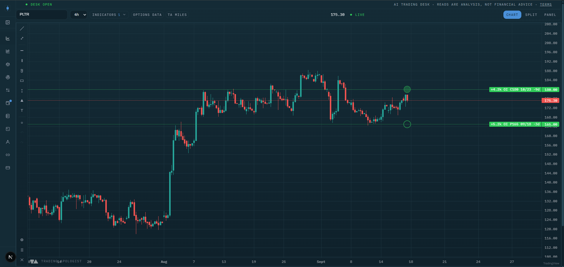
Purpose
OI Change marks the strikes on the charted stock where option open interest built up or unwound overnight. Volume tells you what traded today; open interest change tells you what stayed on the books afterward. That makes it the positioning ledger: it shows where new commitments were made and where old ones were taken off.
It is an early-warning layer for the other positioning indicators. A large OI build at a strike is a wall forming, often visible a day before it shows up as gamma in the GEX Profile.
Best used for:
- Catching walls before they exist: a fresh multi-thousand-contract build at a virgin strike is new positioning worth watching.
- Confirming existing walls: an OI build on top of a tall GEX bar upgrades that wall's credibility.
- Spotting pins losing their magnet: an unwind at the current call or put wall means the max-pain gravity trade weakens into expiry.
- Reading intent: put-side builds below spot while price grinds up are hedged longs (healthy); call-side unwinds into strength are overhead supply being taken off.
What you see on the chart
- Dashed horizontal lines at the affected strikes: green for builds (open interest added), red for unwinds (open interest coming off). Labels read like
AAPL 240C 03-21 +12.4k OI, so you get side, strike, expiry, and size in one glance. - Size-scaled bubbles in the right gutter, one per contract: bigger bubble, bigger overnight change. Calls draw filled, puts draw hollow, and the green/red hue still means build versus unwind. In bubbles-only style the lines collapse to axis labels.
- An honest empty state: a small chip tells you when the scan has nothing for this ticker or nothing above your filters, so a blank chart is an answer, not a bug.
The bubble column automatically shifts left of the GEX Profile gutter when both are on, so the two never overlap.
How to read it
- Build at a virgin strike is new information. Someone committed size where nothing stood before. Watch how price behaves on first approach to that strike.
- Build on an existing wall is confirmation. The wall got heavier overnight. Expect a stronger reaction there than the day before.
- Unwind at the wall is the pin dissolving. If the heaviest strike is being closed out into expiry week, do not lean on the max-pain drift; its anchor is leaving.
- Repeated builds on the same contract are a campaign, not a punt. A strike that grows several days running reflects a position being accumulated deliberately, and those levels tend to be defended.
- Combine with the cone. An OI build plus a GEX bar at a strike inside the Expected Move Cone is the highest-conviction pin or target candidate this suite produces. The same combination outside the cone is a next-week story.
How the engine works
Unusual Whales publishes a market-wide ranking of the roughly 200 option contracts with the largest overnight open-interest changes. The desk fetches that global list once on a shared cache (every user and every ticker reads the same scan), filters it to the charted stock, parses each contract into strike, expiry, and side, and keeps up to 12 rows sorted by the size of the change.
Because the source is a market-wide top-movers list, coverage is deliberately sparse: mega-caps usually have rows, small caps often have none. That is what the "market-wide scan" hint in the menu means, and why the empty state exists. All the filter settings work locally in your browser on the fetched rows, so changes repaint instantly.
Honest limitation: OI change tells you that positioning changed, not why. A build can be opening buys, opening sells, or a hedge. Use direction of price into the strike and the GEX side to interpret it, not the OI number alone.
Key settings
- Side:
both,calls, orputs. - Min contracts: floor of 500, 1k, or 5k contracts to hide small changes.
- Show unwinds: include the red, negative rows or show builds only.
- Style:
lines,bubbles, orboth. - Labels:
full,minimal, oroff. - Opacity: 10 to 100 percent.
- Bubble position: how far in from the right edge the bubble column sits.
Availability
US equities only; not available on pairs or crypto charts. Included from the Plus plan up. Data updates once per market day, reflecting the overnight open-interest print.
My Positions
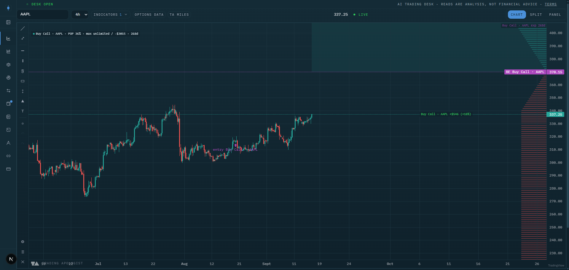
Purpose
My Positions draws your own saved Position Designer structures directly on the price chart: breakevens, profit zones, expiry, probability of profit, and a live modeled P&L. It is the first personal overlay in the suite; instead of asking "where will price go", it answers "where does my structure win from here", in the same pane as the market indicators.
Once your position's geometry sits on the chart, every market level becomes a position decision: a call wall inside your profit zone is a take-profit magnet, a dark pool level at your breakeven is where the defense will happen.
Best used for:
- Managing open option structures without leaving the chart or re-deriving breakevens by hand.
- Pre-visualizing a trade: sketch a structure in the Designer as a sim and see it against live walls, cones, and levels before committing.
- Judging theta risk at a glance: price hugging a breakeven with the expiry marker approaching means time decides the trade, not direction.
- Comparing your profit zone with the Expected Move Cone: a zone that contains the cone is a high-probability structure; a zone entirely outside it needs a move the market has not priced.
What you see on the chart
For up to the three nearest-expiry saved positions on the charted symbol:
- Breakeven price lines: dashed for entered positions, dotted for sims, so committed money and sketches never look alike.
- Profit zone shading between breakevens, drawn from now to the position's expiry, with the expiry marked. Open-ended zones (like a long call above its breakeven) shade accordingly.
- An entry marker below the bar where the position was opened, labeled with the position's name.
- A payoff-at-expiry profile in the right gutter: the combined P&L curve of the drawn positions against price, green where the structure wins, red where it loses.
- A chip row with the live modeled P&L, probability of profit, and max profit and loss per position.
How to read it
- Breakevens are your real support and resistance. Price living above the upper breakeven of a debit structure with time left means the trade is working. Everything else on the chart is context for defending or pressing that line.
- The profit zone versus the cone is your honest odds check. If the shaded zone sits inside the 1-sigma cone, the market's own distribution favors you, and the POP chip will say the same thing numerically.
- The expiry marker changes the question. Far from expiry, direction dominates. Near the marker, theta dominates: a position hugging its breakeven into expiry is a coin flip you can choose not to hold.
- Use market levels as exits. A GEX wall or dark pool level inside your profit zone is where the market is likely to stall; taking profit into a magnet beats hoping through it.
- Sim positions are for rehearsal. Sketch the alternative structure, see both geometries against the same walls, and keep the one whose profit zone lines up with the levels.
How the engine works
The chart fetches your saved Designer positions for the charted symbol and keeps the three with the nearest expiries. All the math runs in your browser with the desk's options model: each leg is aged to today (days to expiry minus your holding period), then breakevens are root-found on the combined payoff, the profit zones and max profit/loss are computed from the same curve, and probability of profit uses a risk-neutral lognormal model seeded with the chart's live implied volatility when available, else each leg's saved volatility.
The live P&L is a model mark from current spot and time, not your broker's fill-level P&L. The overlay renders on its own layer, separate from your drawings, so it never enters undo history or drawing sync.
Honest limitation: POP and the live mark are modeling aids built on lognormal assumptions and the available implied volatility. They are good for comparing structures and reading geometry, not a substitute for your broker's marks.
Key settings
- Include sim positions: draw sketched, not-entered structures (dotted) alongside entered ones.
- POP and max profit/loss chip: the numeric chip row on or off.
- Payoff profile: the right-gutter P&L curve on or off.
Availability
Works wherever your saved Designer positions exist; shown on the charted symbol only, not on pairs charts. Included from the Plus plan up, together with the Position Designer.
Dark Pool Levels
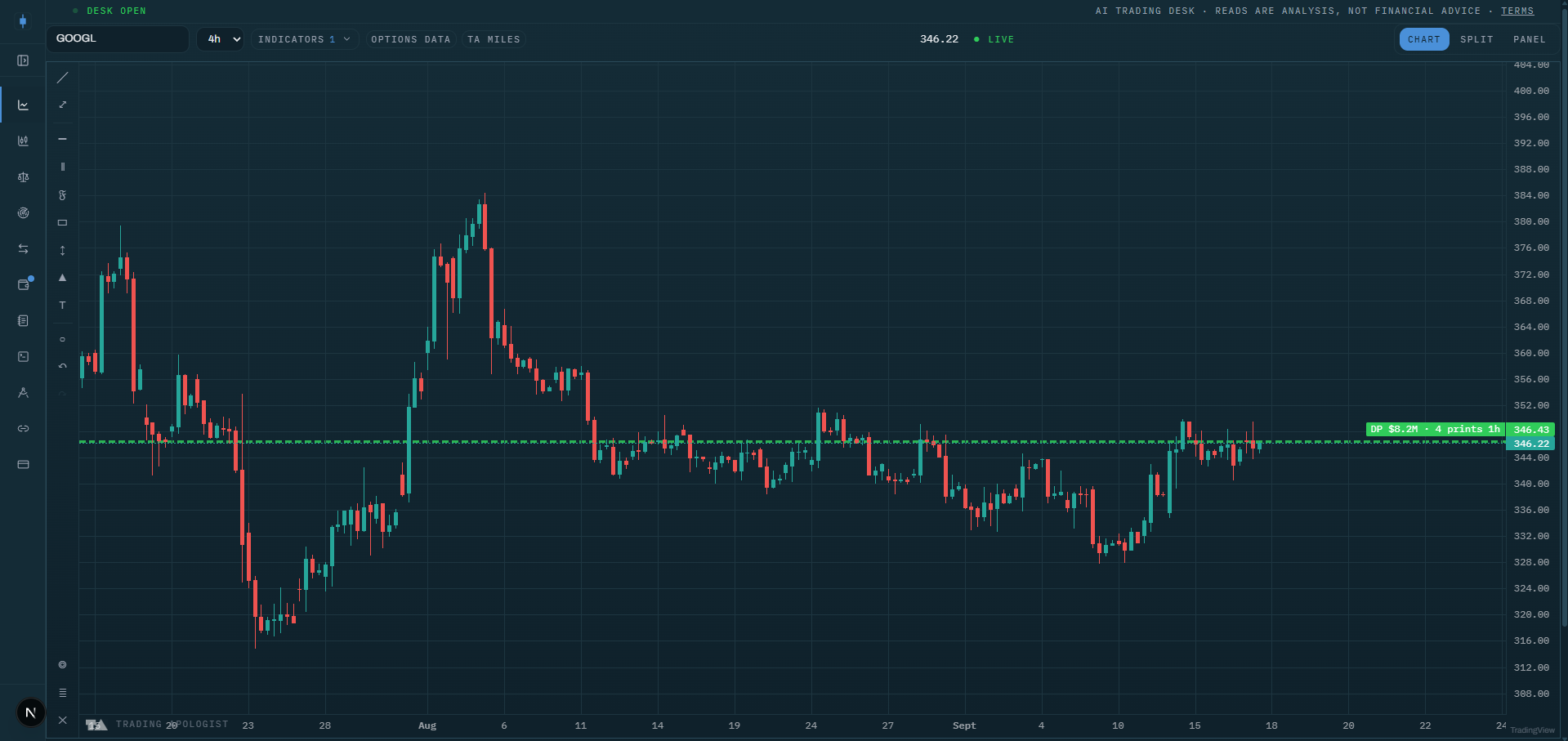
Purpose
Dark Pool Levels clusters the stock's off-exchange block prints into horizontal price levels, weighted by how much money actually changed hands there. Roughly 40 percent of US equity volume executes away from lit exchanges, and the biggest institutional orders concentrate there. This indicator shows you the prices where that size transacted.
It is the observed sibling of modeled level indicators: nothing here is a prediction or a model of pressure. Every level is built from prints that really happened.
Best used for:
- Finding institutional reference prices: a fat level is a price where large players established or exited real positions.
- Anticipating reactions: price returning to a heavy level tends to react there, as the players with basis at that price defend it.
- Distinguishing campaigns from one-offs: repeated prints at one price across days read as accumulation or distribution; a single giant print is a block reposition, a reference rather than a campaign.
- Building confluence: a dark pool level stacked with an option wall or volume node is a high-conviction zone; a lone level in a vacuum is a watch level.
What you see on the chart
- Levels as horizontal lines or shaded bands (your choice) at the clustered prices, up to the eight heaviest by notional. Labels read like
DP $4.2M 3d: total notional and the age of the level. - Print bubbles placed at the actual time and price of the biggest individual prints, sized by print size relative to the largest print on screen.
- Freshness drives opacity: levels fade as their prints age. That fade is deliberate signal, not decoration; a level going pale is a level losing relevance.
- Color always means buys versus sells: net buy pressure in green, net sell pressure in red, and levels the quotes could not classify in neutral blue. There is no other colour mode, so a green level on this overlay always means the tape bought there.
How to read it
- A fat level is real inventory. Institutions transacted size there. Above the level, it tends to act as support (buyers defending their basis); below it, as resistance (trapped inventory looking to get out flat).
- Fresh beats heavy. A moderately sized level printed this week near spot is more actionable than a giant level from three weeks ago. Trust the fade: what has gone pale has mostly stopped mattering.
- Color adds direction. A level built mostly on prints at the offer (buy-classified) that price later revisits from above is a stronger support candidate than a mixed or sell-classified one. A neutral blue level is size without a readable direction, not a weak level.
- Campaign levels are the prize. The same price collecting prints day after day means someone is working an order there. Those levels get defended, and a clean break of one is meaningful.
- Confluence rule of thumb: dark pool level plus an option wall or a volume-profile node within a band is a zone to plan trades around. A dark pool level alone is a level to watch, not to trade blind.
How the engine works
The desk pulls the stock's recent dark pool prints from Unusual Whales, each with price, size, premium, timestamp, and the prevailing bid and ask. The engine drops prints below your notional floor and older than your lookback, then bins the rest by price (bin width is your cluster setting, as a percent of spot) and merges adjacent occupied bins so a level straddling a bin edge is not split in two.
Each cluster becomes a level with a notional-weighted price, total notional, print count, and a freshness score that decays exponentially with age. Buy/sell classification signs each print against the midpoint of the quote at execution time: above mid counts as a buy, below as a sell, exactly at mid carries no information. The top eight levels and the thirty largest dated prints reach the chart.
Honest limitations: prints are reported with a delay, so this is a 15-minute-delayed view. Dark pool data shows that size traded at a price, not who traded or why; a print is not automatically bullish or bearish, which is exactly why the buy/sell classification stays conservative and leaves ambiguous prints neutral.
Key settings
Display settings (instant repaint):
- Levels:
lines,bands, ornone(bubbles only). - Labels:
minimal(top four levels),full(every level with print counts), oroff. - Opacity 10 to 100 percent and bubble size 50 to 200 percent.
- Print bubbles: on or off.
Clustering settings (these recompute the chart):
- Lookback: 1, 5, or 20 trading days (default 5).
- Min print notional: $250k, $1M, or $5M (default $1M).
- Cluster width: 0.05 to 1 percent of spot (default 0.25).
Availability
US equities only; not available on pairs or crypto charts. Prints are observed with a 15-minute delay. Included from the Plus plan up.
Order-Book Depth
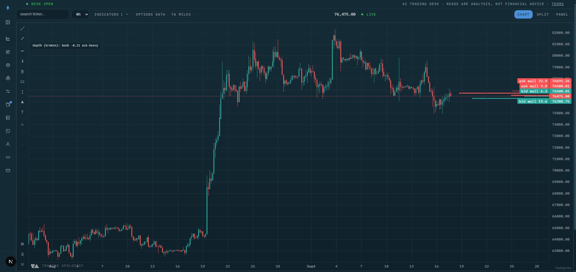
Purpose
Order-Book Depth puts the live exchange order book on your crypto chart: a right-edge histogram of resting bids and asks around the current price, with the largest resting walls promoted to labeled levels and a bid/ask imbalance readout.
Crypto is the one asset class where the real resting liquidity is public. This indicator turns that book into chart structure, so you can see where the market is actually willing to transact size before price gets there.
Best used for:
- Locating defended levels: a fat bid wall below price is a level someone is currently willing to defend with real orders.
- Anticipating supply shelves: a large ask wall overhead is where a rally will meet resting supply, so expect absorption, rejection, or a meaningful chew-through.
- Reading pressure at a level: bid-heavy imbalance while price holds support reads as genuine defense; price rising into an ask-heavy book is a thin-air rally prone to slipping.
- Confluence with structure: a depth wall stacked with a volume node or a key level is a high-conviction zone; a lone wall deep in the book is decoration.
What you see on the chart
- A depth histogram in the right gutter: resting bids in teal below the current price, resting asks in red above it, binned by price so the shape is readable rather than a spike per order.
- Promoted walls: the largest resting bin on each side draws in a brighter, hotter shade and gets an axis label ("bid wall", "ask wall") at its price. Up to two walls per side.
- An imbalance readout in the legend: how bid-heavy or ask-heavy the book is within two percent of the mid price, alongside the venue the book comes from.
The histogram refreshes about every 30 seconds while the indicator is on and the chart is visible.
How to read it
- A wall is a defended level only while it rests. Order books are not commitments; walls get pulled. A wall that survives an actual test is worth far more than one that has never been touched.
- Fresh walls near spot are the actionable ones. Liquidity three percent away is background scenery; the book within a percent of price is where the next decision happens.
- A clean chew-through is information. When price eats through a large ask wall and keeps going, the supply was real and demand beat it. That is a stronger bullish signal than rallying through empty book.
- Imbalance is a divergence tool. Price holding a level on a bid-heavy book is defense working. Price pushing up into an ask-heavy book is a move without support underneath; be quicker to take profits.
- Beware of spoof-shaped behavior. A giant wall that repeatedly appears and vanishes without ever filling is being shown, not offered. Weight walls by how they behave under test, not by size alone.
How the engine works
The desk fetches the live order book (up to 100 price levels per side) from the resolved centralized exchange for the charted pair, typically Kraken or OKX depending on where the pair trades. The snapshot is shared and cached for 30 seconds, and it is only fetched while the indicator is actually on.
Everything visual is computed in your browser from the raw book: prices are binned by your chosen width around the mid price, the largest bins are promoted to walls, and the imbalance is measured over a fixed window of two percent either side of mid. Because the payload is one raw snapshot, every setting change repaints instantly without refetching.
Honest limitations: this is one venue's book, not global liquidity; large flows on other exchanges and in perpetuals will not appear. And a book is intent, not commitment: it shows where orders rest right now, and those orders can cancel the moment price approaches.
Key settings
- Gutter width: 8 to 40 percent of the pane.
- Bin width: 0.1, 0.25, or 0.5 percent of the mid price. Finer bins show structure on majors; coarser bins tame noisy books.
- Label the largest resting walls: promote top bins to labeled levels, on or off.
- Bid/ask imbalance readout: on or off.
- Opacity: 10 to 100 percent.
Availability
Centralized-exchange crypto charts only; the one indicator in the suite exclusive to crypto. Not available on equities, indices, or pairs charts. Included from the Plus plan up.
Market Vitals
The live equity-market health dashboard: internals, breadth, and regime at a glance.
Crypto Vitals
The live crypto-market health dashboard: the digital-asset companion to Market Vitals.
TA Terminal
A company snapshot for any ticker: fundamentals, earnings, and filings, plus call/put walls and flow imbalances.
TA Position Designer
Build option positions from the real chain: payoff, Greeks, breakevens, and a built-in AI options coach.
ECHO / SPCX Arbitrage
How much SpaceX you're really buying through EchoStar.
MSTR Bitcoin-per-Share
Bitcoin per share, mNAV, and the effective BTC price for MicroStrategy.
TSLA / SPCX Merger Scenario
Model a speculative Tesla and SpaceX combination.
Bitcoin Treasury Tracker
Live mNAV screener across public Bitcoin treasury companies.
Solana Treasury Tracker
Live mNAV screener across public Solana treasury companies.
Crypto Treasury Tracker
Live mNAV screener across the ETH, HYPE, TRX, and ZEC treasury companies.